









Highest Priority · New to ORG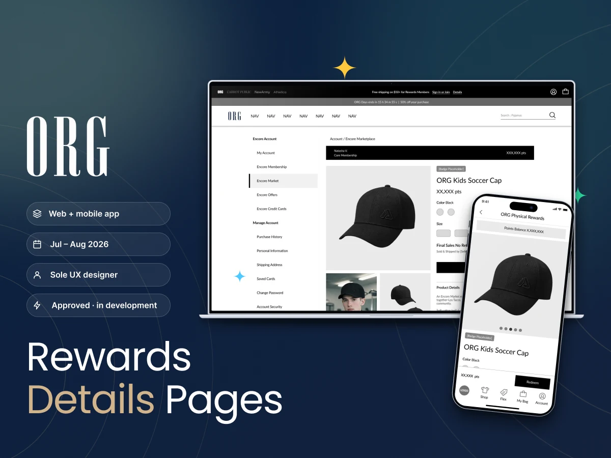
Rewards Detail Pages
Duration
2 months · in development
View

Hello! I’m Prakhar Verma
UX / Product Designer shaping products and experiences through empathy, curiosity and a deep understanding of people.
E-commerce · Retail · Banking · Insurance · Telecom · Automotive · Healthcare · Enterprise Products












ORG Inc. — a global fashion retailer shaping everyday style across generations through brands including ORG, Carrot Public, New Army & Athletica, where I lead loyalty and rewards experiences across membership, offers, QR journeys, and partner ecosystems.
 View
One-line challenge: three overlapping shifts, five leave types, fourteen of fifteen pain points traced back to WhatsApp — make a policy-heavy workplace feel simple enough to just get on with the day.
 View
One-line challenge: build an e-commerce experience from scratch — research, journeys, personas and a design system, shaped for usability and persuasion.
 View
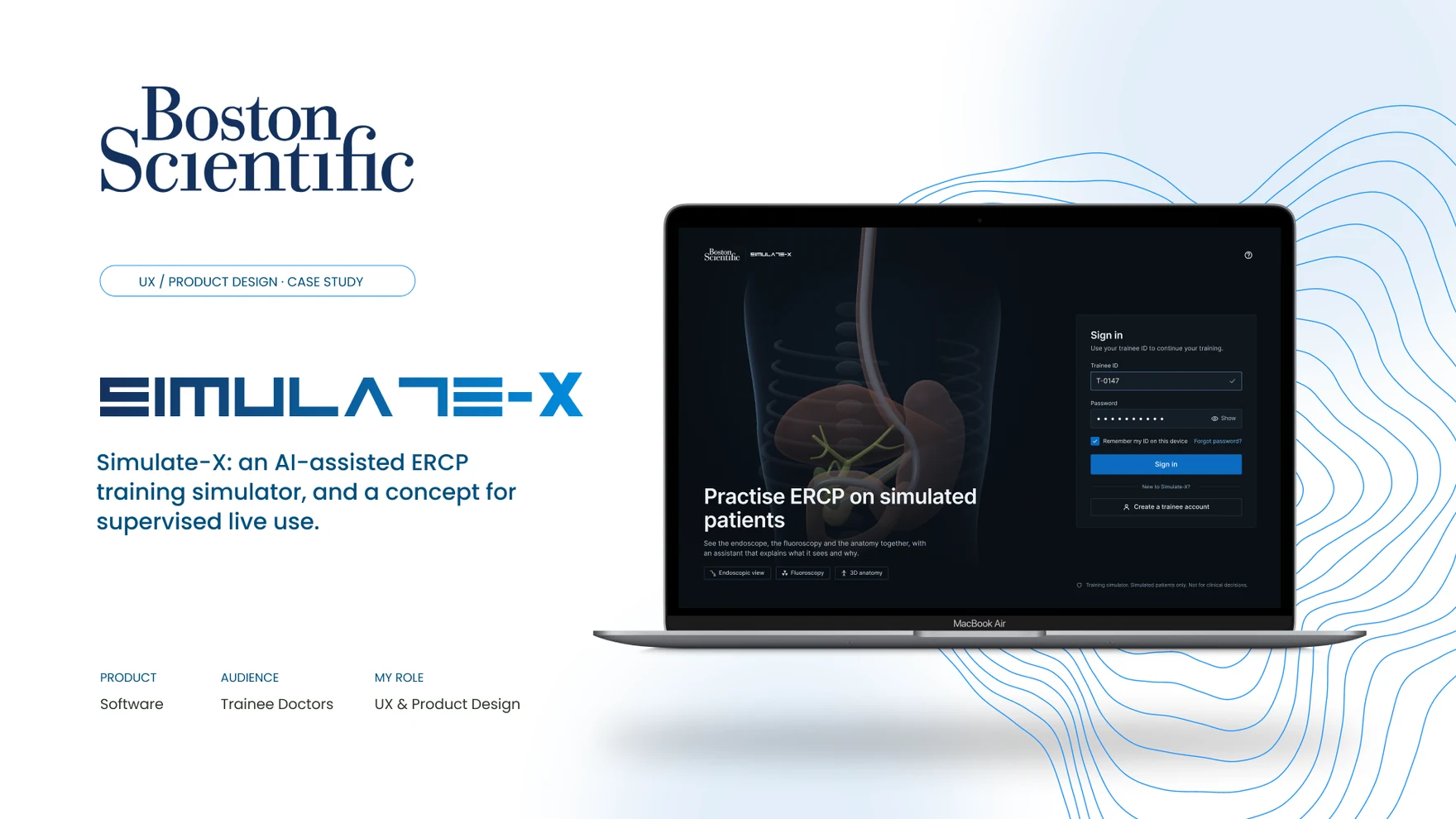
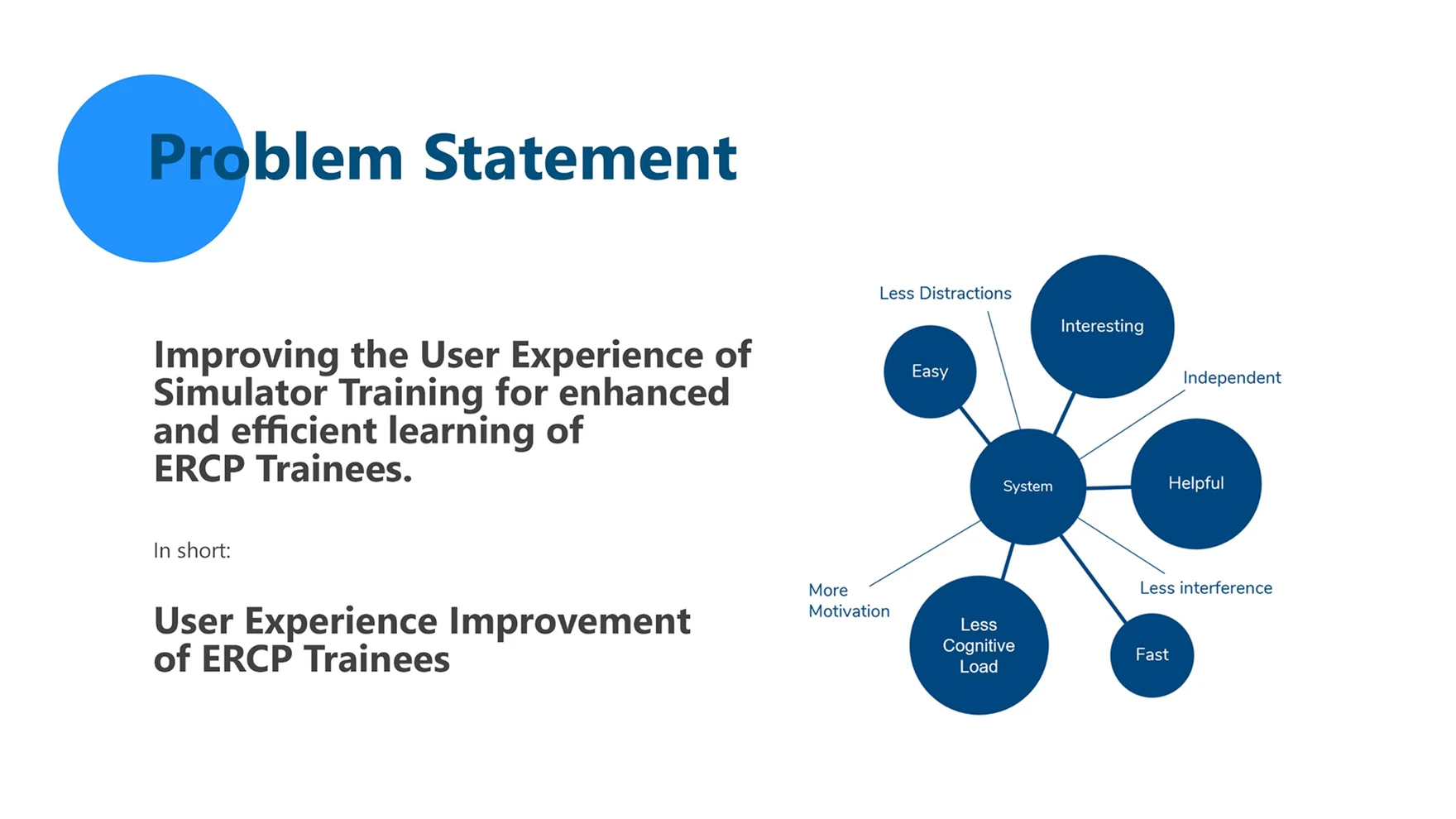
One-line challenge: an ERCP trainee has to hold an endoscopic image, an X-ray image and a mental 3D model in mind at once — with almost no tactile feedback, and a simulator that kept handing them the same patient.
A couple of smaller engagements, shown here at a glance — open either one for the full case study.
 View
 View
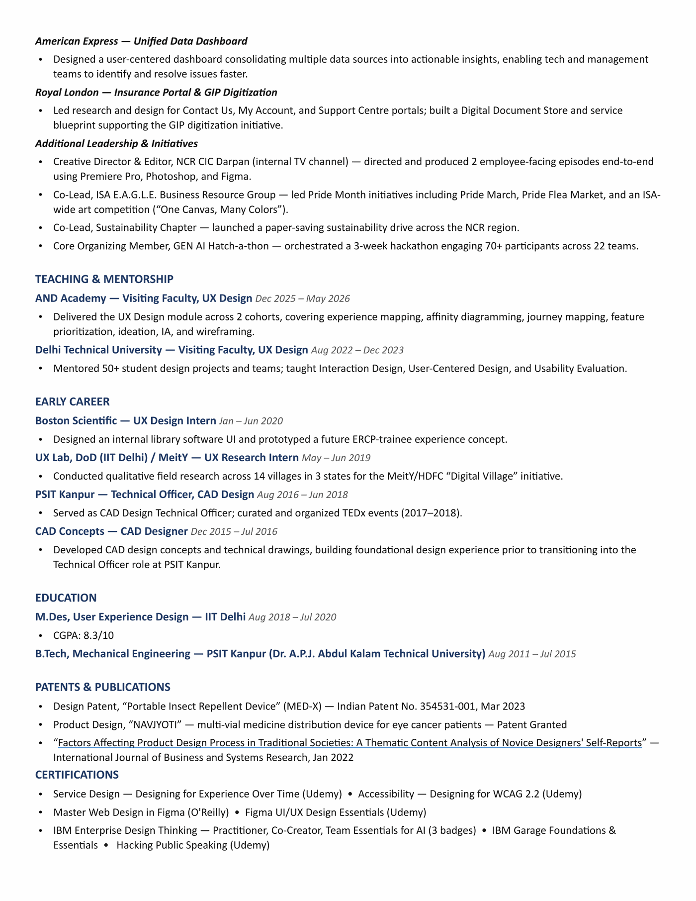
One layout, rebuilt to finally fit every reward ORG sells through points — physical goods, digital vouchers, sweepstakes prizes and card-member benefits — after the page that launched Encore Marketplace was built to a deadline and never matched the product page it sat beside.
Encore Marketplace is where ORG customers spend the points they’ve earned — across four sibling brands, ORG, Carrot Public, New Army and Athletica — on physical goods, digital vouchers, sweepstakes prizes and card-member perks. Every one of those reward types lands on the same kind of screen: a reward detail page (RDP), the point where a customer decides whether a stack of points is actually worth spending. By the time this project started, that page had never been designed on purpose.
Encore Marketplace went live on February 24, 2026. The reward detail pages that shipped with it were built to that deadline, not to a layout — carried over from an older points screen rather than drawn against the product page (PDP) they now sat beside. Once the marketplace was live and customers were already redeeming against it, nobody had the room to circle back and fix the page itself.

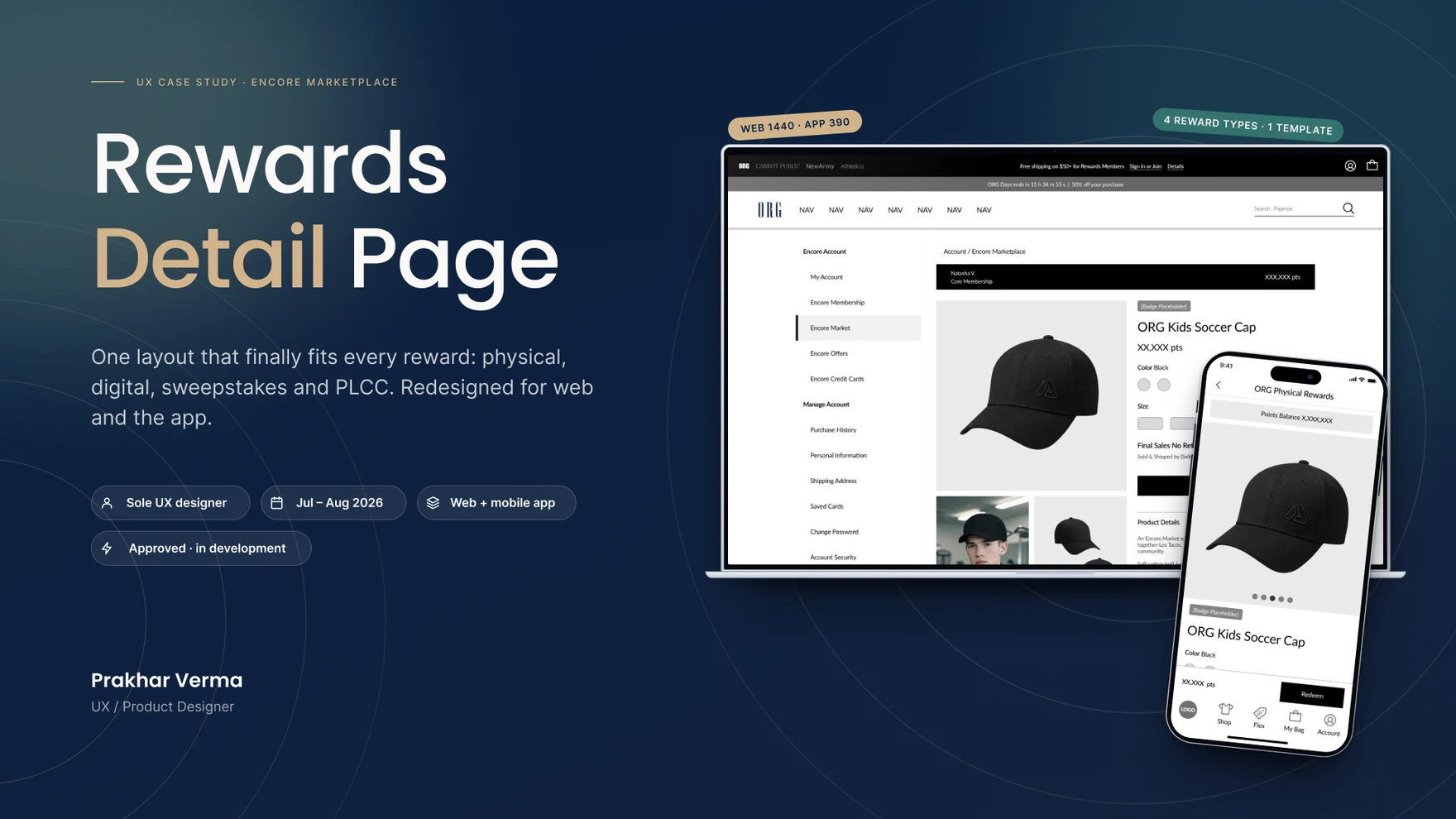
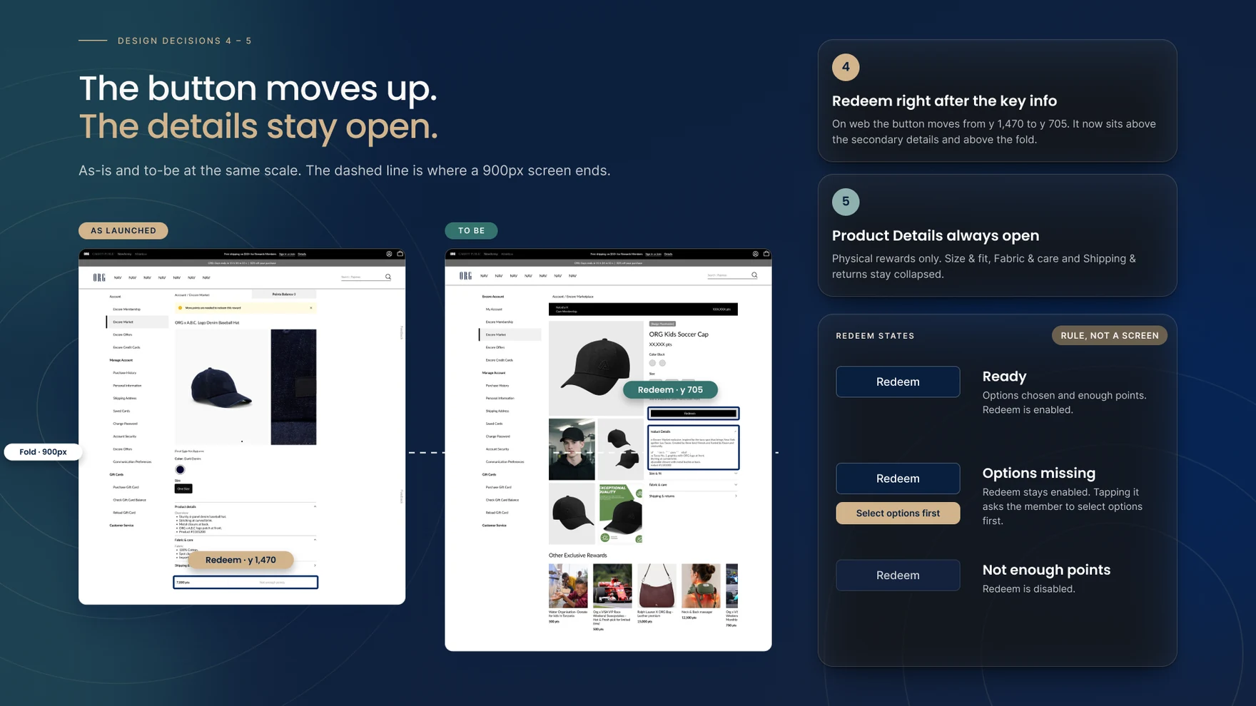
On a 1440px screen, the as-launched reward page used a 645px content column against 395px of unused space on the right — 27% of the page doing nothing while the product page next to it used the full width. The Redeem button sat near y:1,470 on a page about 1,580px tall, not sticky, so it was gone the moment a customer scrolled past it. A “more points are needed” warning could appear nearly 1,200px above that button. The reward’s name and its points cost sat more than 1,100px apart. And the second product image was cropped at the edge of the content column, with its pagination dots barely visible underneath.
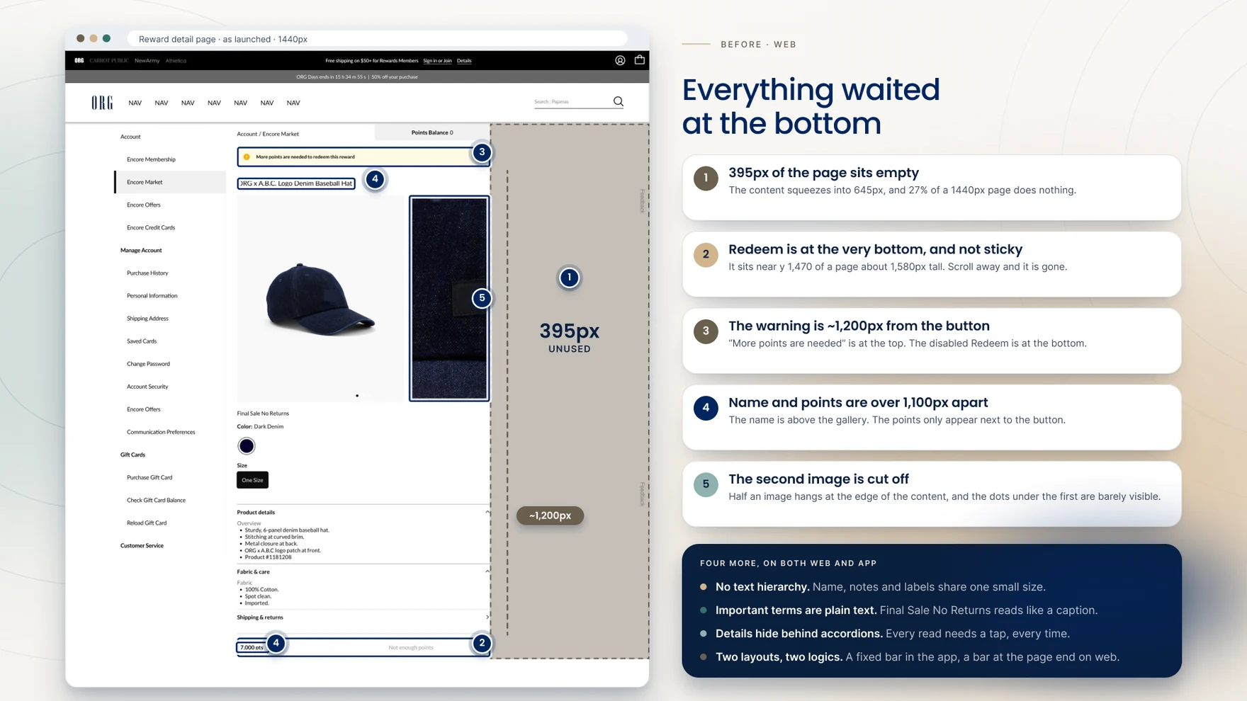
The mobile picture was its own problem. About 509 of the app’s 844px went to a single product photo — 60% of the screen — so nothing else about the reward fit on the first view. An “All-Access” badge sat directly on top of the photo, competing with the product instead of introducing it. The reward’s name lived only in the app’s top bar, set like any screen title, so there was no product name anywhere inside the page itself. Pagination dots were three faint marks, two nearly invisible, with nothing telling a customer more images were waiting. And every choice — colour, size, the sale terms — sat below the fold, so a customer had to scroll past the full photo before they could decide anything.
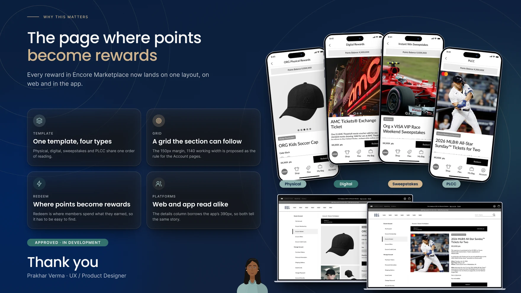
This was a two-month redesign, run end to end by one UX designer — layouts, states and hand-off for both web and app — working alongside a product owner, developers, designers from ORG’s Fabric Design System team, a client-side program manager, a copy team and legal. The goal from the outset wasn’t a cosmetic pass on the launched page: it was one template that could carry all four reward types — physical, digital, sweepstakes and PLCC — without forking into four different layouts.

The first move was to draw both pages to the same scale and see what the numbers actually said. ORG’s product page uses equal 50px margins on a 1440px page: a 958px image grid and a 358px buy box, filling 1,340 of the 1,440 pixels available. The as-launched reward page used a 120px left margin, a 256px account rail and 645px of content — then 395px of nothing on the right. Drawn at the same scale, the gap wasn’t subtle: one page used its width, the other didn’t.
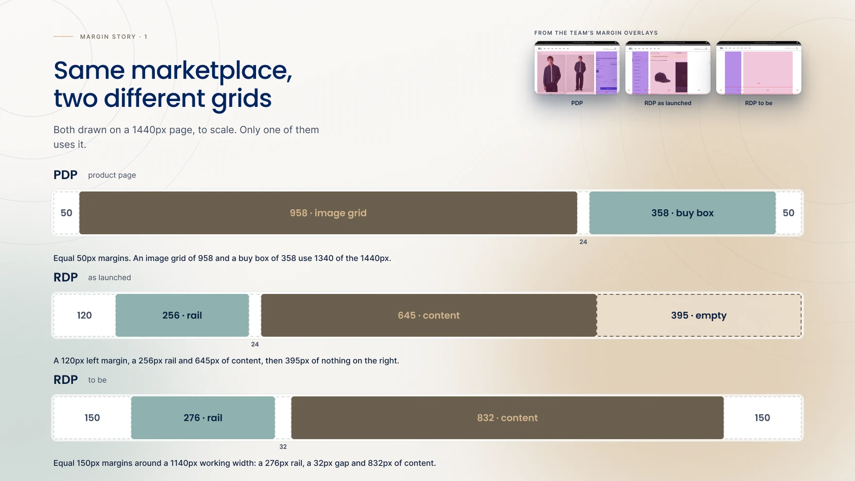
The account-section side rail wasn’t something this project could remove: it belongs to every page under My Account, not just this one, and the as-launched 924px working width (rail included) left the product too congested to breathe. The ask, taken to the team together, was 150px margins on both sides of the 1440px page — a 1,140px working width, 216px more than before, a 23% increase. Getting there took real effort: the team asked for the wider grid together, and it was approved alongside the rest of the design.

The approved 1,140px working width breaks down the same way on every reward type: a 276px account rail, a 32px gap, then 832px of content. That content splits again into a 426px image column, a 16px gutter and a 390px details column — and 390 isn’t an arbitrary number, it’s the app’s own screen width, chosen deliberately so the desktop details column and the mobile screen read alike. 150px margins on each side close the page out at 1,440.
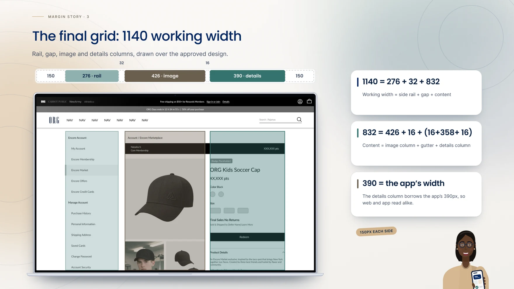
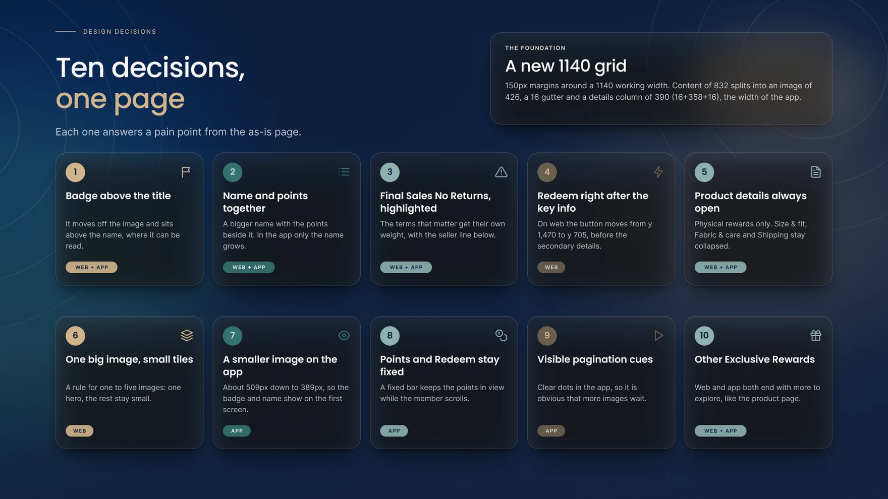
Every pain point from the as-launched review maps to one of ten specific decisions, each tagged by whether it changed web, app, or both. Together they sit on top of the new 1,140px grid: a 150px margin, a 276px rail and an 832px content column that splits into a 426px image and a 390px details column — the app’s own width, reused.
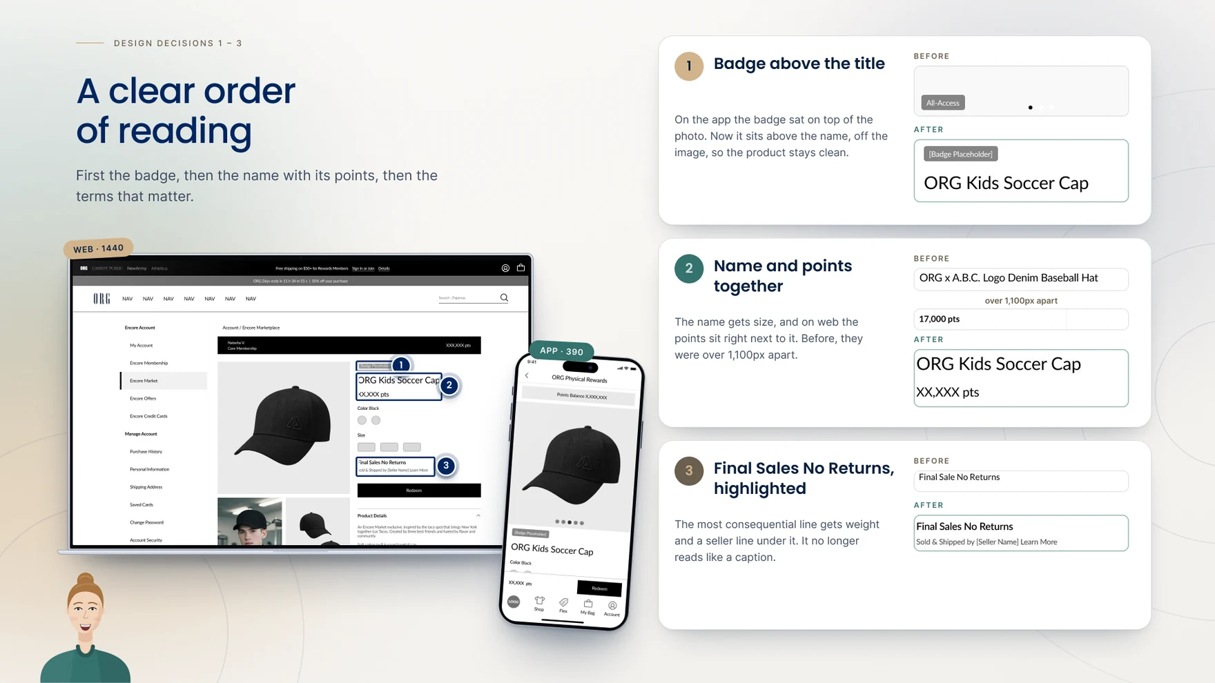
The first three decisions fixed how a customer reads the page at all. The badge that used to sit on top of the product photo now sits above the title, off the image, so the product itself stays clean. The reward’s name and its points — over 1,100px apart on the as-launched page — now sit together, with the name given real size and the points right beside it. And “Final Sales No Returns,” which used to read like a caption, gets its own weight with a seller line underneath, so the term a customer most needs to notice doesn’t get skipped.
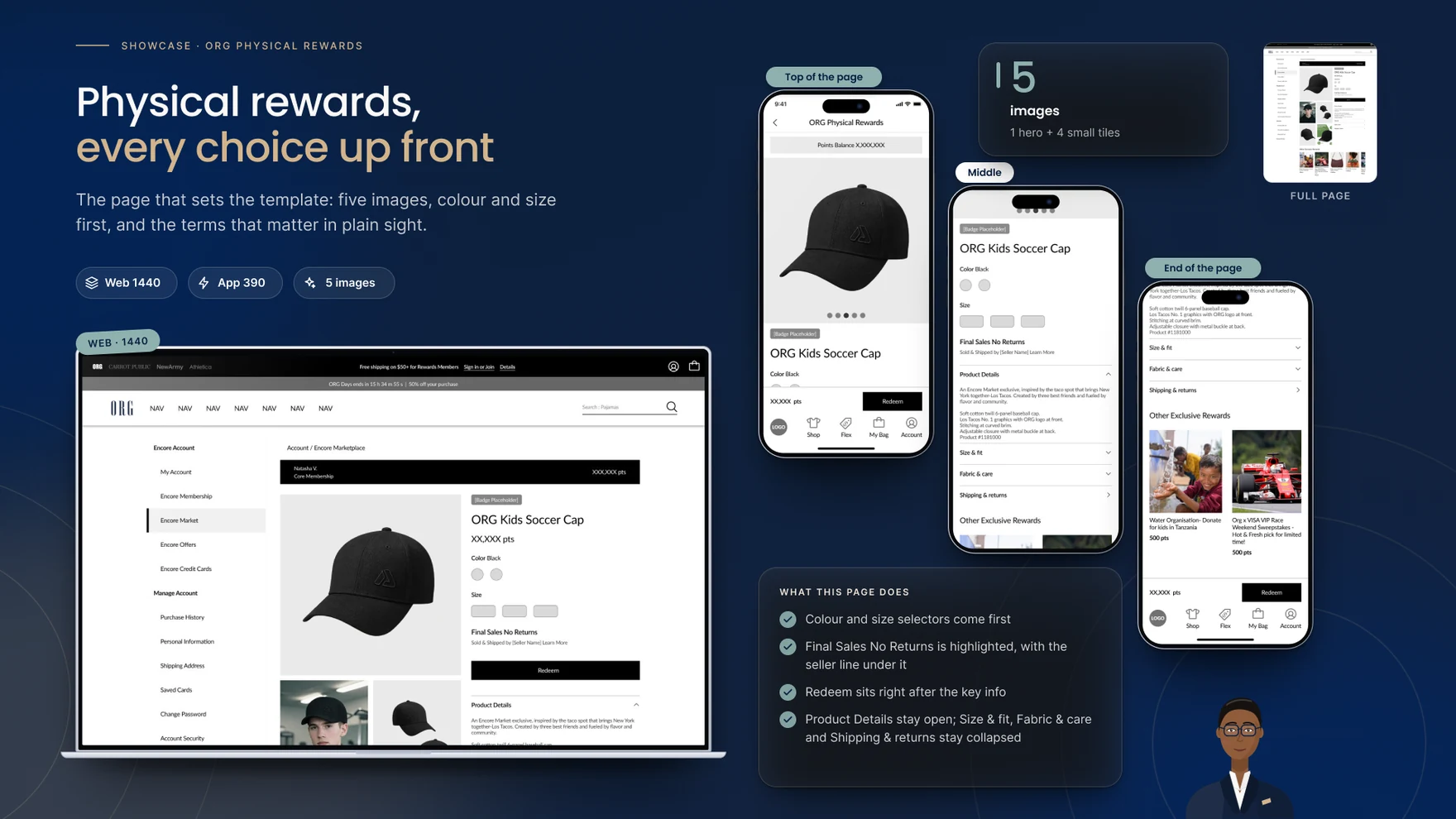
On web, Redeem moves from y:1,470 — past the fold on a roughly 1,580px page — to y:705, right after the name, points and key terms, and above the secondary details. For physical rewards specifically, Size & fit, Fabric & care and Shipping & returns stay collapsed under Product Details, which now stays open by default. Redeem itself carries three distinct states rather than one: ready, when options are chosen and points cover the cost; options missing, where the button stays enabled but tapping it asks the customer to choose first; and not enough points, where it’s disabled outright — a rule applied consistently rather than a single generic disabled state.
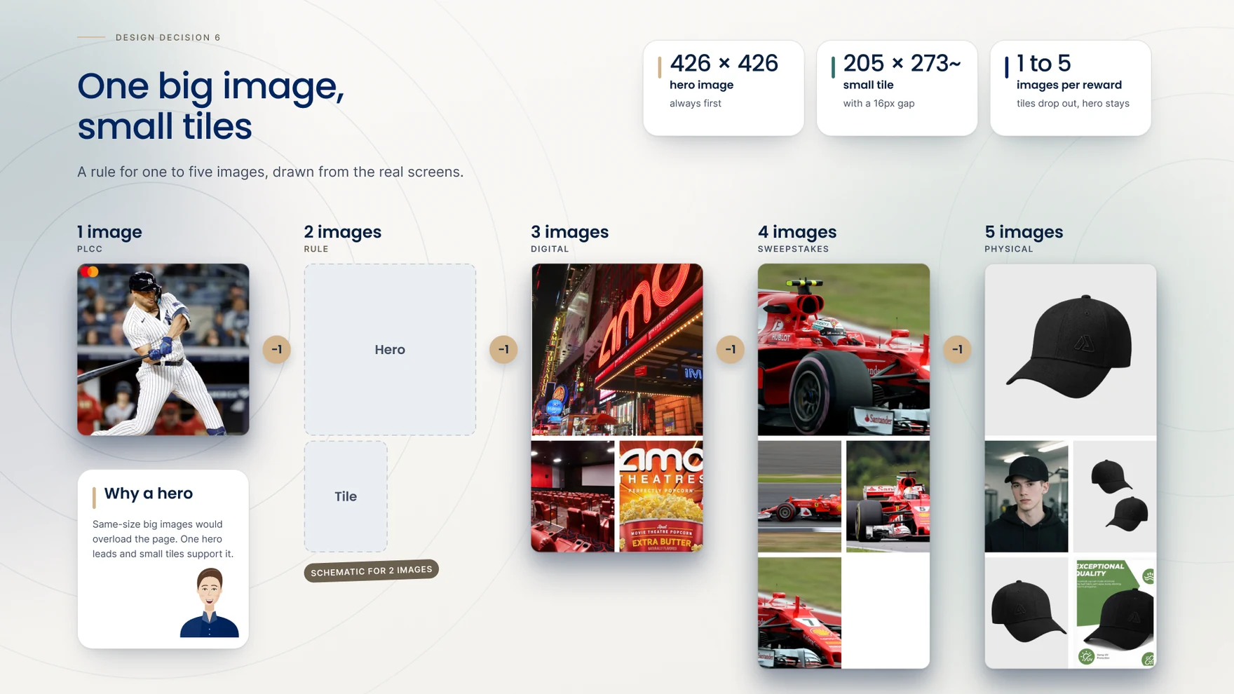
The gallery rule had to work for anywhere from one image (PLCC) to five (physical rewards), so it became one hero image at 426×426, always first, followed by small 205×273 tiles with a 16px gap between them. Same-size big images would have overloaded a page meant to move quickly; one hero leads and the small tiles support it, dropping out one at a time as a reward needs fewer images rather than leaving empty space behind.
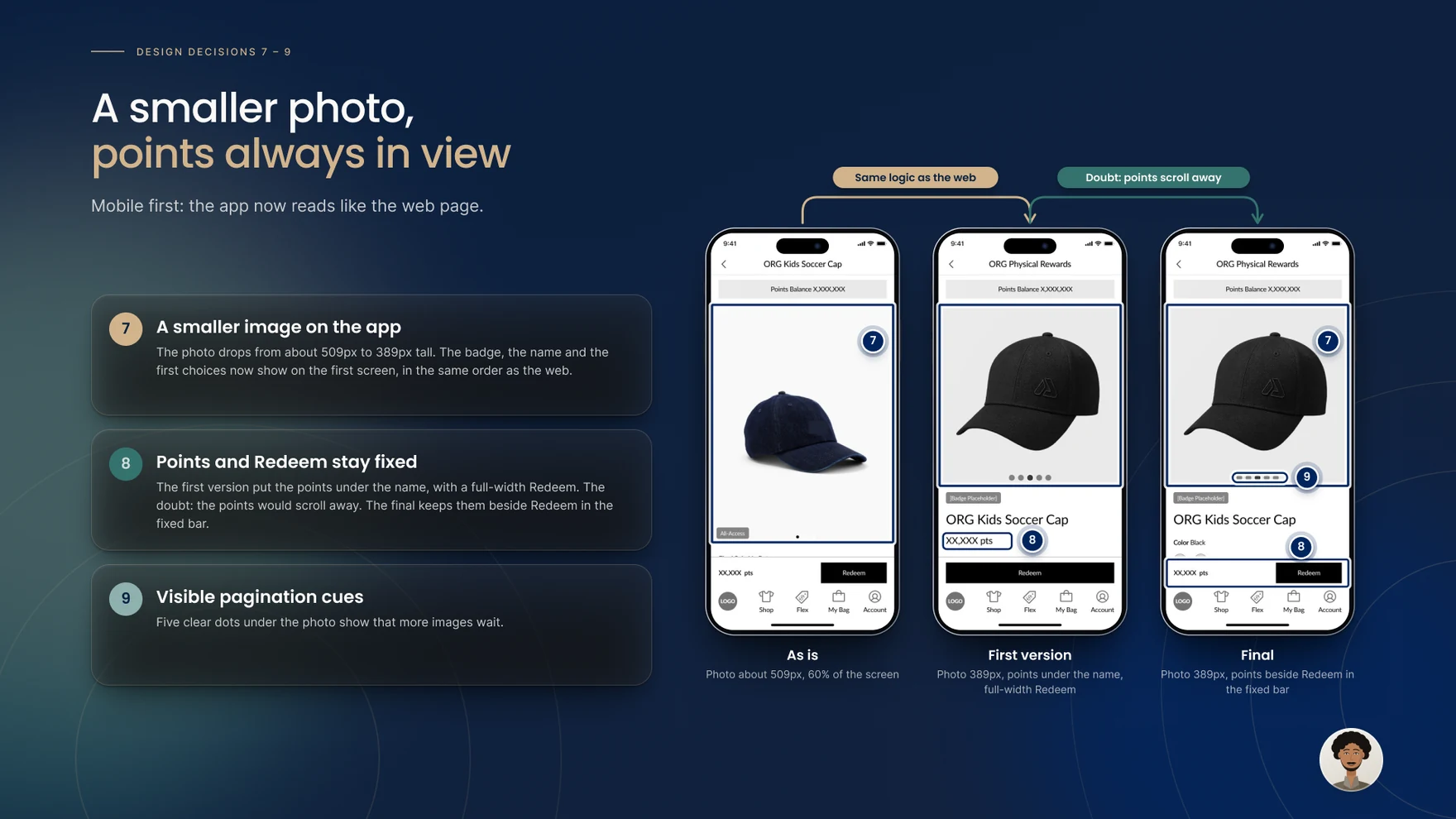
On the app, the hero photo drops from roughly 509px to 389px tall — still the lead image, but no longer 60% of the screen — so the badge, the name and the first choices now show on the very first screen, in the same reading order as the web page. Where the points balance lives took two tries: the first version put it directly under the name, with a full-width Redeem button beneath; the concern, raised in review, was that the points would scroll out of view the moment a customer moved down the page. The final version keeps points and Redeem together in a fixed bar instead, so the number a customer is spending against never disappears. Five pagination dots, clearly visible under the photo, replace the three faint ones from before.
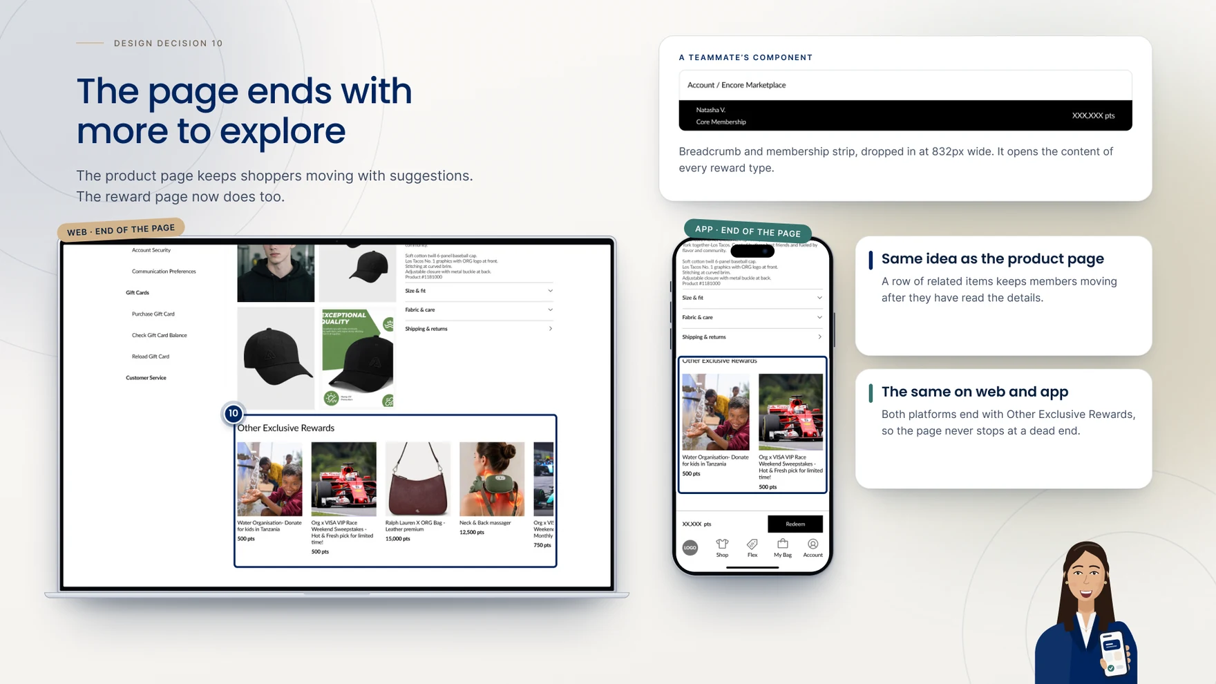
The product page keeps shoppers moving with a row of related items after the details; the reward page, as launched, simply stopped. An “Other Exclusive Rewards” row now closes out every reward type, on both web and app, reusing real cross-sell content — a donation campaign, a race-weekend sweepstakes, a designer bag, a neck massager — so a customer who finishes reading never lands on a dead end.
With the grid, the reading order and the gallery rule settled, the same template had to prove itself against every reward ORG actually sells through points — not just the physical goods used to work out the rules.
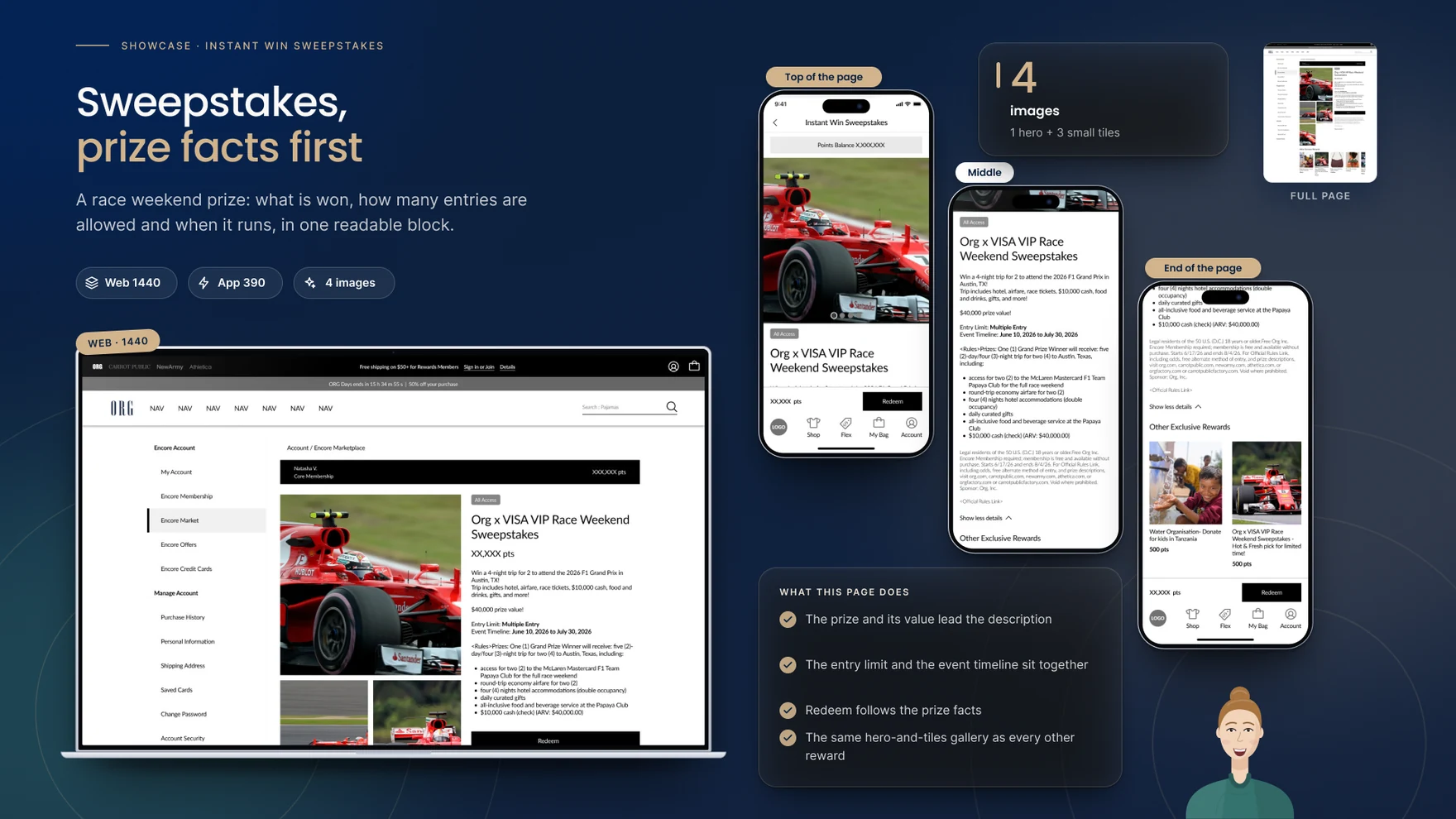
Sweepstakes rewards lead with the prize and its value rather than a product name, pairing the entry limit with the event’s timeline in one readable block so a customer never has to hunt for when an event closes or how many entries they’re allowed.
Digital rewards need nothing picked — no size, no colour — so Redeem comes straight after the description, and the page answers the one question every customer has before redeeming an exchange ticket: how will I actually receive it. The description states plainly that the voucher code arrives by email after redemption.

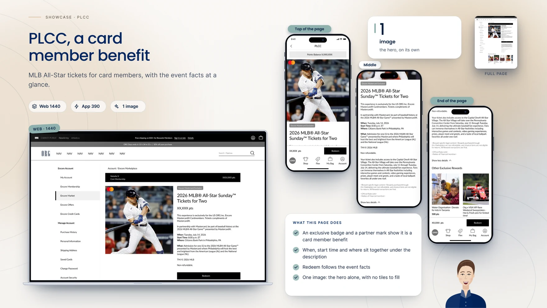
PLCC rewards — card-member benefits like event tickets — carry a single hero image and no tile row at all, with an exclusive badge and a partner mark establishing upfront that the reward is gated to cardholders, and the event facts (when, start time, where) sitting together directly under the description.
This is the most valuable thing I’ve done on the ORG account — it’s going to change how people see the loyalty space, and how they see Encore Marketplace.
Rewards Detail Pages is designed, approved, and in development at the time of writing, so what follows is a qualitative account of what the redesign changes, not a measured result. The 1,140px grid is the clearest, most durable outcome: the same math — 150px margins, a 276px rail, an 832px content column split into a 426px image and a 390px details column — now underwrites all four reward types rather than being redrawn per reward, and it’s a grid the wider Account section can reuse going forward.
A page that left 27% of a 1,440px screen empty now uses the width the product page always had. A Redeem button that sat 1,470px down an unscrollable fold now sits at 705px, with three distinct states instead of one generic disabled one. An app photo that ate 60% of the first screen now leaves room for the badge, the name and the first choices on arrival. And one template, not four separate layouts, now carries physical, digital, sweepstakes and PLCC rewards alike — closing, like the product page always did, with more to explore rather than a dead end.
The clearest lesson from this project was that the grid math had to be argued for, not assumed: the account rail couldn’t move, so getting from a congested 924px working width to an approved 1,140px meant taking the number to the team together rather than redesigning quietly and asking for a rubber stamp. A close second was that a template only proves itself once it’s been run against every case it has to carry — the rule for one to five images, for instance, only became a rule after physical, digital, sweepstakes and PLCC had each been drawn against it. What ships next is the same page carrying reward types that don’t exist yet, which is exactly what the 1,140px grid was built to do.
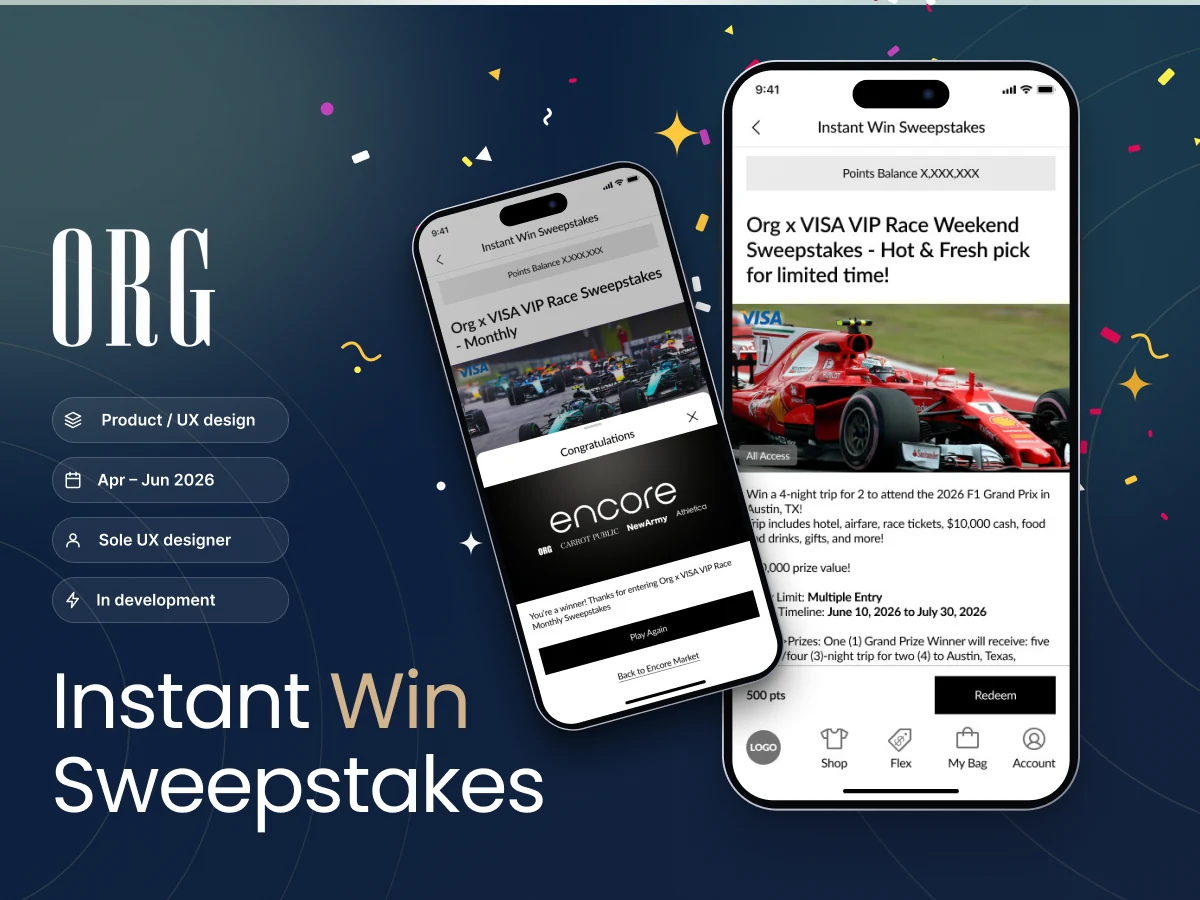
Designing real-time Sweepstakes wins for ORG — from “we’ll email you later” to “you won, right now.” This is the newest, highest-priority project in ORG’s work: the first Instant Win Sweepstakes experience ORG is building, not yet shipped.

Encore Market is ORG’s points-redemption marketplace — the place customers spend points they’ve earned on digital rewards, physical goods, gift cards, donations, events and sweepstakes, shared across four sibling brands: ORG, Carrot Public, New Army and Athletica. Whatever a customer earns in one place, they come here to spend it. Encore Market launched on February 24, 2026 — before that date, it was simply the points Marketplace, with no brand of its own.
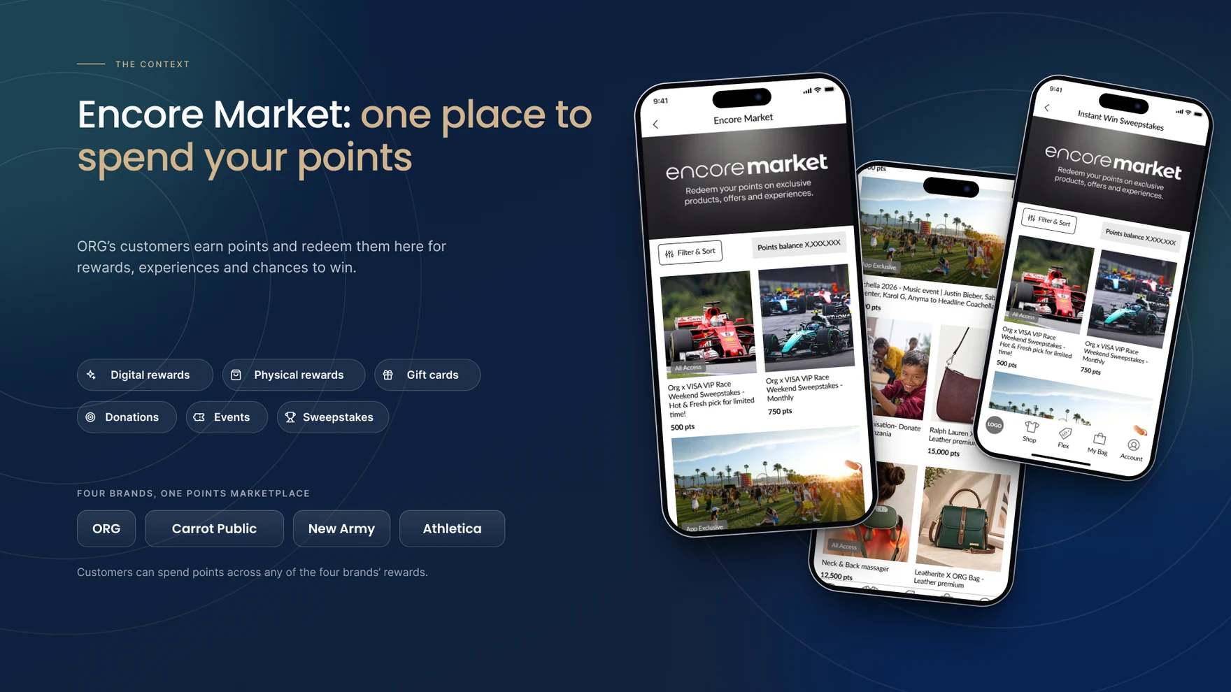
Sweepstakes is one of six redemption types inside Encore Market, alongside digital rewards, physical goods, gift cards, donations and events — a free, chance-based way to win prizes using points a customer has already earned, no purchase necessary. It has been part of the marketplace from the start, but it always worked the same way: enter, wait, and find out later by email. Instant Win is the first redesign of that experience.
Standard sweepstakes had always worked the same way: a customer entered, the event closed, and a result arrived by email sometime after — often days later, disconnected from the moment that earned it. The brief was to design Instant Win: tell the customer the moment they redeem, not after the fact. That single change in timing is what the rest of the project had to be built to support.

None of the design decisions that follow make sense without a short primer first: entrants need no skill, since a draw or, in instant-win, a random outcome at entry decides who wins; a free way to enter must exist, and paying never improves the odds; and official rules set who can enter, how often, when the event runs and what the prize is. That’s context for the design work, not legal advice — but it’s the floor everything else sits on.

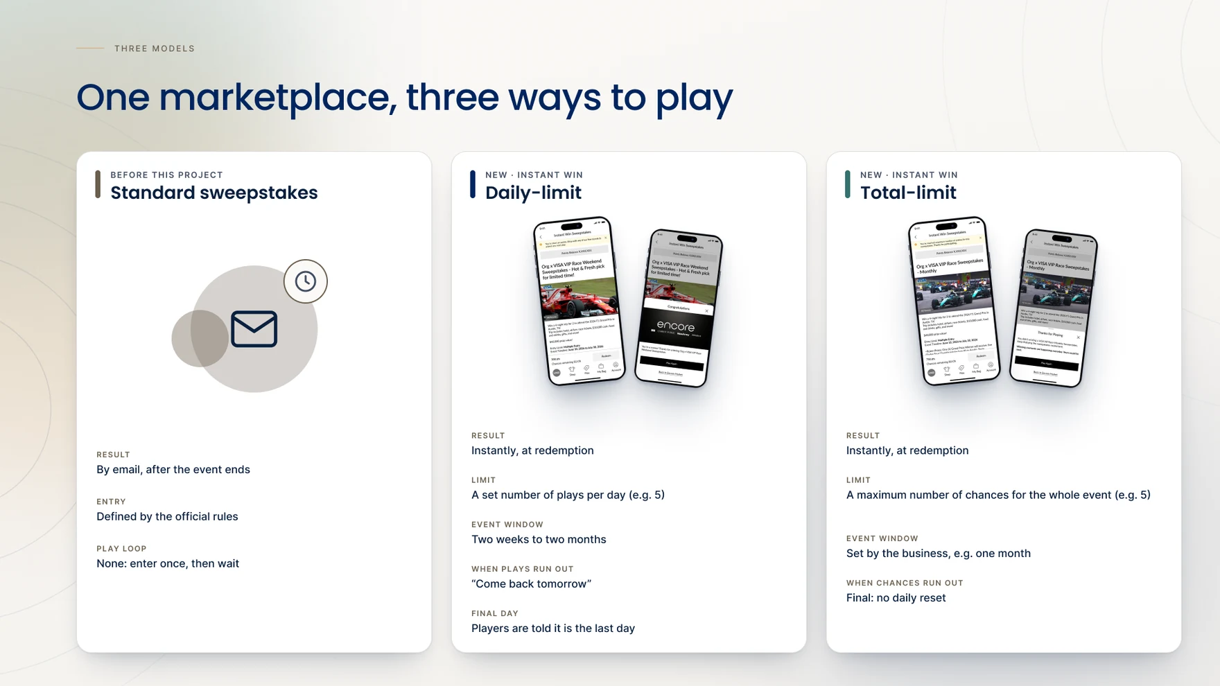
Delivering on “instant” meant building not one sweepstakes experience but three — the existing standard format, plus two new instant-win models with genuinely different rules. A daily-limit type gave a fixed number of plays each day across a multi-week event, so hitting the cap meant “come back tomorrow.” A total-limit type instead set one fixed number of plays for the whole event, so hitting the cap meant that chance was gone for good. Both spent the same currency — redeemed points — but needed entirely different language for exactly the same shape of problem: what to tell someone who has run out. The questions a customer actually asks — did I win, how many plays do I have left, why can’t I play right now, is there a free way to enter — had to be answered clearly for both.
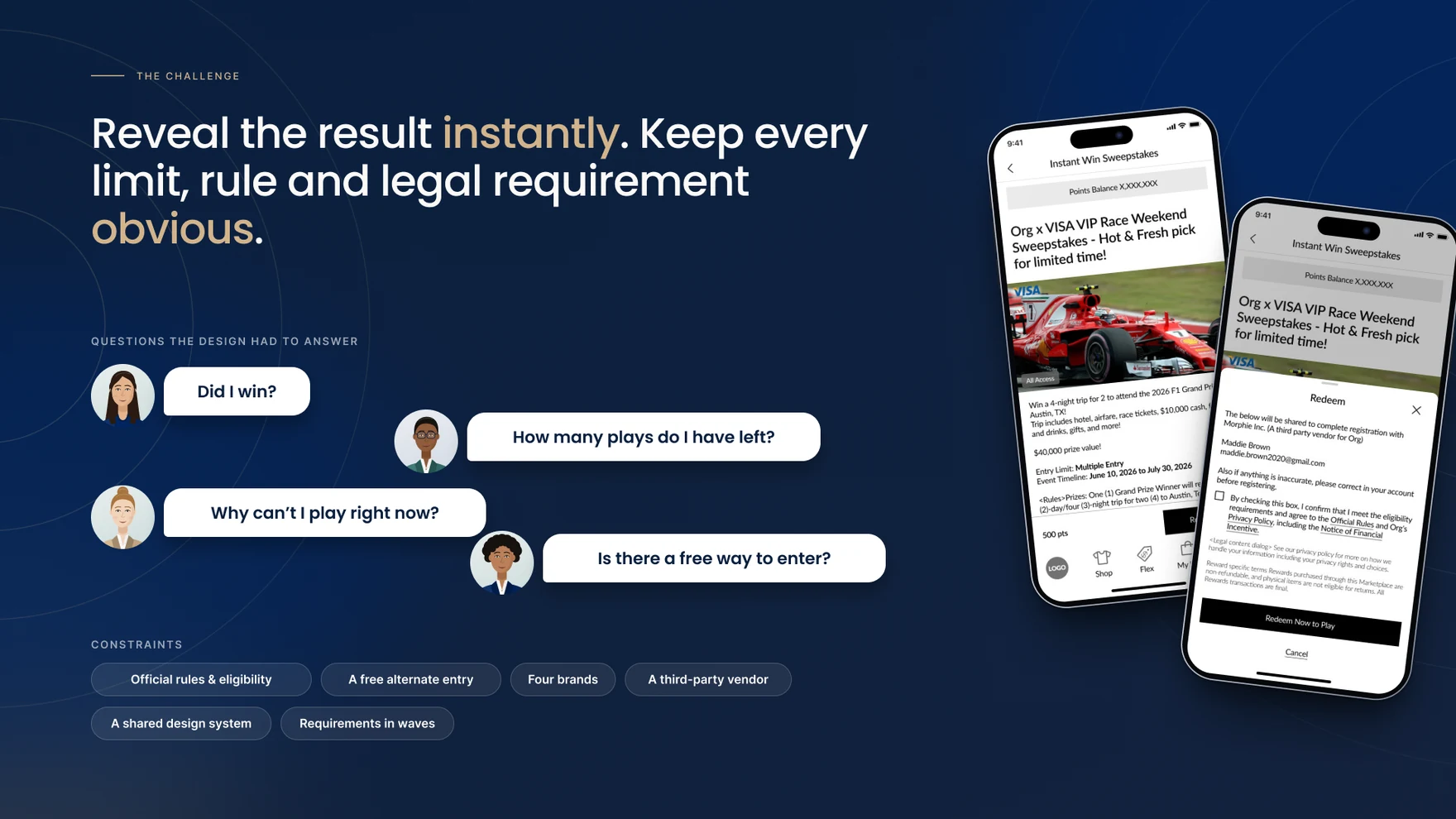
Layered on top of both instant-win models was a non-negotiable: under US sweepstakes law, a promotion that only lets people pay to enter risks being treated as an illegal lottery, so a genuine free alternate method of entry (AMOE) had to exist, be clearly disclosed, and stay usable — while the business still needed paid, points-based play to carry the experience. Reconciling a legal requirement, a business goal and a good customer experience, inside a product spun up across four brands and a third-party prize vendor (Morphi Inc.), was the real design problem.
How do you build something legally required to be free, inside a product built to be paid for?
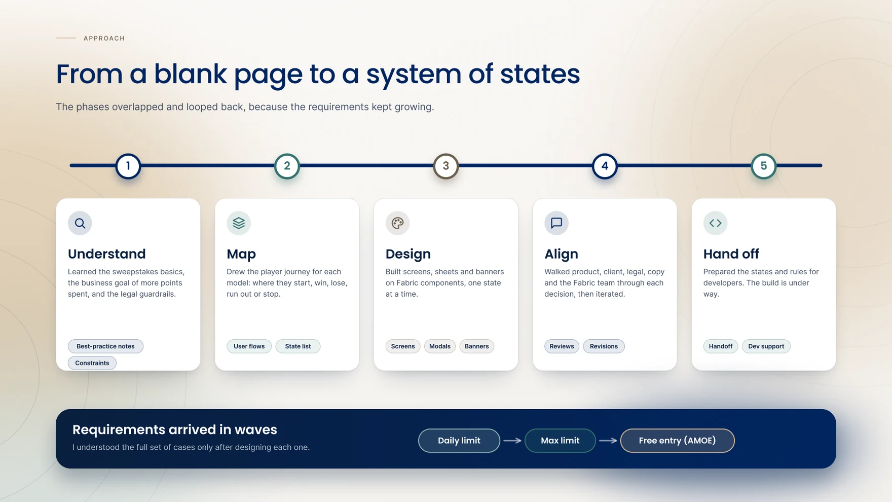
None of this arrived as a finished spec. The project started as a single daily-limit case, then the total-limit model appeared, then the AMOE requirement arrived on its own — each with its own rules and edge cases. There was no document listing every win, lose, limit and expiry combination to design from; that matrix only became clear once every state had actually been built. Making the system, in large part, was how the system got understood.
A three-month build for Encore Market’s first instant-win experience, designed end to end — research, flows, screens and every state — by one designer working across six partner groups.
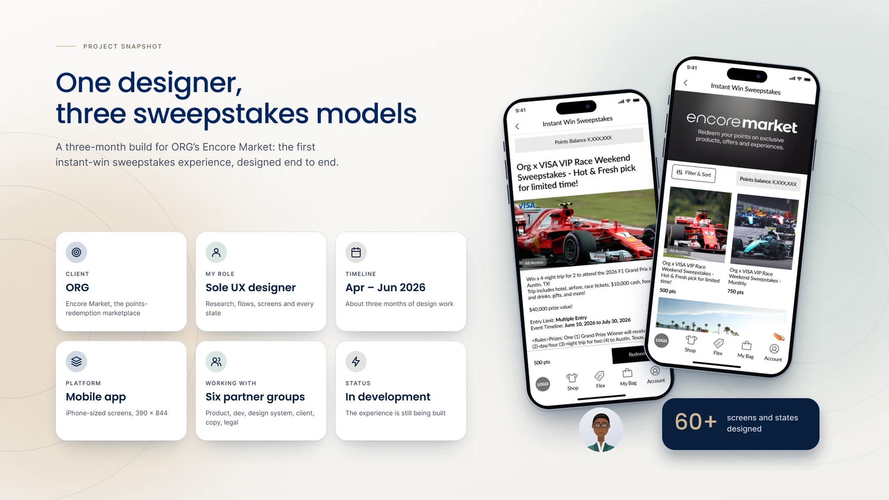
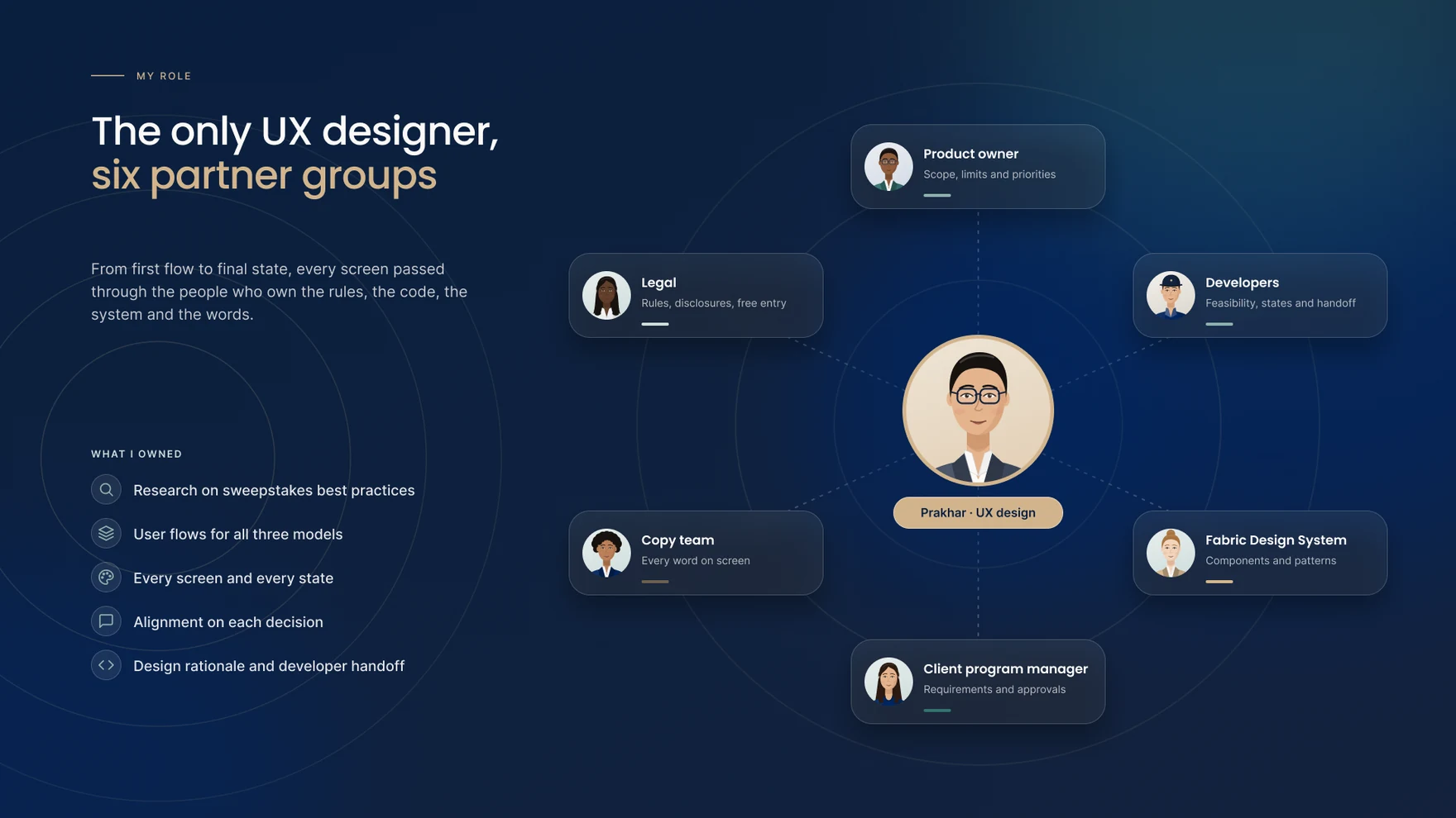
As the sole UX designer on Instant Win, the role ran end to end — from research into sweepstakes conventions and legal patterns, through flow and state design, to the screens and copy that shipped. The project ran alongside a product owner, developers, designers from ORG’s Fabric Design System team, a client-side program manager, and a dedicated copy team, with close collaboration as scope and requirements evolved.
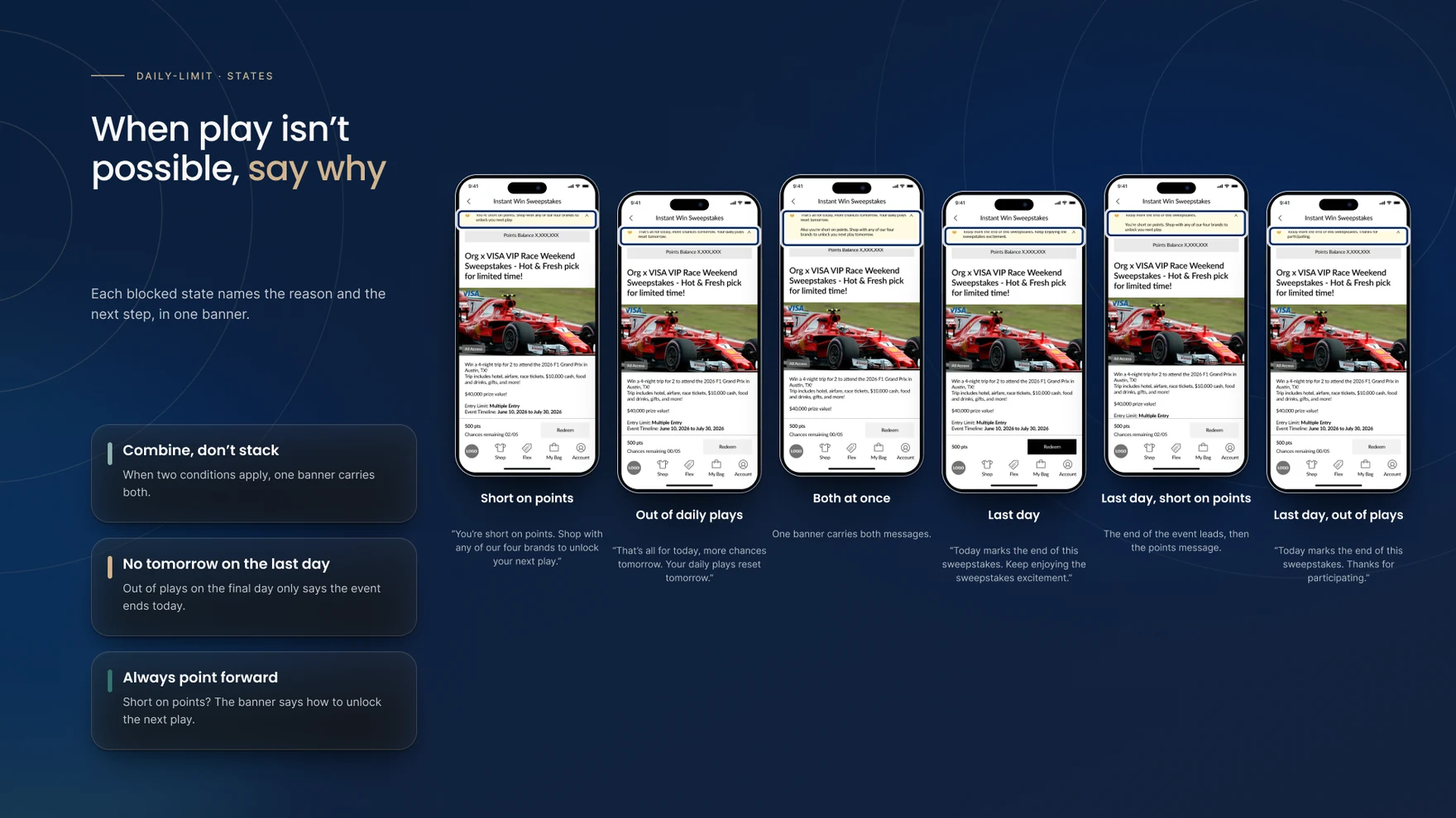
With no finished spec to build from, the approach became to design every state the two models could produce — happy path, short on points, limit reached, both at once, last day, system error, win, lose — and let patterns emerge from the full set rather than from any single screen. That surfaced a rule the brief never stated: when more than one blocking condition applies at once, the harder, least-recoverable constraint has to lead the message, with anything the customer can still act on following beneath it.
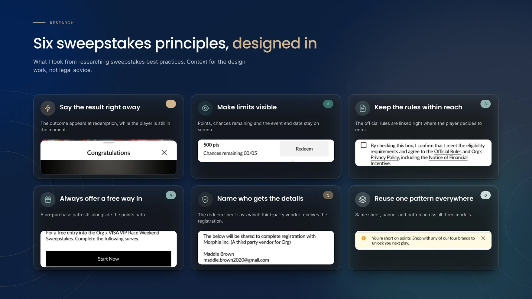
Research into sweepstakes best practice — not legal advice, but context for the design work — turned into six working principles that shaped every screen afterward: say the result right away, make limits visible, keep the rules within reach, always offer a free way in, name who gets the details, and reuse one pattern everywhere.
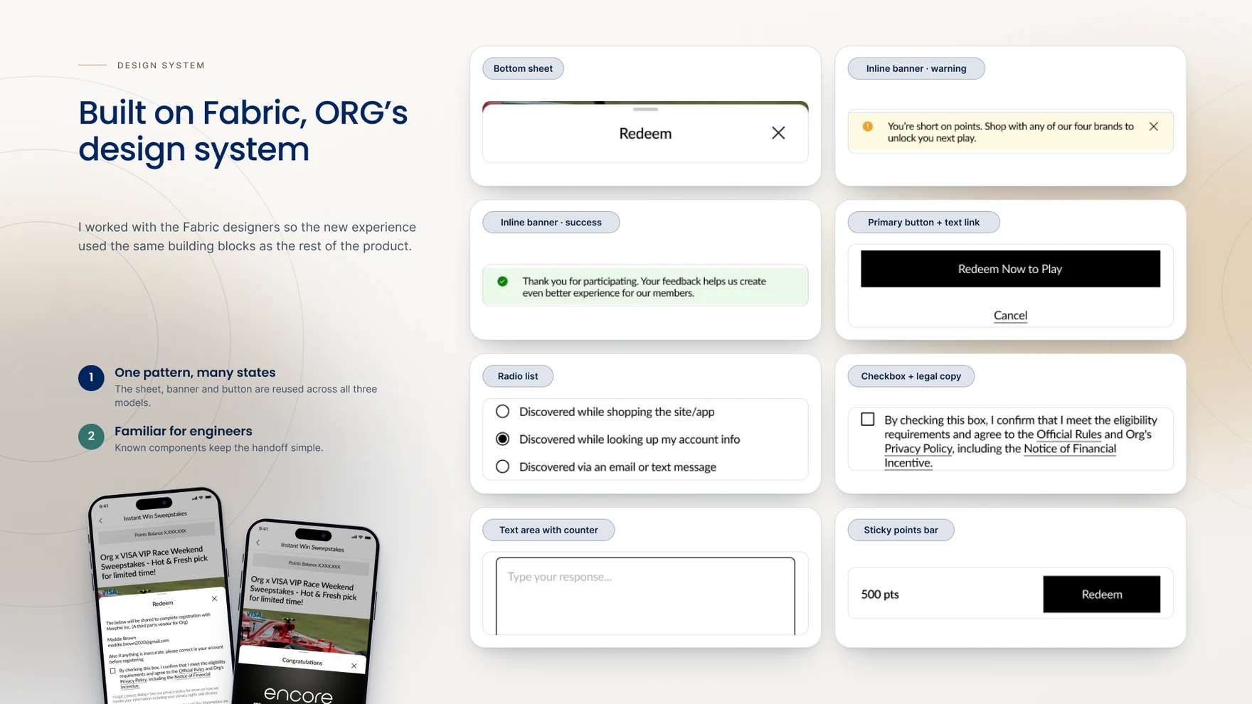
Every banner, modal, button and form state was built from ORG’s Fabric Design System, extended rather than reinvented, so the same components could carry four brand treatments — ORG, Carrot Public, New Army, Athletica — and a third-party vendor integration (Morphi Inc.) without the experience fragmenting between them. Working with Fabric’s own designers kept the handoff to developers familiar rather than bespoke.
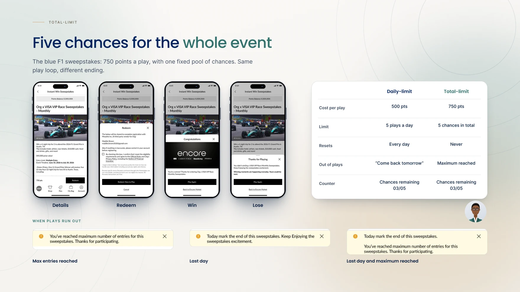
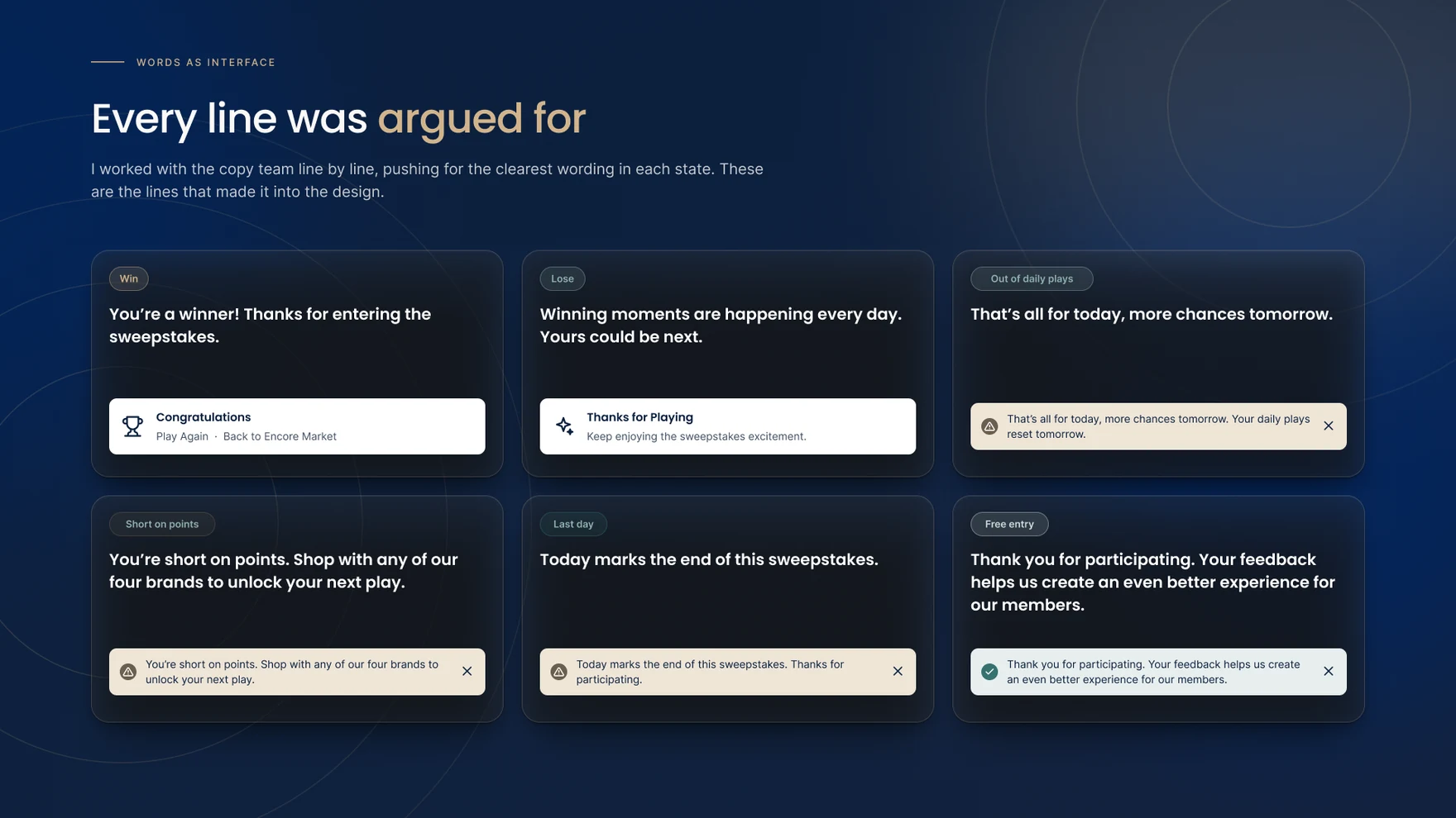
Because the daily-limit and total-limit models shared the same currency but opposite consequences — one recoverable tomorrow, one final — every piece of UI that touched a limit needed two readings, not one. The daily type’s copy had to sound temporary (“more chances tomorrow”); the total type’s had to sound final (“thanks for participating”) without reading as punitive. That distinction became the backbone of the state design: every banner, button and result modal was written and built twice, once for each kind of ending.
The core loop needed to be mapped before any single screen could be trusted: browse the marketplace, open a reward’s detail page, redeem, see the result. Walking that loop for both sweepstakes types, and for a first play versus a repeat play, is what surfaced the biggest opportunity in the whole flow — a step that only needed to exist once. A separate, compliant free-entry path had to sit alongside it, reachable without spending a single point.
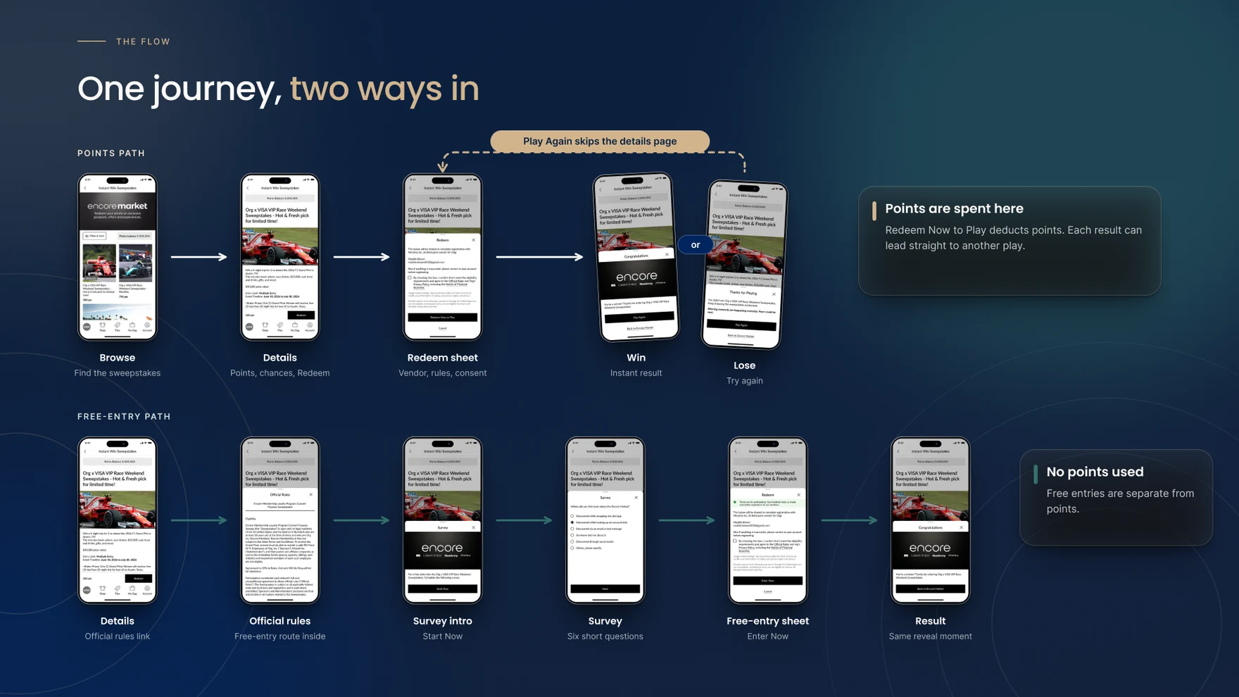
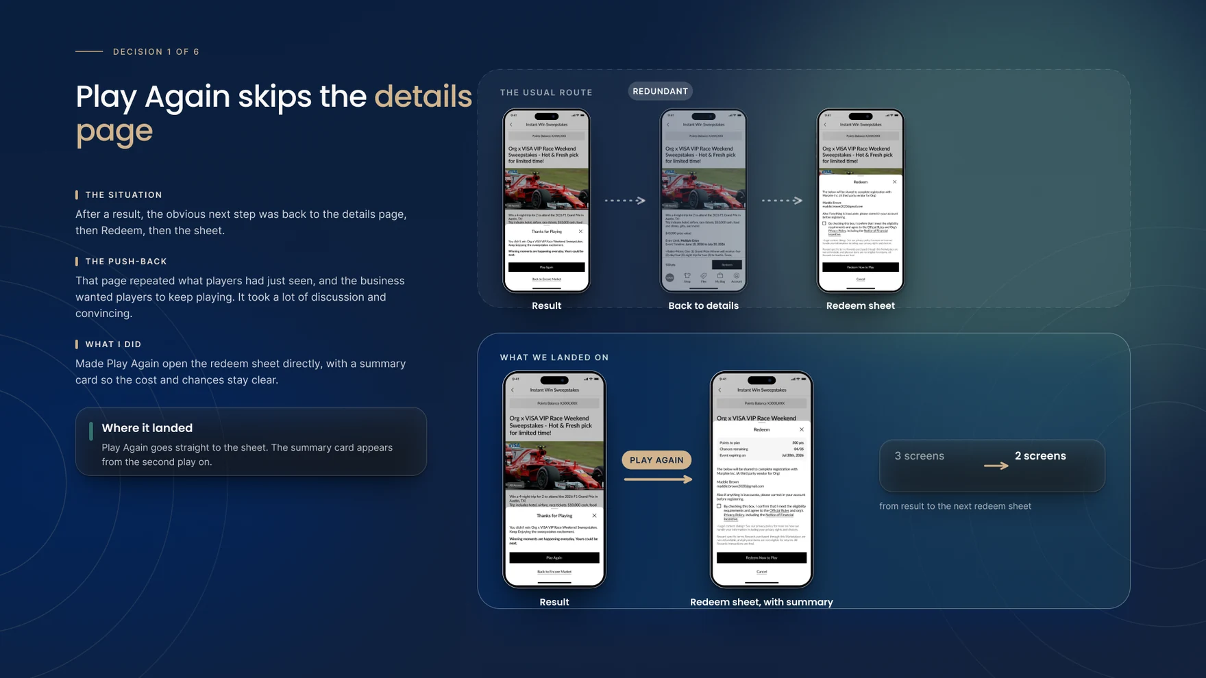
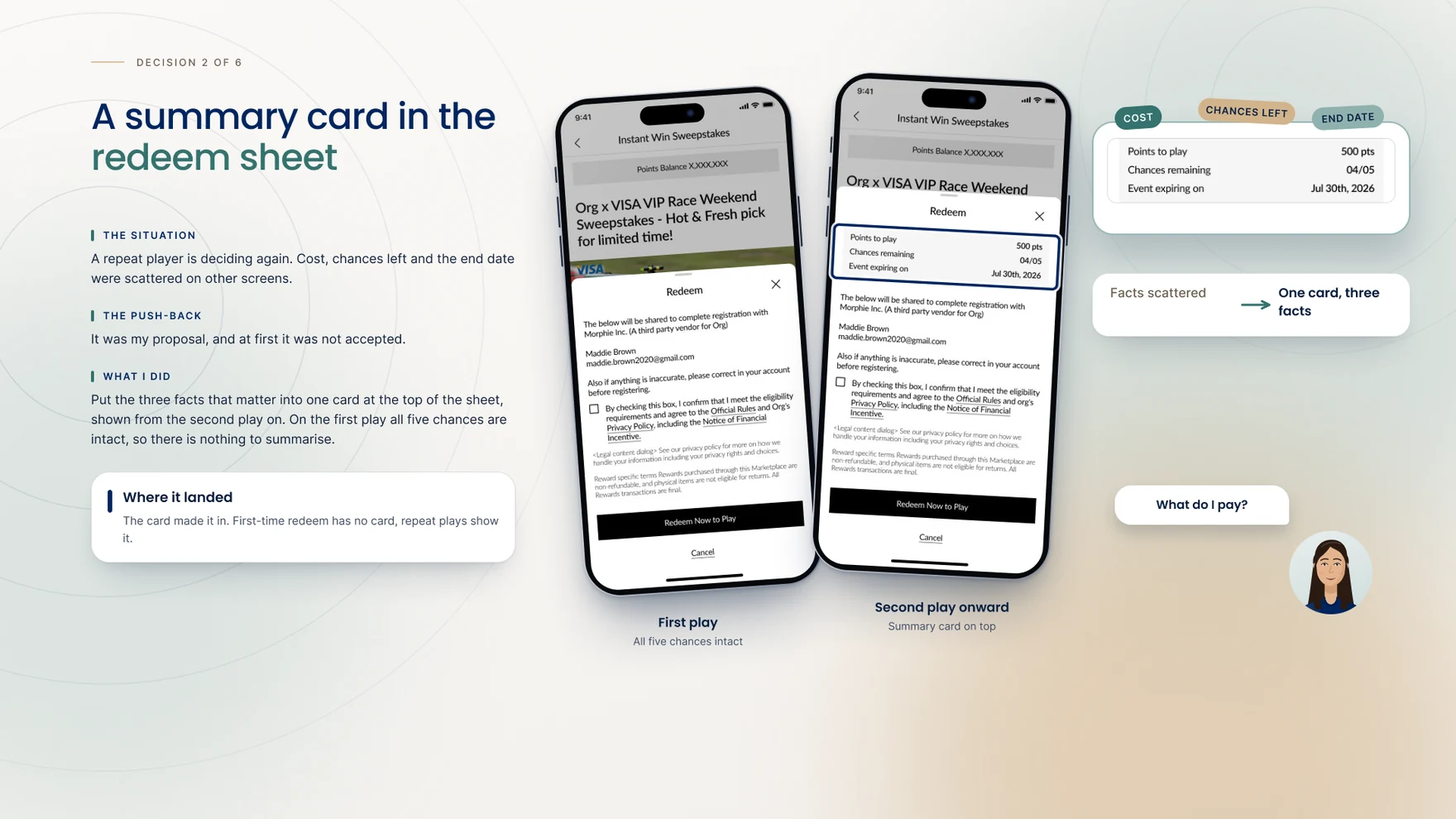
The core loop runs browse → reward detail page (RDP) → redeem → result. On a customer’s first play, the detail page carries the full context — cost, rules, event dates — so the redeem step opens without repeating it. On every play after that, “Play Again” skips the RDP entirely and opens straight into redeem, now carrying a summary card with points to spend, chances remaining and when the event closes. It was a deliberately proposed trade: the RDP’s detail is redundant once a customer already knows it, and removing the extra step served the one thing both business and customer wanted — back into the next play with one less screen in the way.
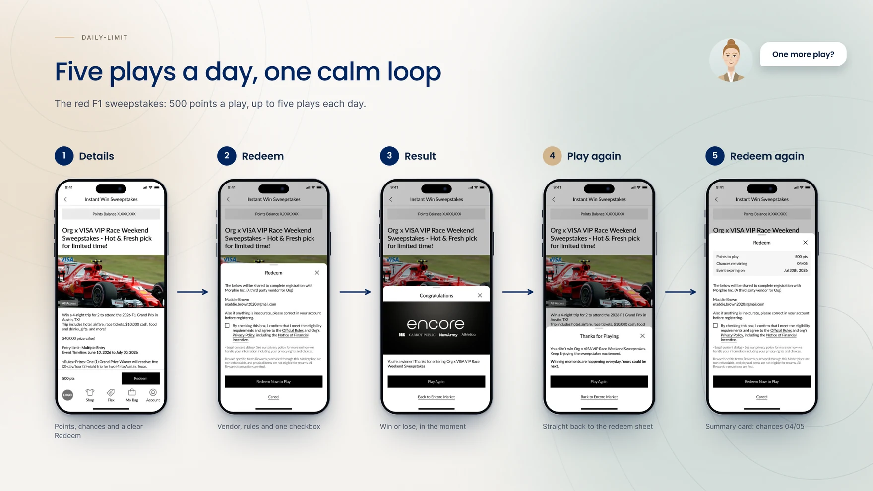
The red F1 sweepstakes runs on 500 points a play, up to five plays each day. Redeem opens with points, chances and a clear consent checkbox; the result reveals win or lose in the moment; Play Again goes straight back to redeem, now carrying a summary card so the cost and chances remaining stay visible without a trip back through the details page.
When play isn’t possible, the design says why rather than just blocking the button. Each blocked state names the reason and the next step in a single banner, two rules combine into one message rather than stacking, and the final day drops any mention of “tomorrow” since there isn’t one.
The blue F1 sweepstakes charges more per play — 750 points — against one fixed pool of chances for the entire event rather than a daily reset. Same play loop, same components, a different ending: reaching the cap here is final, not recoverable tomorrow, so the copy, the banner and even the counter had to carry a different emotional register for what is mechanically the same screen.
The AMOE path opens from the event’s official rules and leads to a short six-question survey: where the customer found the marketplace, their general impressions, how often they expect new rewards, and how likely they are to join instant-win and standard sweepstakes. Choosing “Others, please specify” on the first question reveals a text field with a 100-character minimum, so an open answer always carries enough substance to be useful. Only the first question has a plain close button; every step after it gains a back arrow, and “Next” stays grey until that step is actually answered, turning black the moment it is.
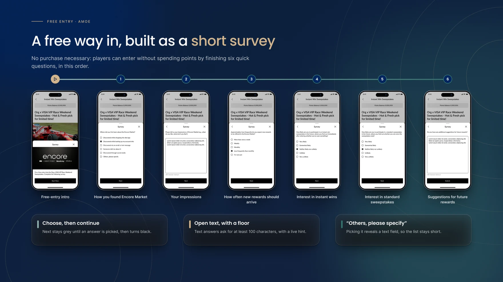
After the survey, the free-entry sheet confirms the details and the result lands exactly like a points entry would — same reveal, same win and lose modals. Free entries sit apart from the points path everywhere else in the flow, but after a win, the prize still appears in the customer’s points purchase history, so there’s nowhere the free path feels like a lesser version of the paid one.

Six moments in the project started as a question, a disagreement, or a missing piece in the brief — each one is broken out below with the situation, what was proposed, who it was worked through with, and where it landed.
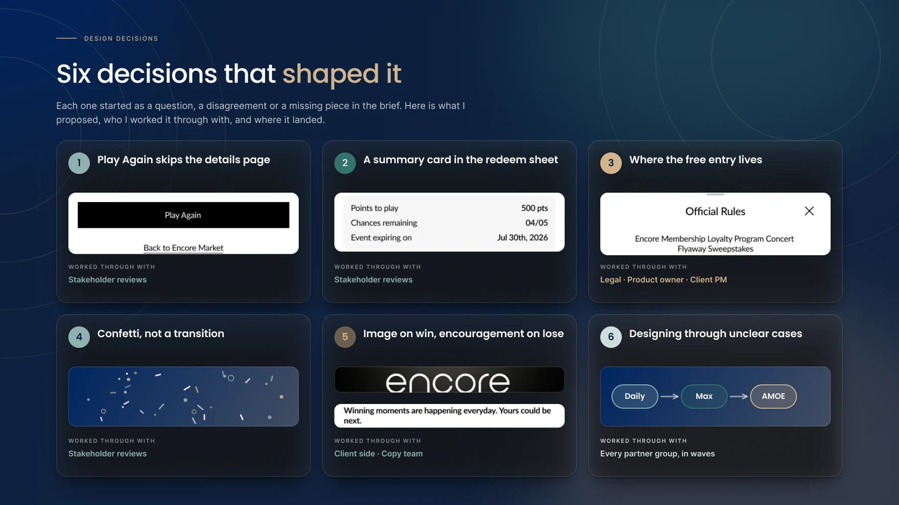


With dozens of states across two sweepstakes models, the copy carried as much of the design as the layout did, and ORG’s copy team was involved in nearly every line of it. Getting the message-priority rules right — which constraint a customer hears about first when two apply at once — took as much back-and-forth with that team as any screen did, because the same information in a different order reads as either an explanation or an excuse.
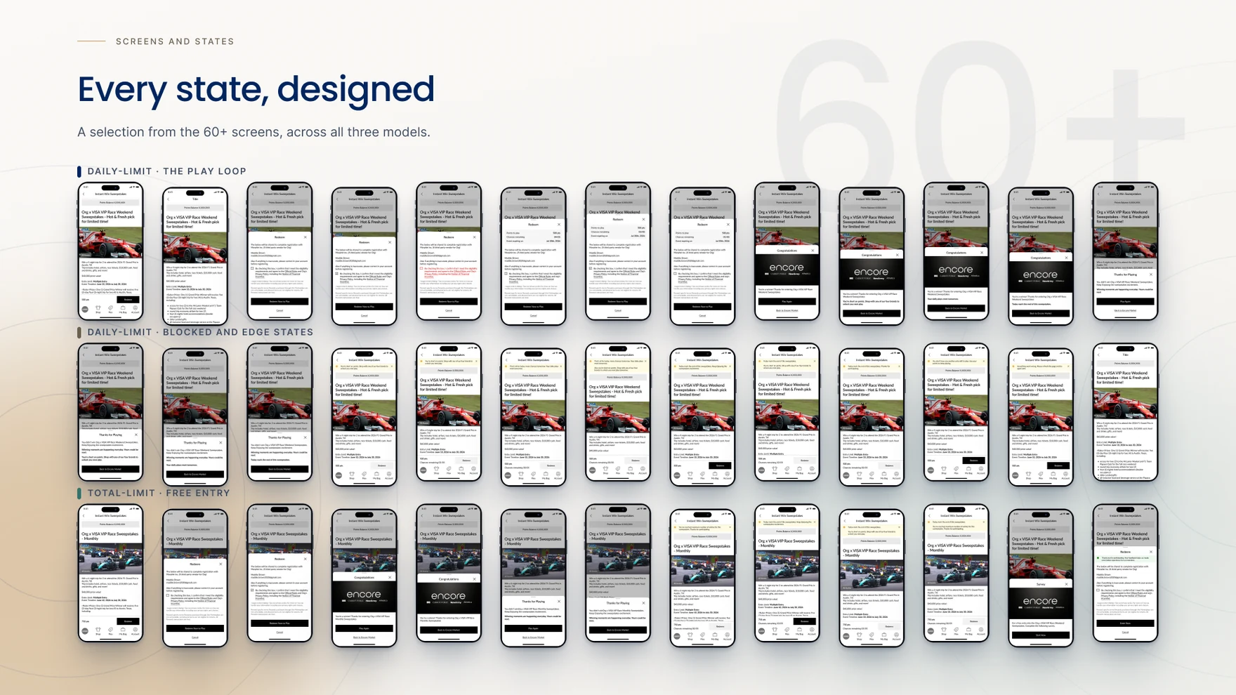
Across both instant-win models and the free-entry path, the project produced 60-plus distinct screens and states — the play loop, every blocked and edge case, and the full free-entry journey, all built on the same Fabric components so nothing in the set reads as a one-off.
Instant Win is still under development, so what follows is a qualitative account of what the design delivers, not a measured result.
A result that used to arrive by email, days later, now arrives the instant a customer plays. One sweepstakes format became two instant-win models plus one compliant free path, all built on the same system. And a project that started with no documented edge cases leaves behind a full state matrix the team can build from going forward.

The clearest lesson was that the states were the design — the interesting decisions in this project live in what a customer sees when something doesn’t go their way, not in the happy path. A close second: sequencing matters as much as wording, and getting the message-priority order right took more iteration with the copy team than any single line of copy. And watching this project’s own shape change — one model, then a second, then a compliance requirement that reframed both — was a reminder that a system built to absorb a requirement it hasn’t met yet tends to hold up better than one built to fit only what’s already known.
What’s shown throughout this case study is the mobile app — the same Instant Win system also ships on desktop and mobile web.
Once Rewards Detail Pages shipped its new 1,140px grid, the sweepstakes reward page — the screen a customer lands on after choosing to play — was rebuilt to match it, on both web and the app. The prize and its value now lead the description in place of a product name, the entry limit and the event’s timeline sit together in one readable block, and Redeem follows directly after those prize facts. It’s the same reading order and the same hero-and-tiles gallery as every other reward type on Encore Market, so a sweepstakes win and a physical reward now feel like two versions of one page, not two different products.
Thank you for reading.
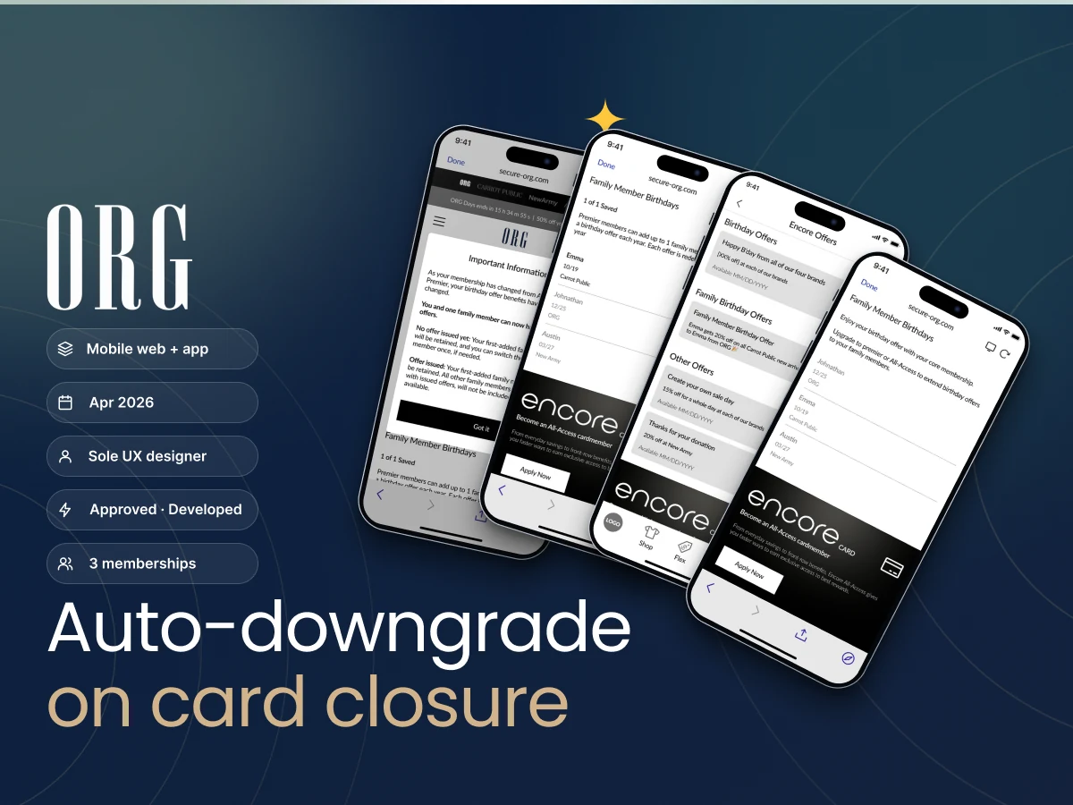
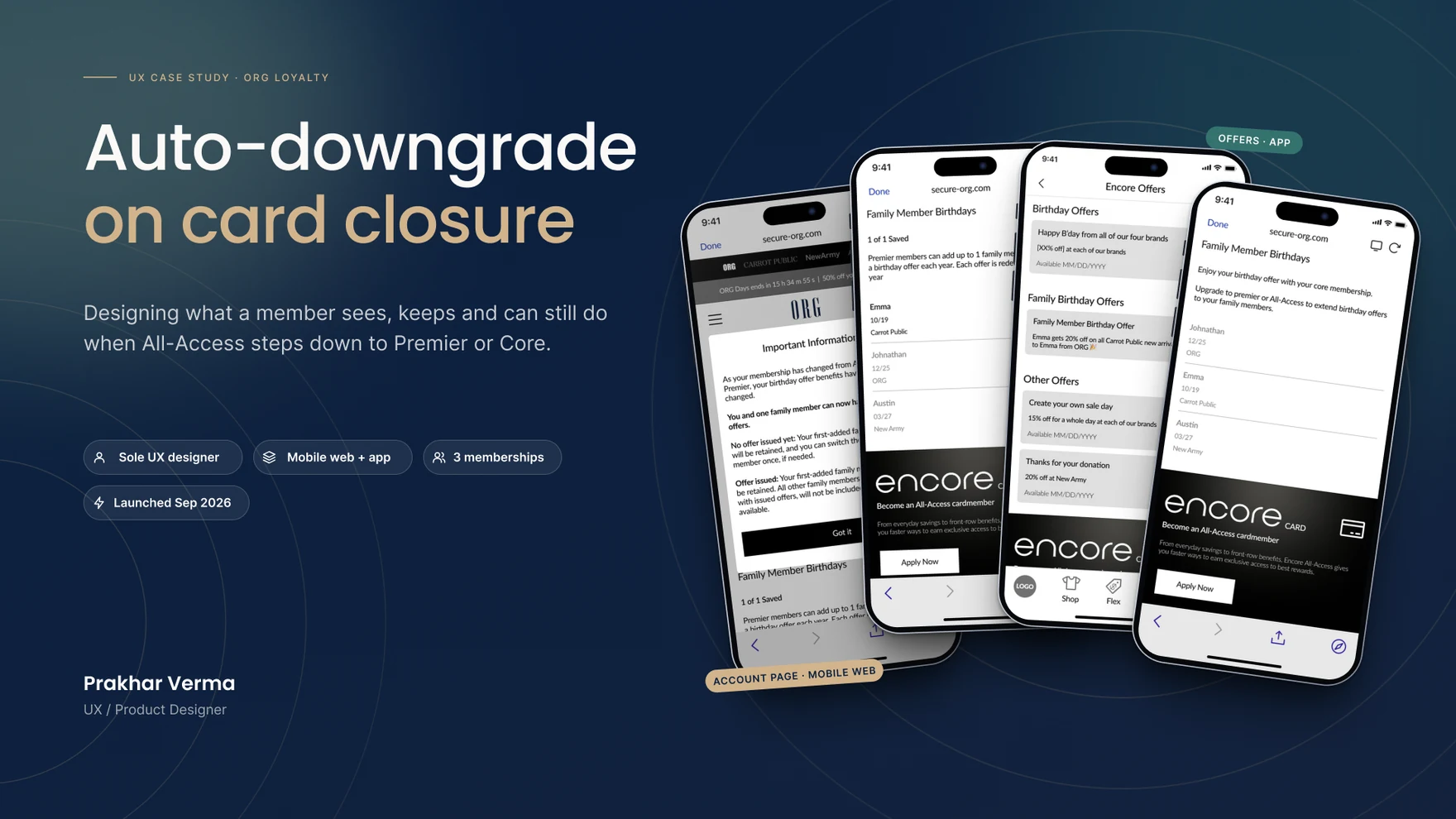
Designing what an ORG member keeps, loses and can still do the moment an All-Access card closes — three memberships, two downgrade paths, and sixteen rule rows covering family members, offers already issued, and the one modal that has to explain all of it, with no email or push to fall back on.
Before this shipped, a closure didn’t trigger anything: a member whose All-Access card closed kept full All-Access benefits until the next year’s requalification cycle, no matter what their spend actually supported in the meantime. At roughly 1.2 million accounts projected to close every year, that gap was real money — benefits still paid out past the membership that earned them — an inaccurate picture of who actually held which membership, and a reactivation audience nobody could see clearly, since closed-card members weren’t segmented from anyone else.
All-Access is the one ORG membership that comes with a physical card. When that card closes, the membership now has to step down with it — to Premier or to Core, depending on spend — and nobody gets an email about it. The design had four constraints to work inside, none of them negotiable: no customer communications of any kind, so the Account page itself has to be the notice; the surfaces split across mobile web (the Account page and its modals) and the app (the Offers page), with nothing shared between them; only a true closure triggers the downgrade, never a lost or stolen card; and every family member already on the account stays on file, held rather than deleted, in case the card comes back.
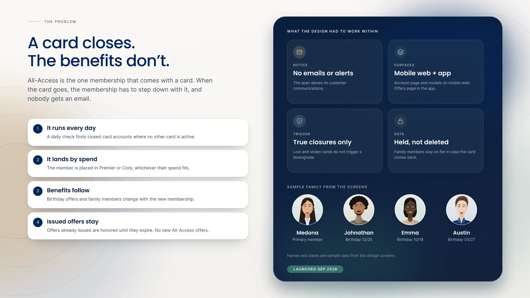
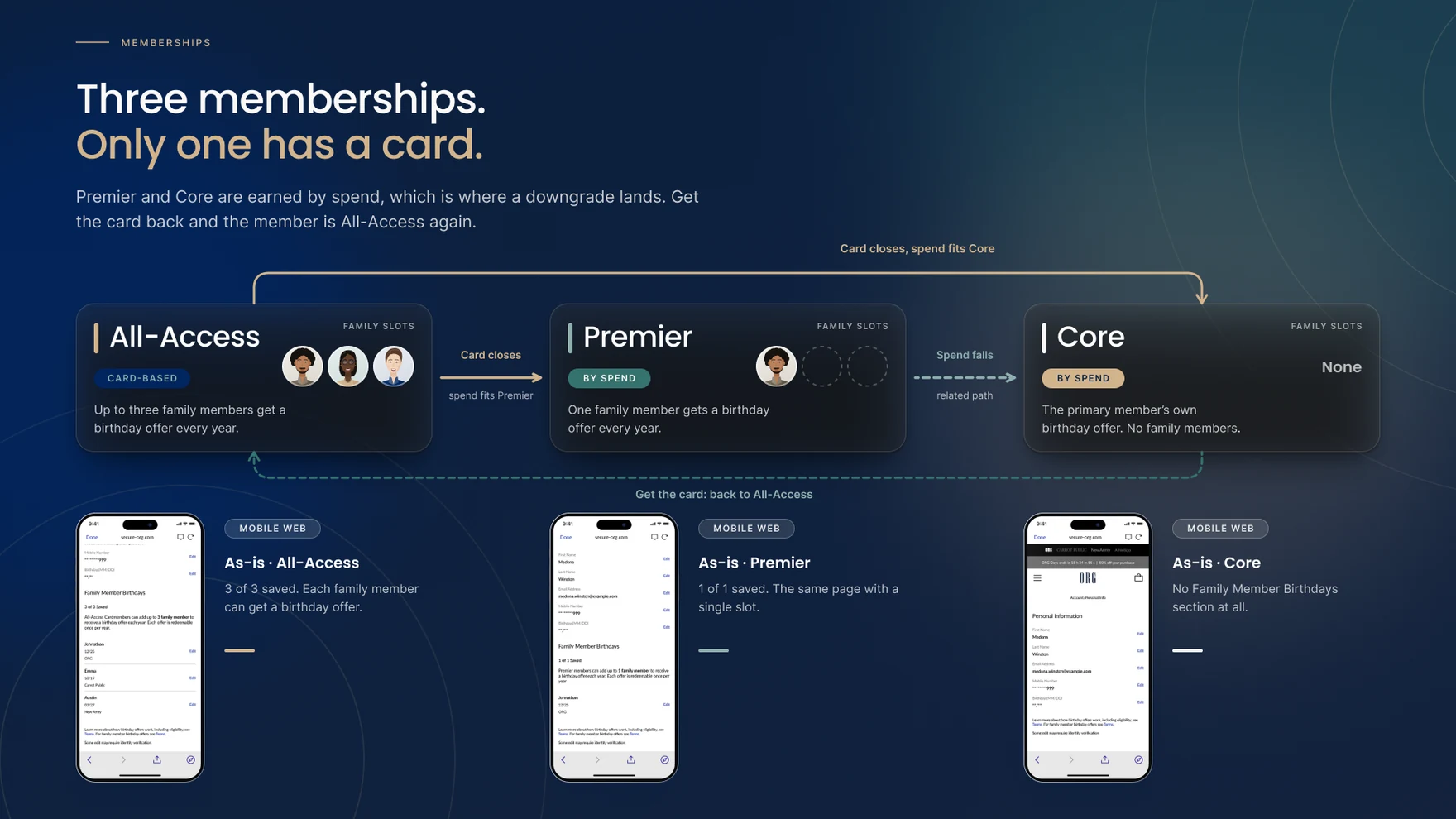
All-Access, Premier and Core are memberships, not tiers — only All-Access is card-based. All-Access carries up to three family members, each eligible for a birthday offer every year; Premier carries one; Core carries none and has no family section at all. A closure drops All-Access straight to whichever of Premier or Core its spend actually fits, and a downgraded Premier member can fall again to Core the same way. The only way back to All-Access is to apply for the card again from the Encore banner already sitting on the page. A downgrade touches three specific, named perks — shipping entitlements, family member birthday offers, and Choose Your Own Sale Day — each adjusted or removed to match whichever membership a member’s spend now actually supports.
As the sole UX designer on this feature, the work ran from logic through to shipped screen — alongside a product owner, developers, designers from ORG’s Fabric Design System team, a client-side program manager, a copy team and legal, the same partner group as the rest of ORG’s Encore Marketplace work. With no customer communications allowed and two disconnected surfaces to cover, the brief couldn’t be designed screen-first: a member’s family size, which membership they were leaving and entering, and whether an offer had already been issued to someone in their family all changed what the page had to say. That meant writing the logic out as a table before trusting any single screen — sixteen rows in total, split across three tables, each one naming the scenario, the family-member profile, who an offer was issued to, the expected behavior, and the exact copy or screen state that follows.
The first table works through a member dropping from All-Access to Premier across every family size from zero to three, and across whether an offer has already gone out to any of them. The retained family member is always the first one added, not whoever happens to hold an offer — everyone added after them is greyed, with a one-time Activate available only if no offer has been issued yet. An offer already in someone’s hands stays valid for its own window regardless of who the page keeps active.

The second table covers what a member can still do after the downgrade lands — the one-time Activate switch and its confirm modal, what happens when a family member is removed and the slot reopens — plus the All-Access-to-Core path, where every family member is greyed at once and the page replaces the family list with a single Core message.
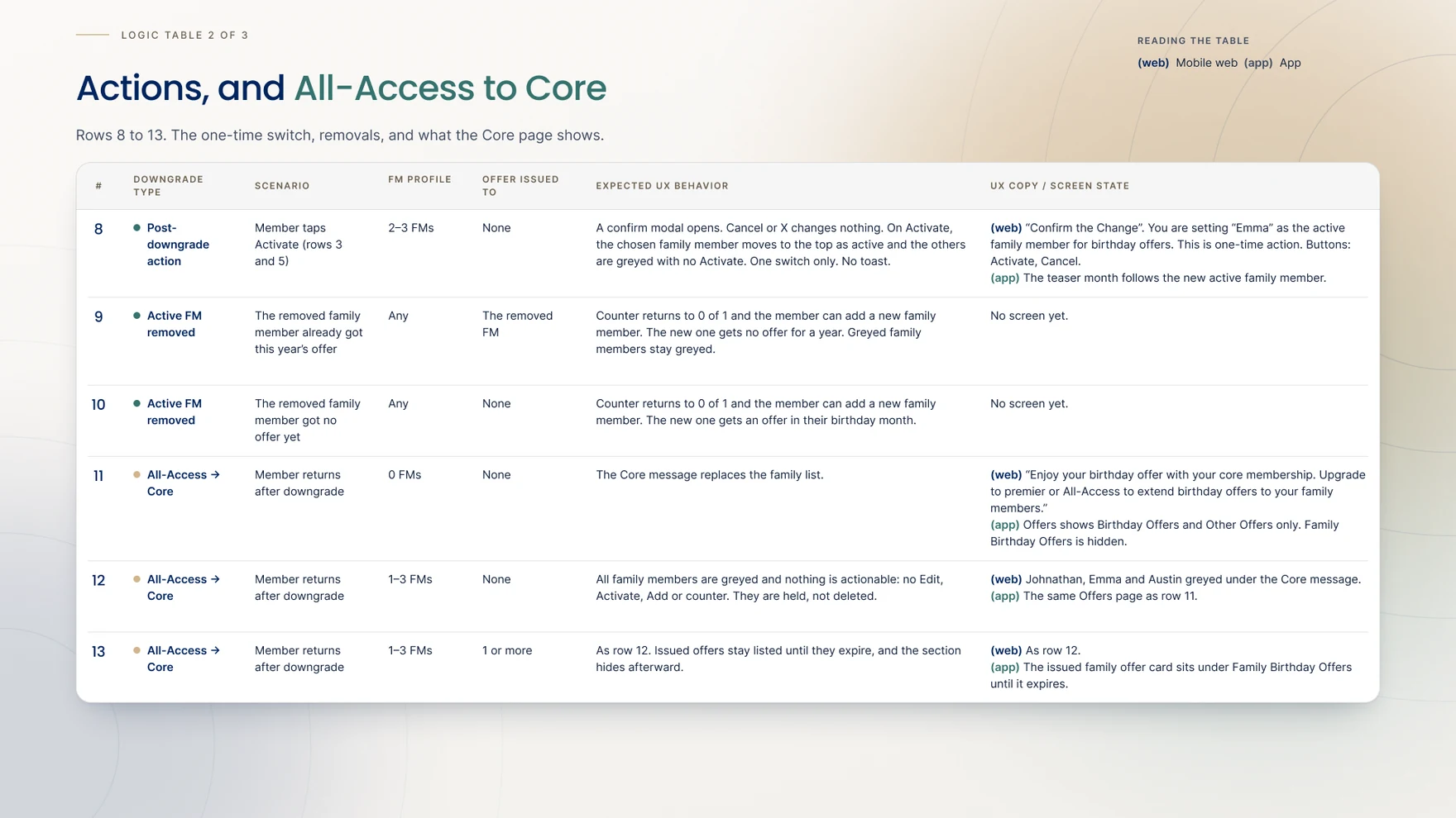
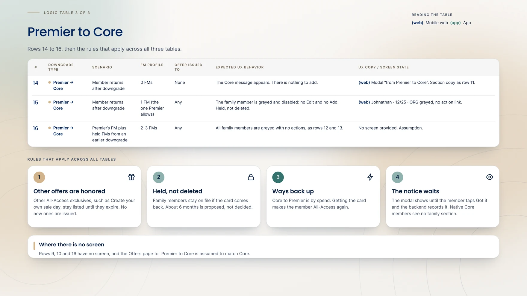
The third table closes out Premier-to-Core, then states four rules that run across all sixteen rows rather than belonging to any single one: other All-Access exclusives already issued stay listed until they expire; held family members are never deleted; the only way up is the card coming back, proposed at roughly six months; and the notice sits on the page until Got It is tapped and recorded. Writing the rules out this plainly, row by row, is what let the same four principles apply cleanly across every family size and every downgrade path, rather than being re-reasoned screen by screen as each case came up.
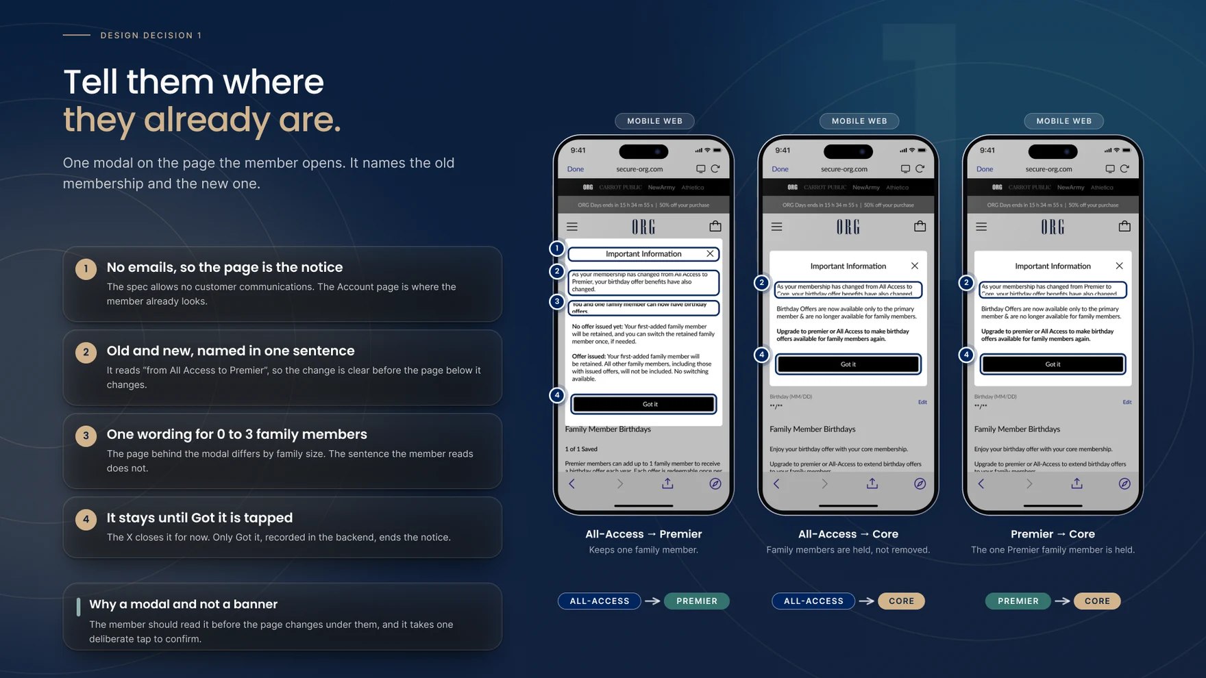
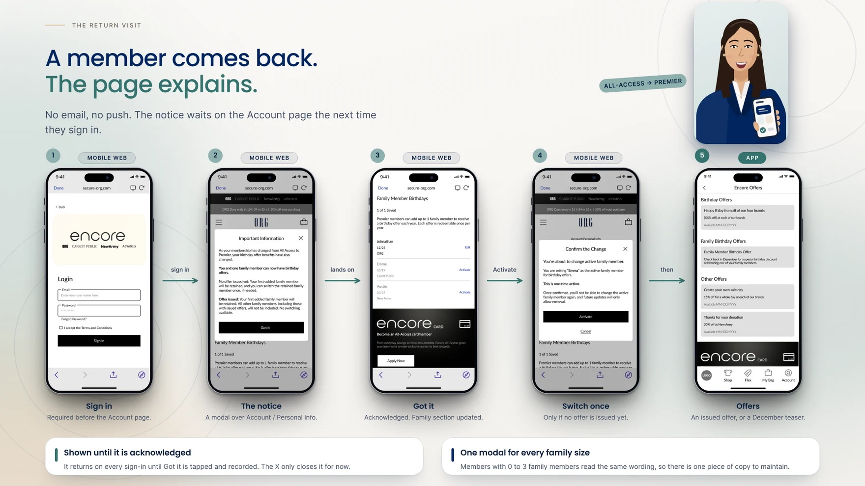
With no email or push allowed, the Account page itself had to carry the notice: one modal, shown the first time a member signs in after the downgrade, naming the old membership and the new one in a single sentence — “from All-Access to Premier” — before anything on the page beneath it changes. The same wording covers every family size from zero to three, so there’s one sentence to maintain rather than four. It’s a modal rather than a banner on purpose: the member reads it before the page changes under them, not alongside the change. It stays until Got It is tapped; the X only dismisses it for that visit, and the backend records the acknowledgement either way.
Rather than asking a member to choose who keeps their family slot, the system defaults to whoever was added first — no action required, and there’s always a sensible starting state. If no offer has been issued yet, that default can be changed exactly once: Activate opens a named confirmation (“you’re setting Emma as the active family member… this is one-time action”), and confirming moves the new member to the top while the rest grey out. Once that switch is used, or once any offer is issued, Activate disappears everywhere — the page simply shows the result from then on.
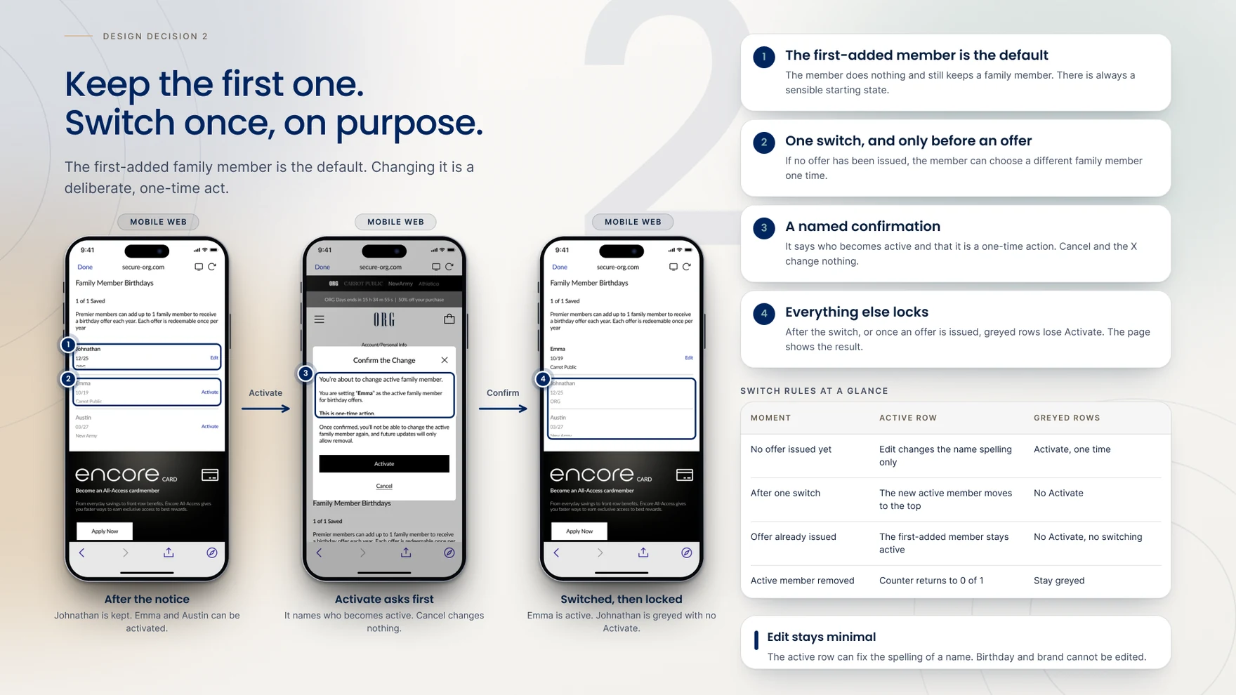
The rule here changed during design. It started as “whoever received the offer is the one retained” — simple, but it meant the retained family member could change depending on timing nobody controlled. The rule that shipped instead keeps the first-added member retained no matter what, while anyone who already has an issued offer keeps it live for its own window regardless. Walked through with the sample family: Emma’s offer goes out in October; the same month, the daily downgrade job runs and keeps Johnathan — added first — active, greying Emma with no Activate; Emma’s offer still honors through its October window; and because the family’s one annual offer was already spent on Emma, Johnathan’s own birthday offer that December simply doesn’t issue. Nobody is penalized for when the downgrade happened to land.

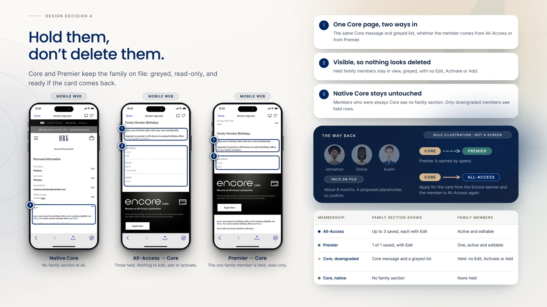
Every held family member stays visible rather than disappearing: a native Core member sees no family section at all, since they were never holding one; a member downgraded from All-Access to Core sees up to three family members, all greyed, with no Edit, Activate or Add; and a member downgraded from Premier to Core sees their one family member the same way, read-only. Nothing is deleted on any of those paths — the data waits, in case the card comes back. Getting the card back is proposed at roughly six months, still to confirm, and returns the member straight to All-Access with every held family member re-enabled.
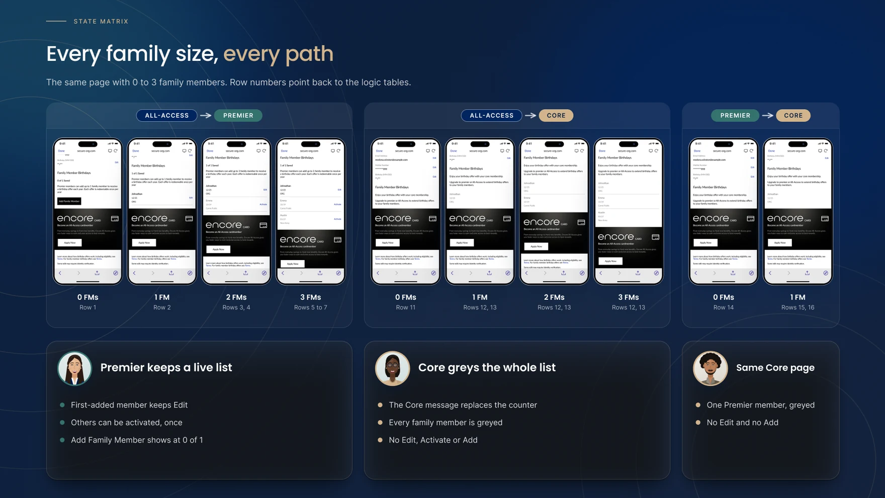
The same Core-bound page had to hold up across zero to three family members and both downgrade paths at once, with row numbers on each state tying straight back to the logic tables behind them. Premier keeps a live list — the first-added member keeps Edit, anyone after that can be activated once, and Add Family Member stays available at zero of one. Core greys the entire list instead: the counter disappears behind the Core message, every family member is greyed, and there’s no Edit, Activate or Add anywhere on the page — the same Core page shows up whether a member arrived there from All-Access or from Premier.
Six scenarios came straight out of the approved logic rather than off any single screen: two family members with offers in the same month; a removed family member re-added, with and without an offer already issued; a switch that’s already been used and locked; a Premier-to-Core downgrade with a held family member; and the card itself coming back. Each one is a rule illustration rather than a shipped screen — the point was to pressure-test the logic tables against situations that don’t show up in the happy path before a developer ever had to guess at one.

Strung together, the whole experience is five steps: sign in, land on the notice modal over Account, tap Got It, optionally use the one-time switch if no offer has issued yet, and then open the Offers screen in the app, which shows either an issued offer or December’s teaser depending on where that member’s logic-table row landed them. No email, no push — the account page carries the entire explanation, and it waits there, unchanged, until the member actually opens it.
Auto-downgrade on card closure launched on September 25, 2026 — unlike Rewards Detail Pages and Instant Win, which were still in development at the time of writing, this one is live. Closing the gap it shipped to fix is now tracked by two metrics. The primary one is cost: the benefit savings that come from correctly moving closed-card members down to Premier or Core, measured against both closures going forward and, retroactively, every closure recorded since February 2026. The secondary one is opportunity: closed-card members are now an accurately segmented, expanded audience for card-reacquisition campaigns, with conversion and reapproved-card counts tracked among the members retargeted. It’s too soon after launch for either number to say anything meaningful yet — what follows next is watching both.
Four trade-offs were accepted going in, not discovered after the fact. No communications means a member who only opens the app can miss the notice until they next open Account on mobile web. One switch only keeps the interaction simple to explain and to build, at the cost of being undoable. Greyed, not hidden, means held family members stay visible rather than looking deleted, even though they can’t be acted on. And a one-year hold on a family member’s birthday offer is easy to apply consistently, even though it means a second family member waits a full cycle for their turn. None of the five open questions that follow — whether members notice the modal on first sign-in, whether “one-time action” reads clearly before Activate is tapped, whether app-only members find out about the change in time, how long a held family member should realistically stay on file, and whether the Offers page needs its own state for two issued offers at once — have been tested yet.
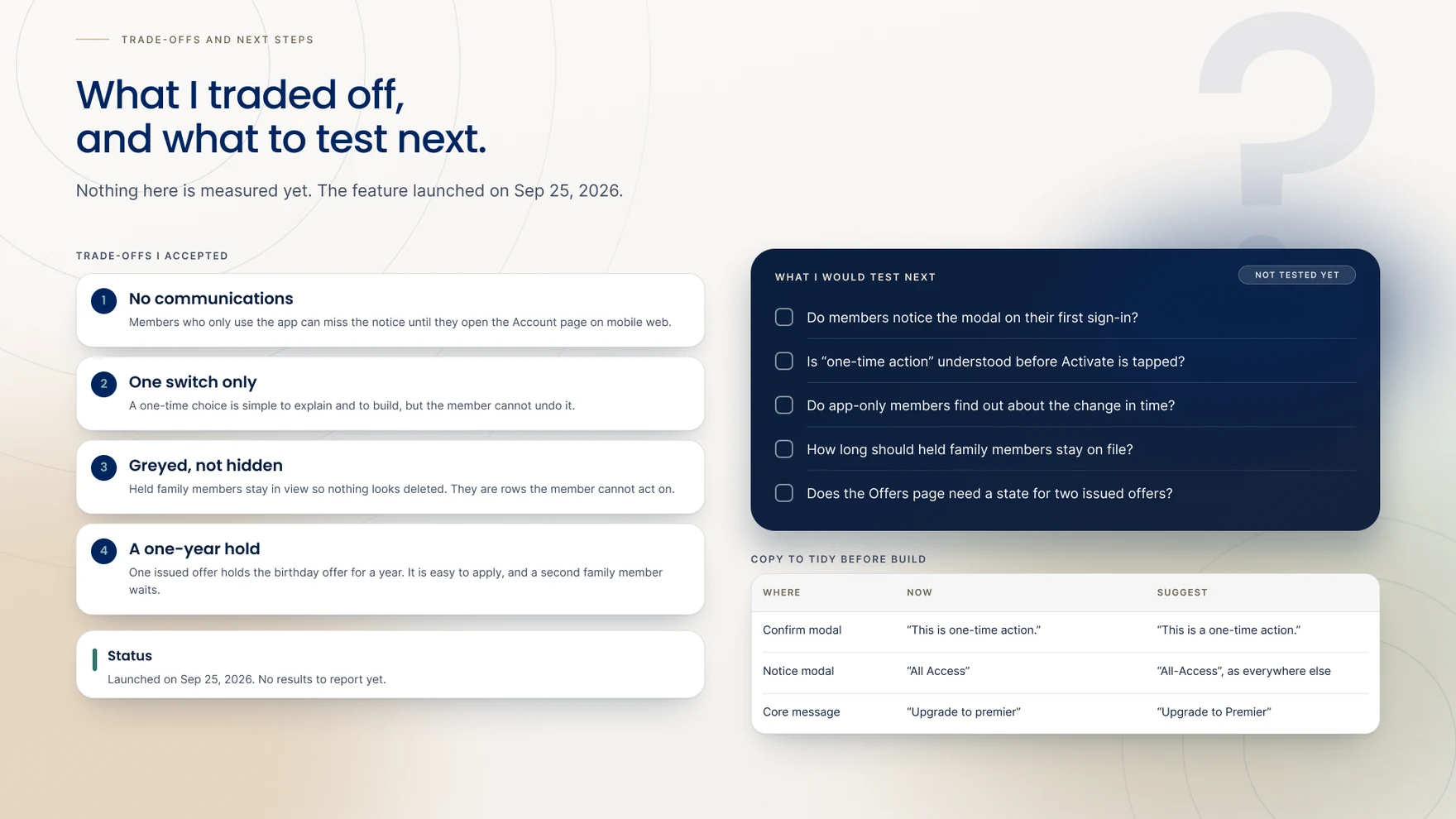
The clearest lesson was that the rules had to exist before any screen could be trusted — with four constraints that couldn’t move and no communications channel to lean on, the account page itself had to carry the entire explanation, which meant the logic underneath it needed to be airtight first. A close second: treating sixteen scenario combinations as rows in a table, rather than as exceptions to patch screen by screen, is what let one set of rules hold up cleanly across every family size and every downgrade path instead of drifting case by case.
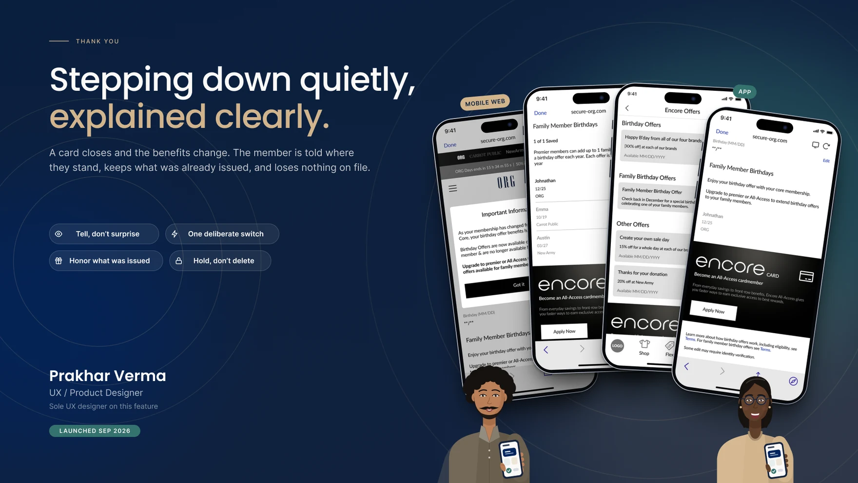
Thank you for reading.
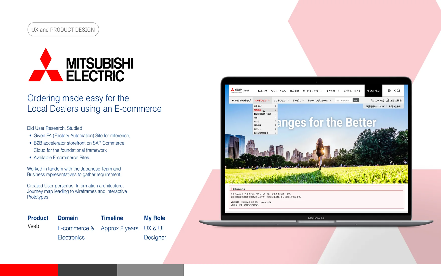
Build an e-commerce experience from scratch — research, journeys, personas and a design system, shaped for usability and persuasion.
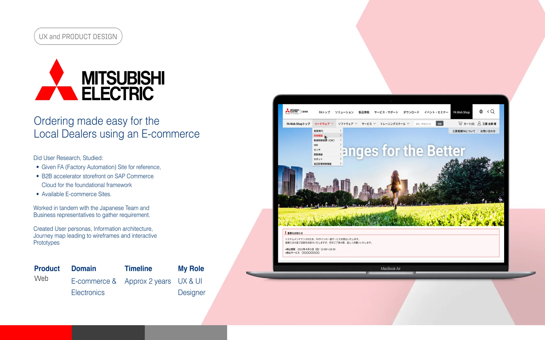
Mitsubishi Electric’s Japanese dealer network — the businesses reselling its factory-automation hardware, software and services — had no way to order online. Every purchase ran through phone calls, faxes and manual paperwork, and a single order could take fifteen to thirty days to clear. My brief was to design a B2B e-commerce platform from nothing, for an audience that had never had one.
The only design reference I was handed was the company’s own FA (Factory Automation) corporate site, still running on guidelines drawn up in the 1990s. Before designing anything, I ran it through a full heuristic evaluation against Nielsen’s ten principles — four of the ten scored a 4, “usability catastrophe.” The page crammed everything into one view with no hierarchy, icons and CTAs that meant different things in different places, and copy that assumed a patience and memory most users don’t have.
It was clear we couldn’t build the new platform on the reference site’s guidelines. We needed a different system to design the dealers’ e-commerce experience on.
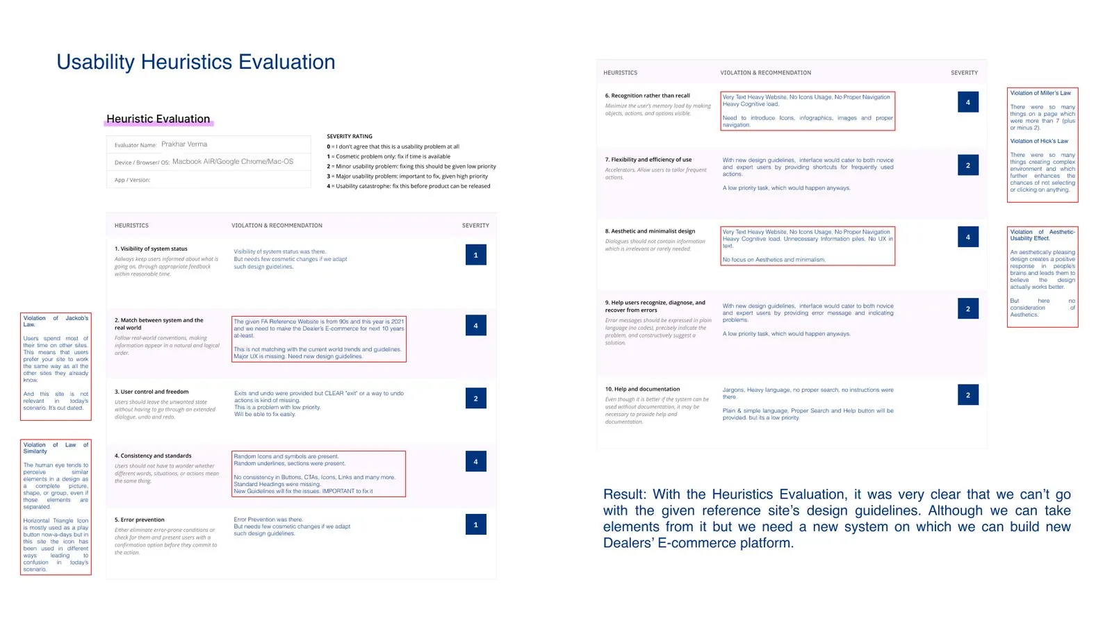
That conclusion reframed the brief. This wasn’t a redesign — it was a first version, with no existing pattern library and no prior user data to design against.
 Grounding in a framework
I ran the project through IBM’s design process — Observe, Reflect, Make — to keep the work honest: understand before judging, synthesise before deciding, and only start on screens once the direction was earned.
Since the FA site couldn’t be the foundation, I looked wider. I audited the company’s own European site — a cleaner, more contemporary property inside the same organisation — alongside outside references like Siemens Healthineers for how a technical B2B site can still explain, educate and sell, and a spread of e-commerce platforms from Denso and Hitachi to Amazon, Croma and Lowe’s for patterns in filtering, comparison and checkout. On the technical side, SAP Commerce Cloud’s B2B/B2C accelerator became the underlying framework, which meant mapping what it already solved against what still needed designing from scratch.
I ran a mini design-thinking workshop with dealers, product specialists and process experts from the client side. Dealers argued for what they needed day to day, product specialists filled the gaps in the catalogue, and process experts pressure-tested the workflow operationally. The output was a prioritised feature map — what the SAP accelerator already covered, what needed adapting from the FA site’s existing processes, and what had to be designed new for this first release.
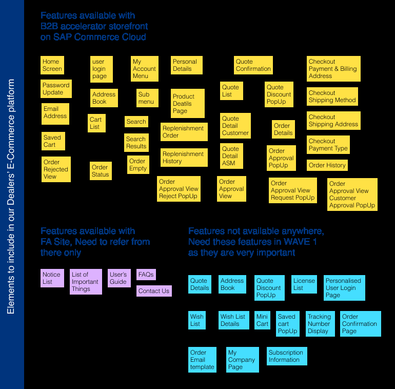
Interviews and the workshop converged on three distinct buying behaviours, so I built personas and empathy maps around them instead of a single composite user.
Buys software in bulk for corporate clients — wants fast comparisons, clear pricing and invoices he can pull without digging.
Frustration: slow visibility into product updates.
Sources hardware against exact client specs and tracks deliveries in real time.
Frustration: a slow returns process for defective stock.
Manages licenses for a range of clients from one dashboard — renewals, contracts and compliance.
Frustration: smaller one-off purchases aren’t as streamlined.
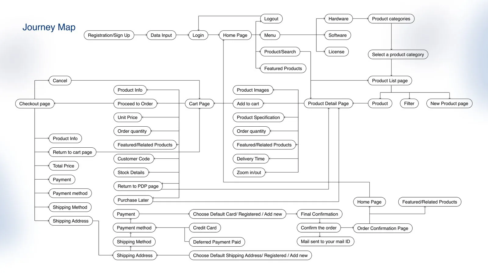
With the feature set agreed, I mapped the information architecture and an end-to-end journey — registration through login, browsing by hardware, software or license, cart, checkout, and the recurring flows dealers actually live in: license renewals and service subscriptions. Low-fidelity wireframes let me pressure-test that structure with stakeholders before a single pixel of visual design was spent.

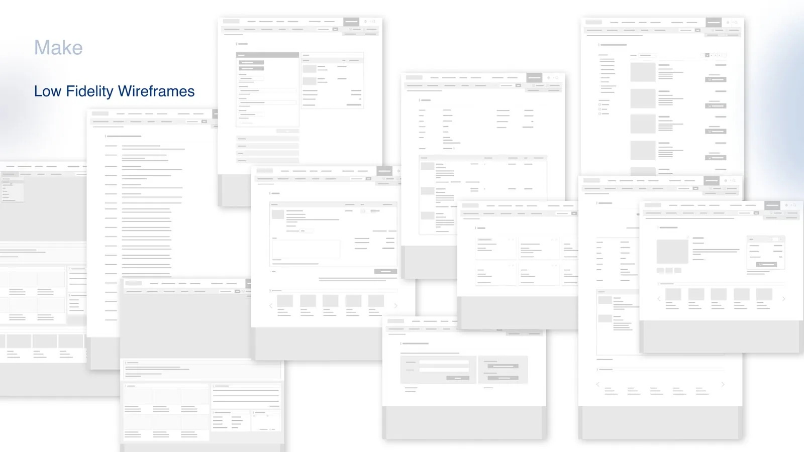
The shipped design replaced the FA site’s single dense page with a structure built around clarity: one job per screen, consistent icons and CTAs, and enough white space that a dealer could scan a product list without re-reading it twice.
If everything’s on the same page, you can’t focus on what matters. The old site never had a concept of cognitive load — the new one is built around it.

The three personas don’t shop the same way, so the platform had to handle more than a product grid. Bulk hardware orders get an explicit confirmation state instead of a silent add-to-cart. Software licenses get their own searchable list with renewal and activation status visible up front. Subscriptions — recurring services like meter reading — get contract-level detail, with a clear path to renew or change terms without starting over.
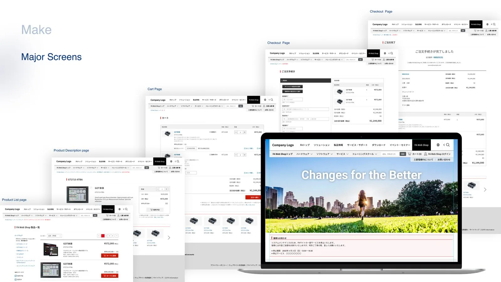
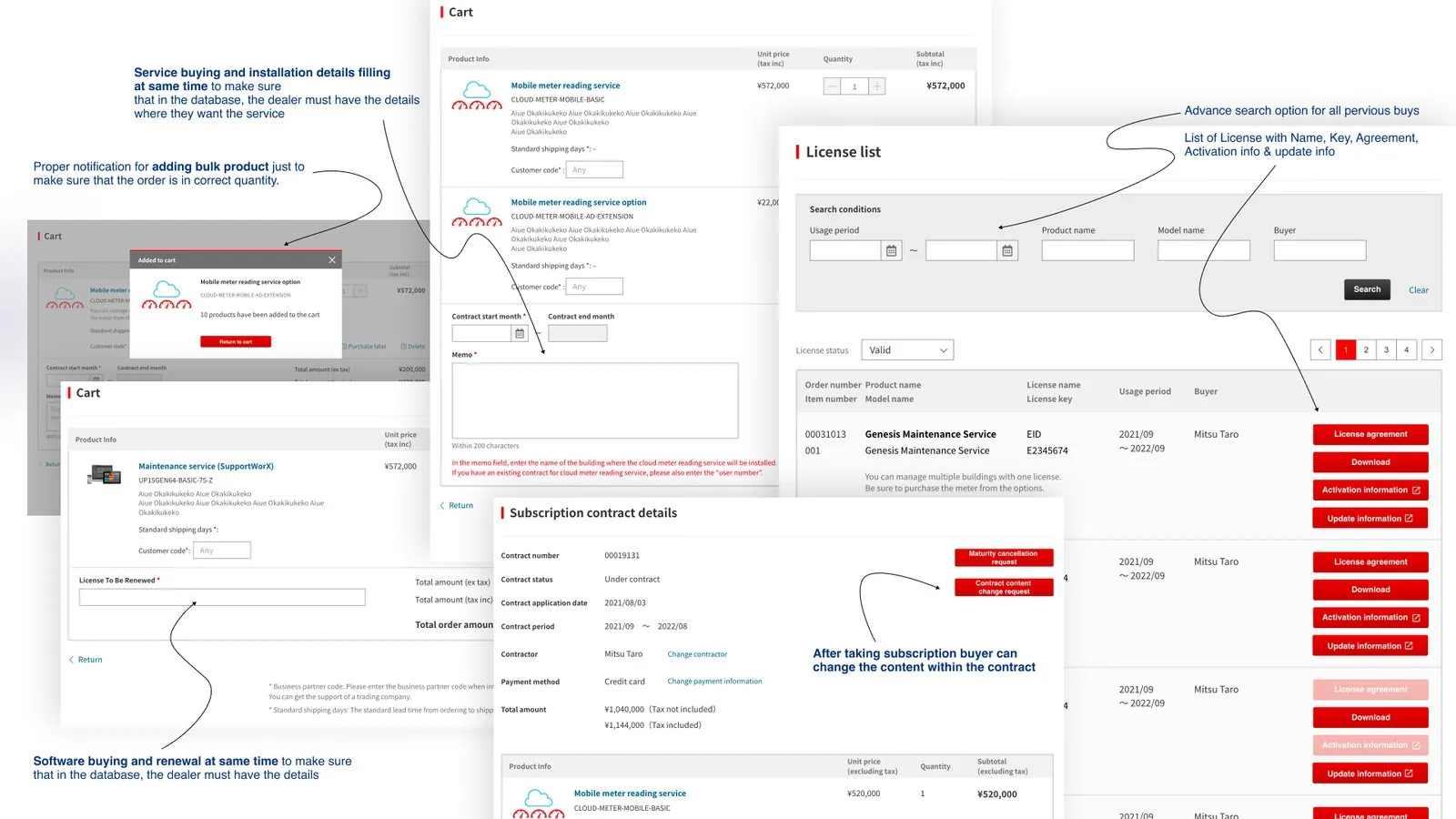
The platform gave Mitsubishi Electric’s dealer network something that hadn’t existed before: a way to buy hardware, software and services online, end to end.
None of that was free. It meant convincing the client to set aside a legacy design system built on 1990s guidelines that had shipped fine for internal, non-commercial pages, and build a research-led one instead. That argument — backed by a heuristic evaluation rather than a personal opinion — is what got the redesign approved, and it’s the part of this project I’d point to first: usability research doesn’t just make screens nicer, it’s what wins the room.
In a real ERCP procedure, doctors already work across two screens — the endoscopic view and the fluoroscopy feed. Simulate-X adds a third: an AI assistant and 3D anatomy screen, my own original addition, meant to help new doctors, trainees and experienced doctors alike.
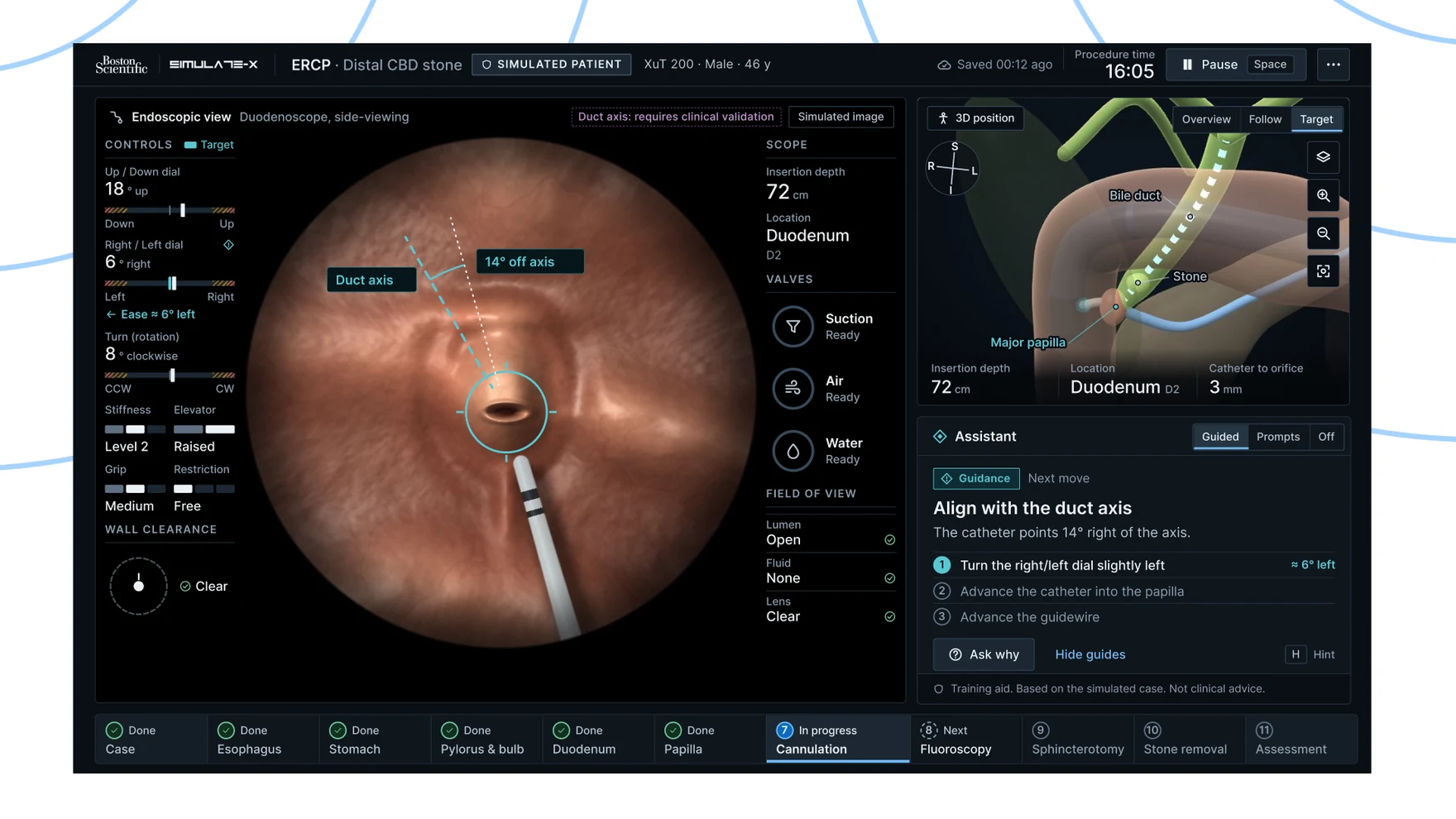
In a real ERCP (endoscopic retrograde cholangiopancreatography) procedure, a doctor already works across two screens: the endoscopic view and the fluoroscopy feed. My own idea, from my M.Des thesis at IIT Delhi, was to add a third — a screen where an AI assistant and 3D anatomy sit alongside those two — because the procedure asks a doctor to fuse an endoscopic image, an X-ray image and a mental 3D model into one picture, while steering a flexible scope with almost no tactile feedback, under teaching that varies a lot from trainer to trainer.
I grounded the redesign in five interviews — a trainee, two gastroenterologists and two technicians — which surfaced thirty distinct pain points, almost all of them traced back to a root cause rather than left as a complaint. The clearest cluster wasn’t really about the interface: it was how much a trainee has to hold in their head at once, with no tactile feedback from the scope and a simulator that kept offering the same patient instead of real variation.
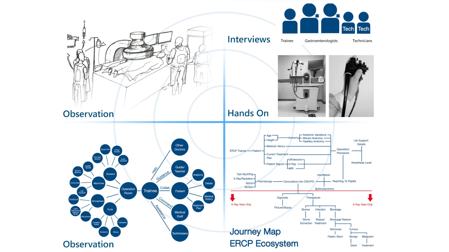
Two rounds of expert review from practising gastroenterologists pushed the brief further. Both reviewers liked the dark theme, a synchronised 3D view and exercises built in before the procedure — but one still wasn’t convinced a 3D coordinate view could work from the side-viewing camera, and the other wanted something closer to a real instrument gauge than the original prototype’s status dots.
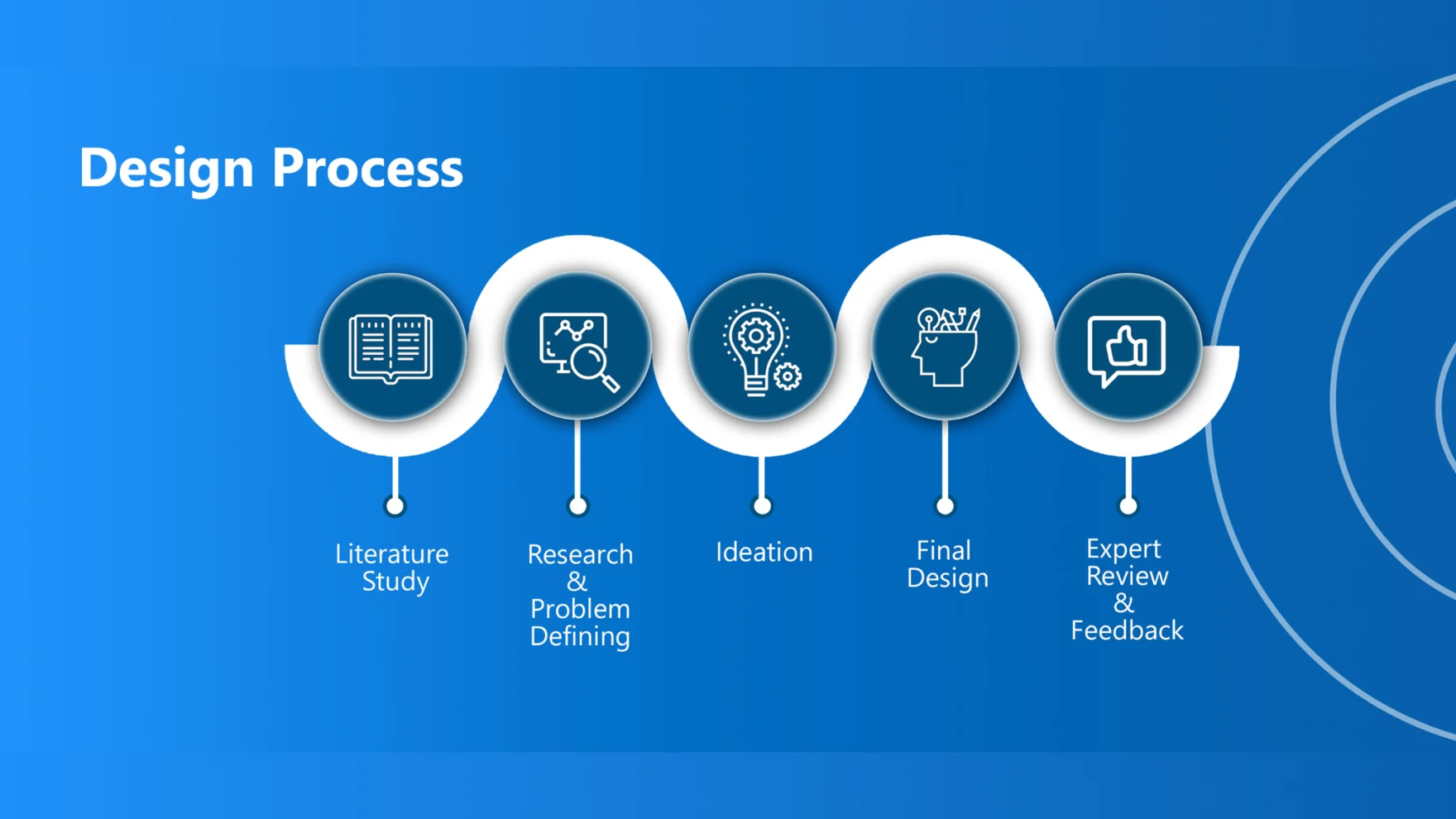
Before redesigning anything, I went back through V1 screen by screen against the research — my own thesis workflow diagram had already called for three paired screens, and only one of them had ever actually been designed. I labelled every gap and inconsistency I found rather than assuming the original concept was right just because I’d built it.

Two of the three screens — the endoscopic view and the fluoroscopy feed — are already standard in an ERCP room. The idea I brought to the thesis was the third: a screen for an AI assistant and 3D anatomy, sitting alongside the two doctors already rely on, built to help new doctors and trainees as they learn, and experienced doctors too, not just one or the other. I kept that spine through the redesign and built out what the original sketch had only gestured at — starting with one landmark marked consistently across all three screens, so a doctor’s eye doesn’t have to re-orient every time they switch between them.

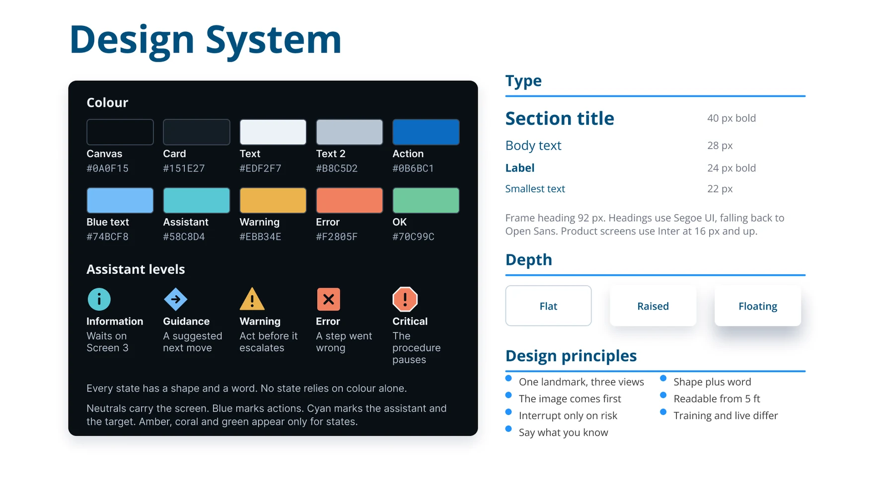
That became six working principles for the redesign: mark one landmark the same way everywhere; never let a panel cover the endoscopic or X-ray image; let information wait and only interrupt on real risk; make observed, inferred and suggested content look visibly different from each other; carry every state in a shape and a word, never colour alone; and keep training and live use looking deliberately different from each other.
I kept the persona grounded in the research: an early-stage ERCP trainee pursuing their MD, who still relies on the simulator rather than live cases and is weighing how much AI assistance to lean on against wanting to build their own judgment. Every assistance decision in the redesign — what the AI says, when, and how loudly — was checked against that tension rather than against what was technically possible to show.

What I actually shipped at the time was twelve screens, all living on a single “Screen 3,” with dot-light indicators carrying state by colour alone, patient selection reduced to an age band and an avatar grid, and no error, pause or loading states built in anywhere. It proved the three-screen idea could work in principle, even though only one of the three screens was ever designed.



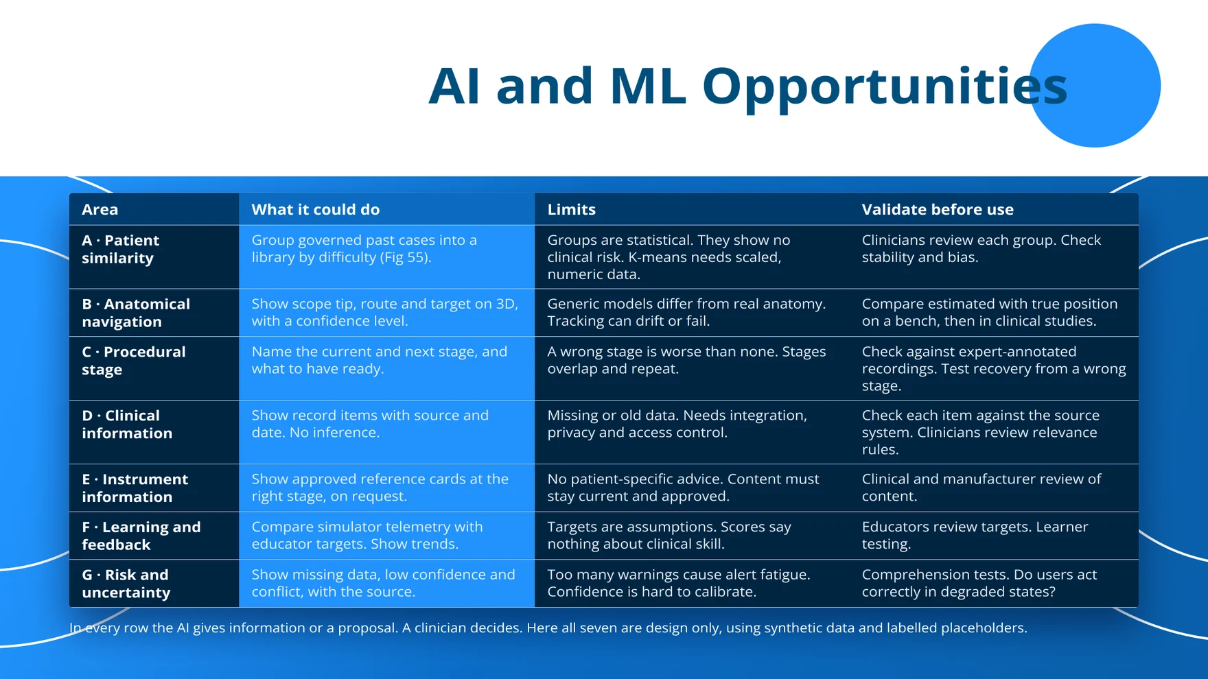
V2 is a more advanced pass at the same idea — the version of this UI I couldn’t build back then. It replaces the single dense “Screen 3” with the full three-screen set, and gives each one a clear job: the endoscopic view stays clear of everything except a small AI badge when something needs attention, the fluoroscopy screen keeps its image tools beside the image rather than on top of it, and the AI + 3D screen carries the assistant, the 3D anatomy, the patient record and the procedure stage together.
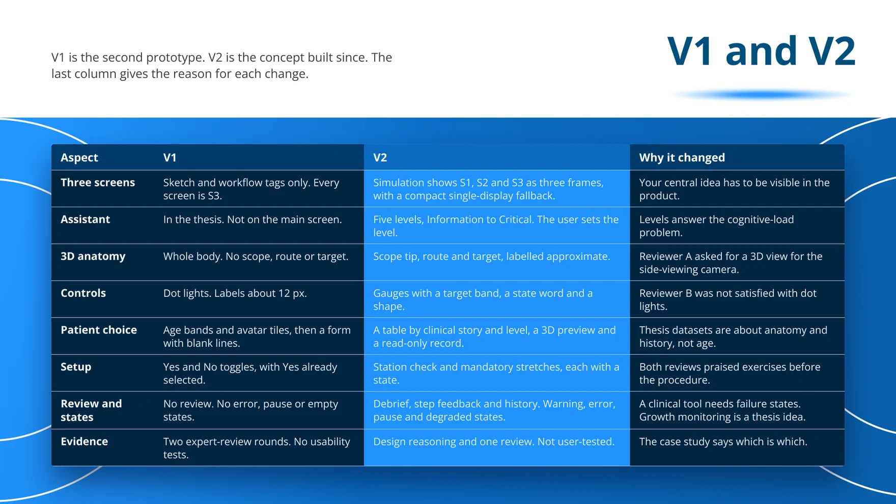
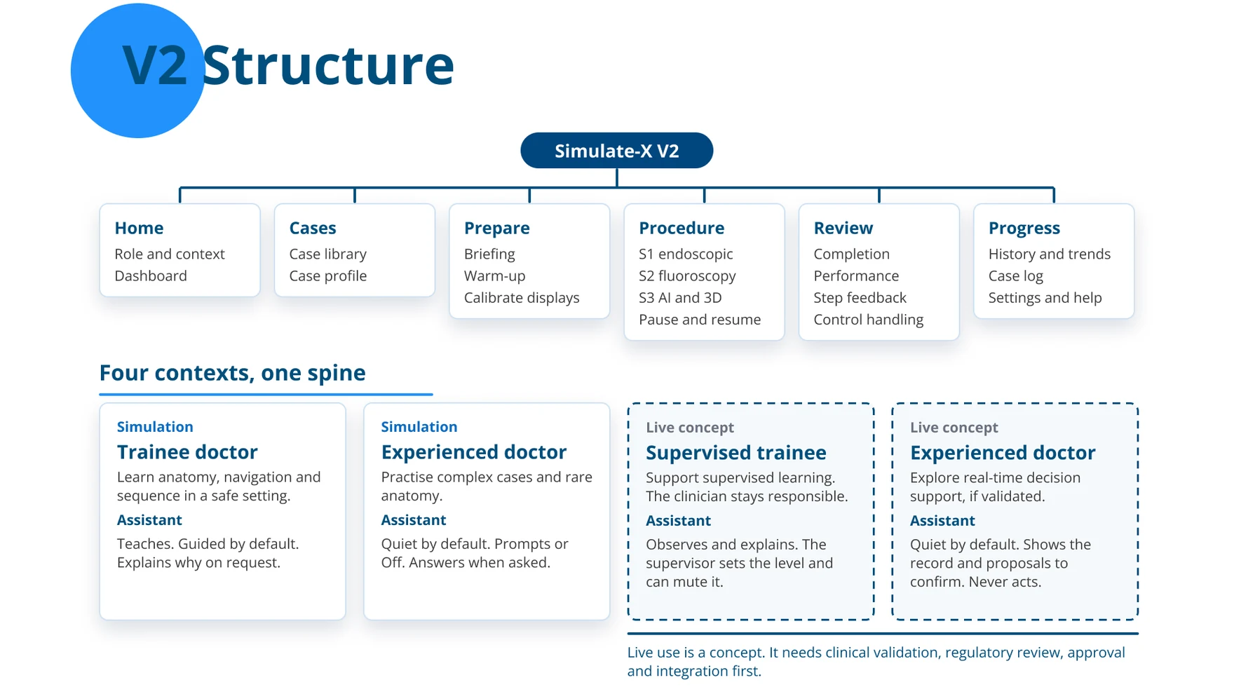
The 3D anatomy now shows an approximate scope tip, route and target — clearly labelled as approximate rather than implying a precision it doesn’t have — replacing a whole-body model with no scope, route or target at all. The AI assistant works on five graded levels, from Information through to Critical, each with its own shape and wording, and the trainee chooses between Guided, Prompts or Off rather than having guidance forced on them.
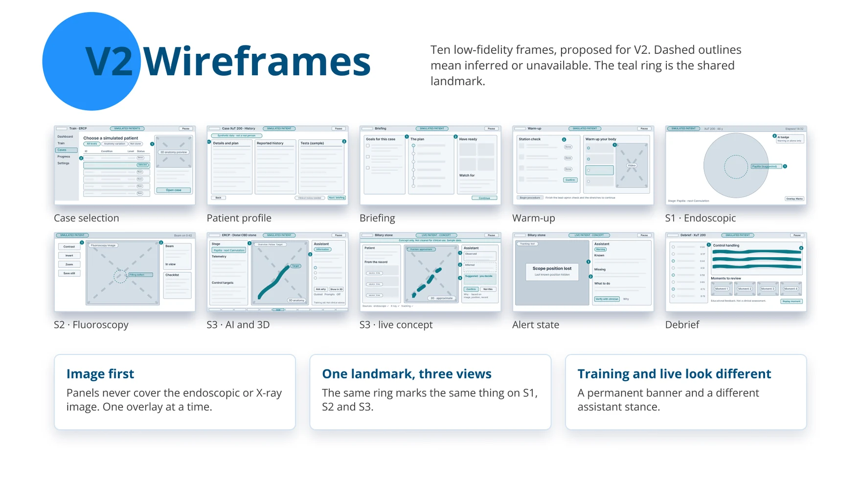


Dot-light instrument indicators became gauges with a target band and a state word. Patient selection moved from age-band avatars to a case library organised by clinical story and difficulty, with a read-only patient record in place of a form of blank lines to fill in. A warm-up and station check — including the lead-apron check — is now mandatory before a procedure can start, and a debrief screen reviews specific moments afterward rather than handing back a single score.
The same three-screen system also sketches out what supervised use with a live patient could look like — a permanent “live” banner, a visibly different assistant stance that only observes and explains rather than coaches, and a supervising clinician who can mute it at any point. It stays clearly labelled as a concept, not a shipped capability: real clinical use would need position-tracking accuracy well beyond what a simulator needs, plus clinical validation, regulatory review and institutional approval before any of it could reach a real procedure room.


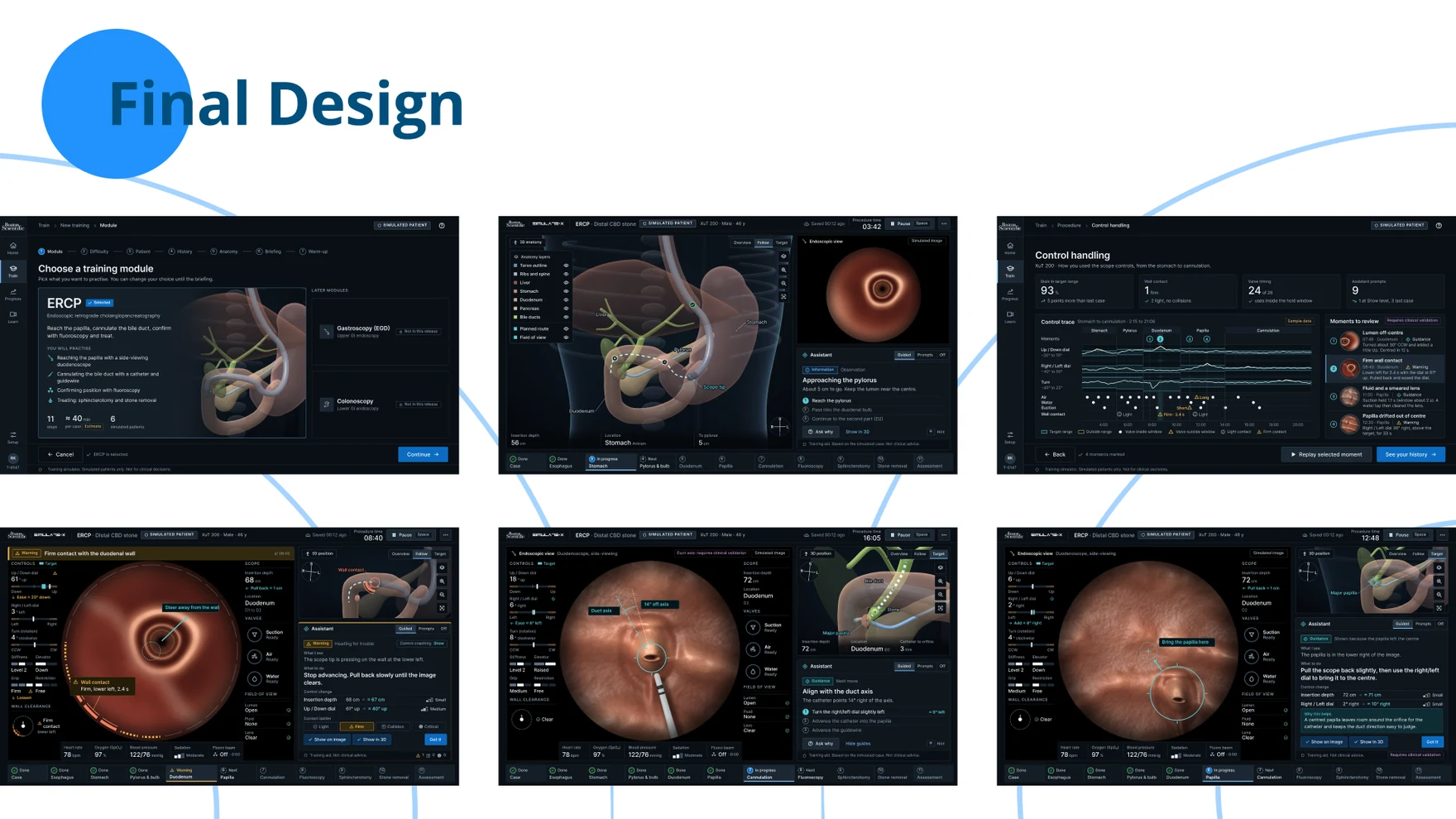
What exists today is a complete, evidence-traced V2 concept — built from real interviews, thirty root-caused pain points and two rounds of expert review — rather than a set of claims about impact. No usability testing has been run on either version yet, and I’ve been careful not to present any of this as a measured result.
Instead, every major decision in the redesign was turned into something testable: does the synchronised 3D landmark actually reduce how long it takes a trainee to orient themselves, and how many fewer errors does it produce against two separate 2D views? Which assistance level do trainees actually choose at each stage, and does that change as they get more experienced? Can the values on the AI + 3D screen be read correctly from five feet away, in a dark procedure room? Each of those has a defined study behind it, not just a hope.
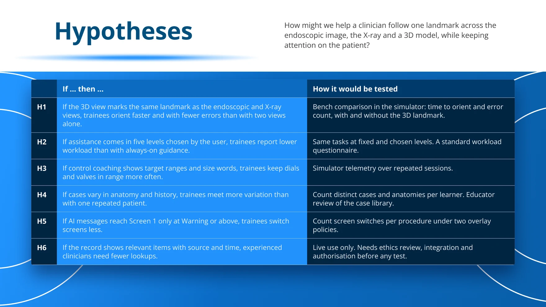
The split between simulation and live use was itself a deliberate outcome, not an afterthought: simulation training is ready to build on top of today’s evidence, while supervised live use stays a clearly labelled concept until it clears clinical validation, regulatory review and institutional approval. That staging — being honest about what’s proven, what’s designed-but-unproven, and what’s still just an idea — is the part of this project I’d point to first.
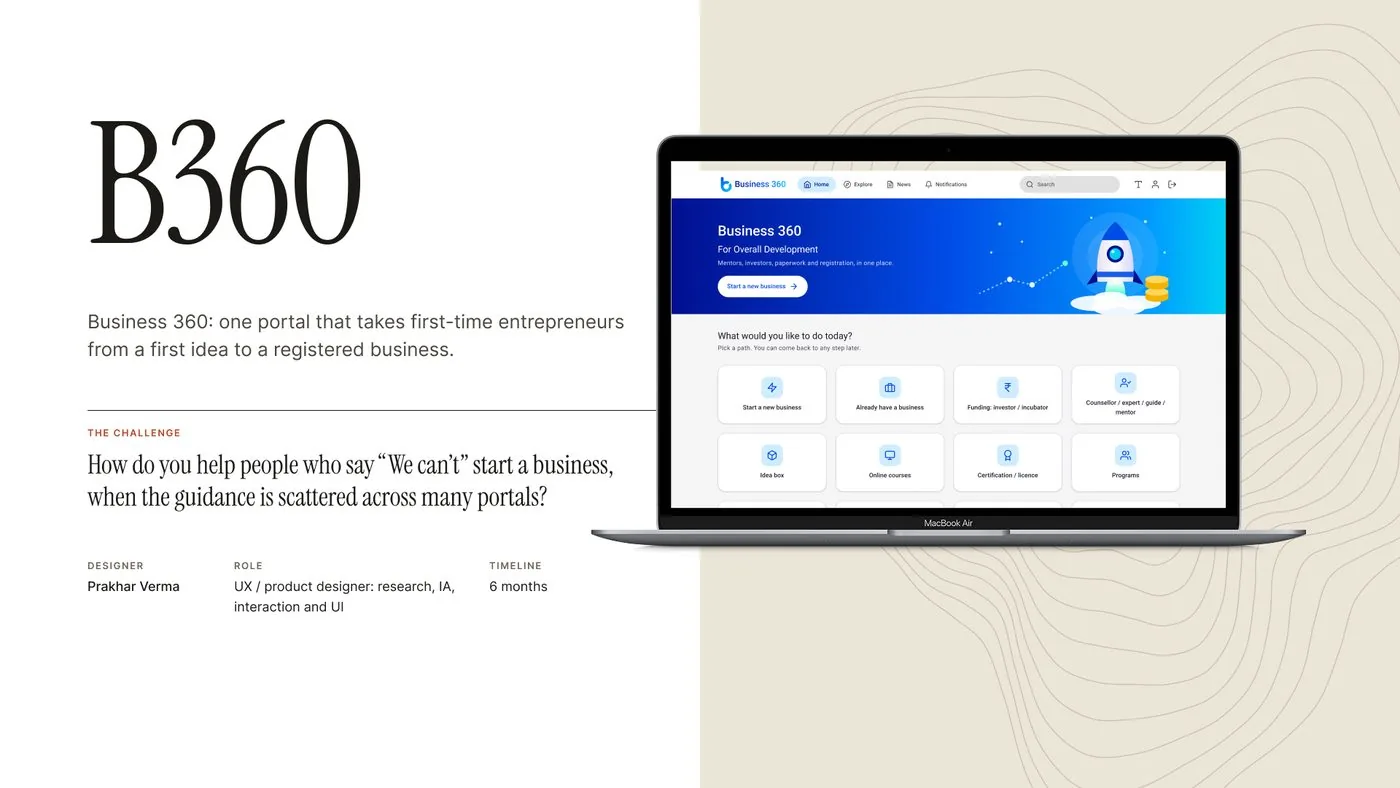
How do you help people who say “We can’t” start a business, when the guidance is scattered across many portals?

During a design internship I spent seventeen days in three villages in the hills of Uttarakhand — Dadoli, Lwani and Doiwala. People were generous with a stranger; one man walked with me to Kedarnath Temple just to see me there safely. What stayed with me was what they told me while I was there: their villages were emptying out. Migration was the word everyone used, and the reason was blunt — no livelihood, alongside extreme weather, no education and no hospitals. One resident summed it up in a line I kept hearing: “Our upcoming generation does not want to live here.”
I proposed the obvious answer — start a business around what they already had, natural, local products. They laughed. “We are uneducated people, and you are asking us to open a company,” one man told me. I pushed back: everything’s on Google, just search for it. His answer became the spine of this whole project: “We can’t.” Not unwillingness — a missing place to start from.
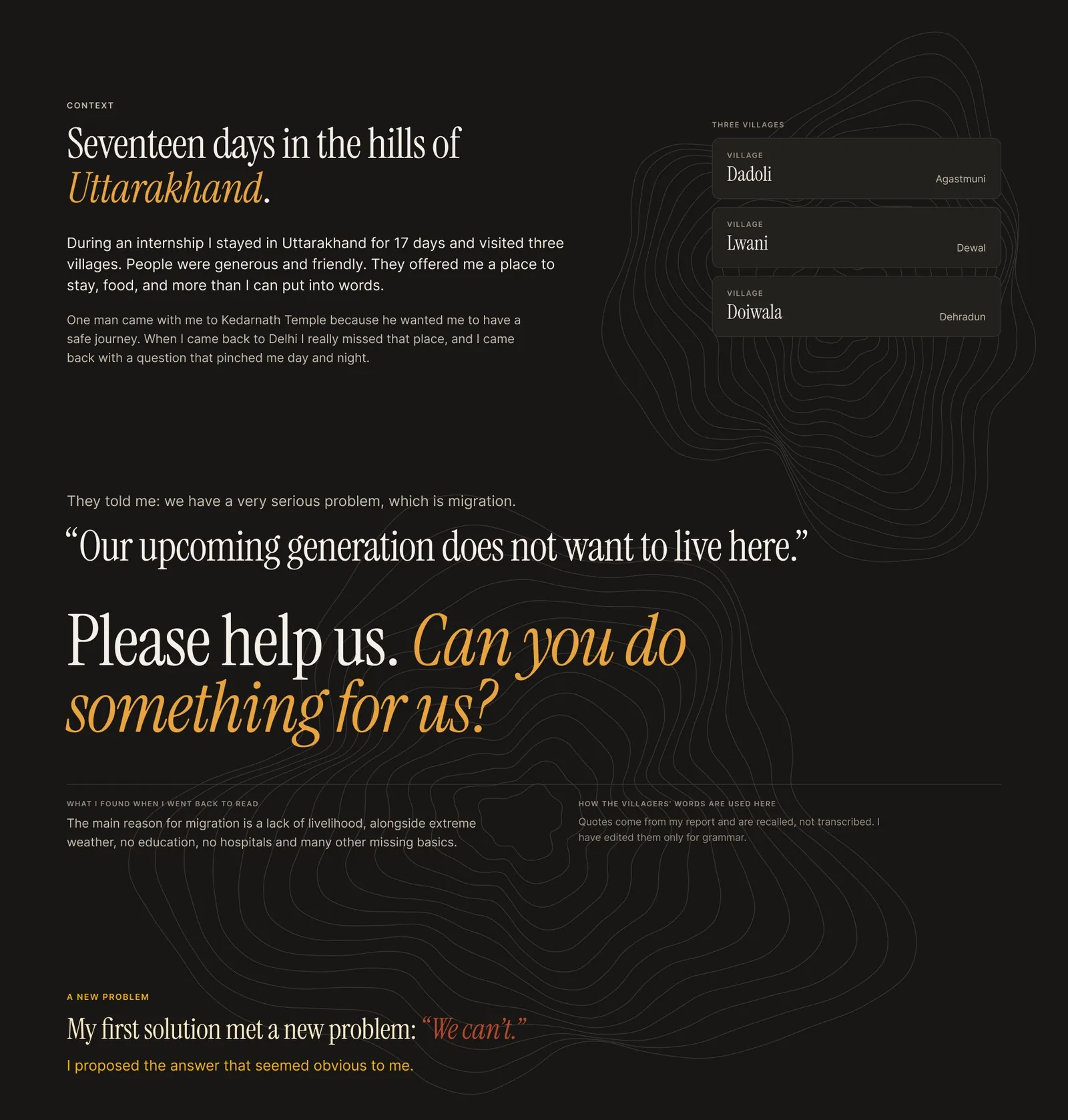
Back in Delhi, that line kept pinching, so I went looking for what “search for it” actually meant for someone in his position. It meant four different government portals — NIESBUD, the Ministry of Corporate Affairs, MSME and Startup India — each with its own homepage and its own menu language, with no indication of which one a first-time founder should open first. Officially, starting a business breaks into twelve steps, from evaluating yourself to growing the business. Unofficially, every one of those steps assumes you already know where to look.

The information exists. Using it is the problem.
That reframed the brief. This wasn’t a content problem — the guidance was all out there. It was a wayfinding and confidence problem: how might I turn scattered guidance into one guided path a first-time entrepreneur could follow without prior computer knowledge?
Before designing anything, I wanted to know whether “we can’t” was specific to rural Uttarakhand or something bigger. I ran short phone interviews with four founder friends in cities, all in their mid-twenties with engineering degrees and start-ups of their own, and asked whether they’d felt the same friction. All four said yes. The barrier wasn’t literacy or geography — no single, guided path existed anywhere for a first-time founder, in a village or in a city.
Secondary research put numbers behind what I’d heard. In one state field survey of 391 migrants, close to half (47%) named lack of employment as the reason they left, and government figures counted 3.83 lakh people leaving their villages over ten years, with 734 villages fully depopulated since the 2011 census. Per-capita income in the hill districts I’d visited ran at roughly half of what it was in Dehradun and Haridwar. Migration wasn’t an abstraction here — it was measurable, and it was accelerating.
I mapped every pain point from the interviews, a review of all four portals, and a card-sorting exercise onto a wall — sixteen in total — and grouped them into four themes: knowledge and confidence, effort and follow-through, trust and cost, and middlemen and safety. Reading those four groups against what each one asked of a product collapsed them into five patterns: confidence has to come before capability, information needs one order instead of many places, a long journey needs visible checkpoints, guidance needs a person and not just a page, and cost and data-sharing need to be explicit before any commitment.
The interviews converged on two very different starting points, so I designed personas and empathy maps around both instead of a single generic user.
Runs a computer and multimedia centre in his village; left school after 12th and worked in Delhi for three years before choosing to stay near home.
Needs: plain words over jargon, and ideas that work for someone who wants to stay in his village.
Leads the women of her village and has a Bachelor of Arts, but no computer knowledge — a degree tells you nothing about how easy a screen will be.
Needs: a way in that doesn’t start with a search box.
Their day-to-day pulled in different directions, but they agreed on one thing: neither wanted a wall of options. Both needed somewhere to start, in plain words, that assumed no prior computer literacy.
Each of the five opportunities became a design decision: a home screen that asks one question and offers labelled tiles instead of a search box; everything a new business needs grouped under one “Start a new business” page; a visible trail on every screen after that, so people always know where they are and can leave and return; a mentor or counsellor entry point built into every stage instead of bolted on afterward; and fees and data-sharing shown before any payment, never after. A hand-drawn flow of more than thirty decision points, traced from the twelve official steps, became a sitemap of six areas and a five-stage core journey — refine your idea, business plan, dealing with money, determination of legal entity, and registration — with a mentor loop built into every one of them.
The shipped design replaces four portals and a twelve-step checklist with one guided journey: pick a path from a single home screen, move through five stages with a visible trail, and never face a step without a route to a mentor.

Every page after the start screen carries the same breadcrumb — a chip for each stage, the current one filled in — so leaving mid-registration and coming back later never means starting over. The pattern repeats page to page on purpose: people learn the shape once, top bar, trail, one title, one action, and then only have to focus on the content underneath it.
Counsellor, expert and mentor entries sit inside the results page, the business plan, the structure comparison and the documents page — exactly where the research said people hesitate, not in a separate help section nobody opens. Booking one shows a real name, what they know, and an actual availability calendar, instead of a queue.

The business plan is built section by section, each one saved as you go, ending in one final document rather than a single long form that punishes anyone who has to stop halfway. To pressure-test the pattern I built a full sample plan for a fictional honey business, Himalaya Fresh Foods, with real structure across all eleven sections — start-up cost and break-even, market pricing and a competitor table, a fund plan, a five- and ten-year projection, mentor notes and registration status — to check the format held up for a plan with actual substance in it, not just placeholder text.

Copy was treated as a design material, not a sign-off step at the end. Buttons say what happens next (“Pay ₹100 and apply,” not “Submit”), costs and timelines are stated up front (“About 2 to 3 weeks to register,” “No monthly charges”), and every screen reassures people they can’t lose their place (“Pick a path. You can come back to any step later.”). Green is reserved for one thing only — the action that moves you forward — so it never has to be second-guessed.
Twelve final screens replace what used to be four unrelated portals and a paper checklist, tied into one guided path that a first-time founder — rural or urban, computer-literate or not — can follow without knowing what to search for.
I was able to save time: a one stop solution, organised and clean. I got crisp information with no hidden details.
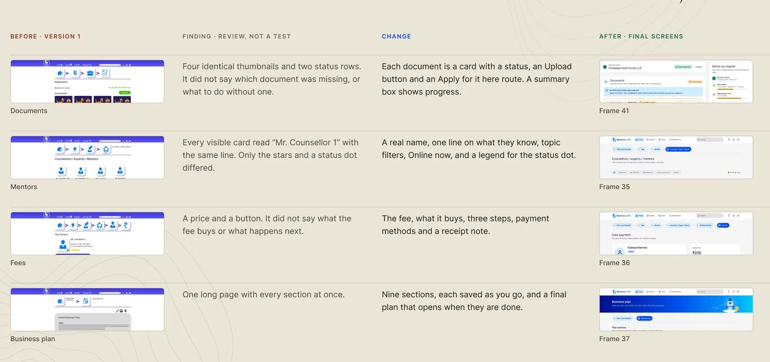
None of this shipped untouched. Reviewing version 1 against the same research surfaced real gaps — four identical document thumbnails that didn’t say which one was missing, mentor cards that all read “Mr Counsellor 1,” a fee button with no indication of what it bought. Each became a specific fix: a status card per document, a real name and one line of context per mentor, a fee breakdown shown before payment.
What this project doesn’t yet have is a launch. It was tested once, at version 1, with people responding that the flow felt organised and saved them time — but the twelve final screens haven’t been tested themselves, and the patterns around trust, cost and middlemen still rest on the needs list rather than a validated flow. Keeping that distinction visible is deliberate: this is a concept with real research underneath it, not a finished product, and knowing exactly where the evidence stops is part of the design work.
The screens above, in your hands — scroll inside to see the rest of the page, then open the real, clickable B360 prototype in Figma.
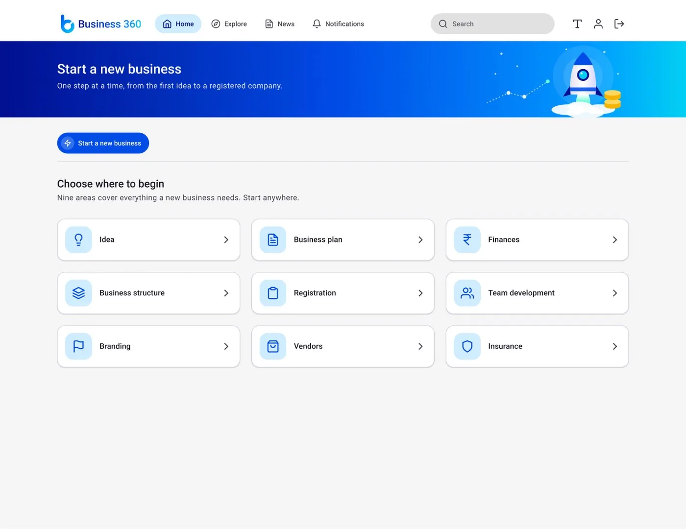
Designing a simpler digital workplace for everyday employee needs.
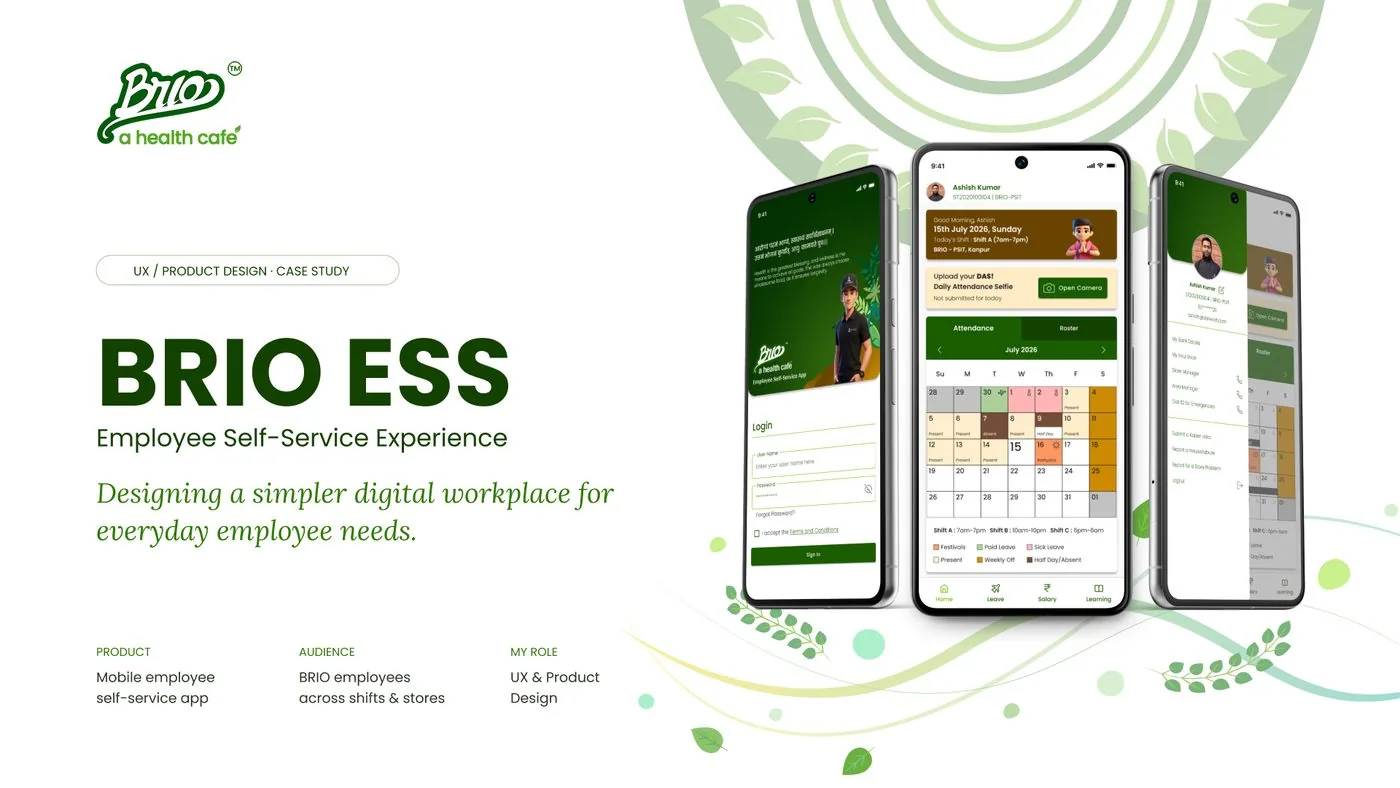
Work at BRIO runs on three overlapping shifts — a 7am–7pm open, a 10am–10pm middle shift, and an overnight 6pm–6am — spread across stores in cities including Kanpur and Ghaziabad, with employees posted to different locations across the roster. Leave itself splits into five types, each with its own balance and cap: festivals, a personal day, half days, paid leave and sick leave. That rhythm — long shifts, rotating stores, a policy for almost everything — is the environment a self-service product had to work inside, not smooth over.

The brief asked for a first-of-its-kind mobile Employee Self-Service platform, prioritising simplicity, accessibility and engagement above all: a place to view rosters, track attendance, submit a daily presence selfie, check salary details and slips, work through a learning portal, submit improvement ideas, and apply for leave.
Before any of that existed, everyday work ran on WhatsApp and paperwork. Rosters arrived as chat messages or printed sheets on a wall. Attendance was written down by hand or reported over message. Leave went through a form or an email, then a wait. Salary slips were requested, not accessed. Interviews with employees surfaced fifteen distinct pain points across scheduling, attendance, leave, salary and everyday updates — and fourteen of the fifteen traced back to the same channel, doing a job it was never built for.
How might a policy-heavy workplace feel simple to someone who just wants to get on with the day?
Getting from that question to a product meant naming the pattern inside the fifteen pain points, meeting the people living them day to day, and then finding one principle that could hold both what employees needed and what the business couldn’t compromise on.
The fifteen pain points sorted cleanly into five groups — schedules, attendance, leave, salary, and everyday updates, learning and ideas — but the underlying problem repeated each time: an outdated roster shared over chat, a leave request lost in a thread, a salary slip requested and re-requested, feedback with nowhere structured to go. WhatsApp wasn’t a bad channel by accident; it was the only channel anyone had been given.
Three employees carried the research: Rohit Verma, a 29-year-old purchase field worker who needed his schedule and leave requests to work from outside a store; Sameer Malik, a 25-year-old warehouse worker relying on paper logs and slow manager sign-off; and Anil Kumar, a 28-year-old café worker without any efficient way to manage his own schedule or attendance. Their frustrations differed in the detail — phone calls from the field, paperwork in a warehouse, no system at all behind a counter — but a day in the life of each of them circled back to the same three questions, morning to night: where do I work today, did my attendance count, did my request go through.
Difficulty accessing rosters, tracking attendance, and submitting leave requests while working in the field.
Easy access to daily schedules, attendance submission, and leave requests on the go.
Relying on phone calls and emails to get schedule updates, which is inconvenient in the field.
Manual attendance tracking, lack of a quick leave application process, and difficulty accessing roster updates.
Streamlined attendance submission, easy leave applications, and instant access to rosters.
Over-reliance on paper-based processes and needing approval for leave requests, causing delays.
Difficulty accessing shift schedules, submitting leave requests, and tracking attendance for daily shifts.
Quick access to daily schedules, a simple leave application process, and attendance tracking.
Lack of an efficient system for managing work schedules, attendance, and leave requests in the café environment.
What employees wanted — quick access, clarity, simplicity, confidence, a low cognitive load — sat in real tension with what the business needed to keep running: policy compliance, structured processes, accurate records, operational control, accountability. Neither side could simply win. The design space that reconciled them became the principle behind every screen that followed:
Make the rule visible, and the next step obvious.
The product landed as one app with four everyday destinations in the bottom navigation — Home, Leave, Salary and Learning — plus a profile menu holding everything used less often: bank details, insurance, contacts, and Kaizen idea submission. The information architecture stays deliberately shallow: login opens straight into five destinations, and nothing sits deeper than a bottom sheet, so a policy document or a confirmation is always one tap from wherever the request started.
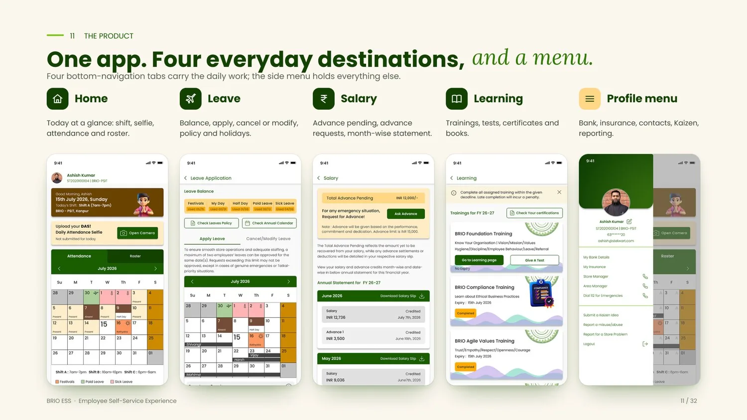
The Daily Attendance Selfie turns a manual check-in into a single verifiable moment: a card on Home asks for today’s selfie, a simple guide frames the face, the photo is stamped with place and time before it can be confirmed or retaken, a sheet repeats exactly what was recorded, and Home itself updates to “Submitted for today!” with the camera button disabled — nothing left to guess about whether it went through.

Leave is where policy meets daily life most directly, so the screen carries its own guidance rather than hiding it in a separate document. Balance, policy and the calendar come first; the form follows. One tab handles both applying and modifying or cancelling, and states plainly what can’t change and why — past leaves are locked because they’re matched against attendance selfies, festival leaves are governed by management, and no more than two people can be off on the same date without a genuine emergency. A review sheet restates the change before it sends, a toast confirms it, the calendar itself reads “Under Review,” and the full policy opens in a bottom sheet with a download, so the source is never more than a tap away.
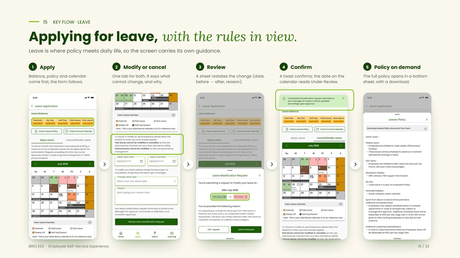
Salary and advance follow the same logic. Total Advance Pending leads in an amber card, in the size a person actually wants at a glance; the explanation of what it means and where the limit comes from sits beneath it, not above. Asking for an advance keeps that same pending figure in view while the request is being made. A toast says who has it and what happens next, and the monthly statement lists salary and every advance, credited and dated, so nothing has to be pieced together from old messages.
Trainings carry a deadline and an 80% pass mark, run through a short in-app video, and end in a certificate the employee can download, grouped by month. Kaizen — BRIO’s improvement-idea channel — gets the same shallow, guided treatment: a single field, a 200-character minimum so ideas arrive with real substance, rules one tap away in a bottom sheet, and a close that reads less like a form confirmation and more like a colleague’s reply: “Thanks! See you tomorrow :)”
Every constraint the business needed enforced got a visible, plain-language answer on the screen where the decision actually gets made, rather than a rulebook filed somewhere else. A maximum of two leaves per date sits above the calendar that shows who’s already off. A selfie stamped with place and time replaces a manual register. A request sheet says outright that submitting doesn’t guarantee approval, before anyone can be surprised by that later. The same logic runs through status: every request carries a fill colour, an icon and a word together — never colour alone — so “Upcoming,” “Under Review” and “Completed” stay legible, and a request in progress becomes a card that visibly changes once it’s done.
Eight usability principles run through the interface in practice rather than as a checklist — recognition over recall in a labelled bottom bar, visibility of status in every calendar cell and toast, familiar patterns in every date picker and dropdown, one consistent family of buttons, cards and sheets throughout. Accessibility held to the same discipline: contrast was measured directly from the exported screens rather than assumed, running from around 8:1 on buttons and headers up past 15:1 on body text — a design check rather than a formal audit, but a real one.
One typeface, Poppins, carries every screen; weight and colour do the work of hierarchy rather than a second or third font. Fifteen components — buttons, cards, chips, tabs, bottom sheets, toasts, checkboxes — are reused across every module instead of invented per screen, and the palette itself stays small and legible: a primary green for actions, amber for anything that needs attention, and a dedicated colour for each calendar status.
The same warmth carries into the login screen itself, which opens on a line from a Sanskrit shloka about health — a small detail that ties a policy-heavy tool back to why BRIO exists in the first place.
What follows is a qualitative summary of what the finished experience provides. This case study makes no claim about usage numbers or measured impact.
BRIO has twenty employees, and at that size the gain isn’t scale — it’s consistency. Everyone works from the same roster, the same set of rules and the same record, rather than whichever version of it happened to reach them over chat that week. This is a projection built from the app’s own features and the pain points named in interviews, not a measured result. What’s worth measuring once it’s in people’s hands: how quickly a leave request moves from submitted to resolved, how many employees submit the daily selfie on time, and where people actually drop off inside each flow.
The clearest lesson was that the policy is part of the interface, not a footnote to it — in an HR product, the rule is usually the reason a request fails, so showing it early is a design decision, not paperwork. A close second: every request needs a named state, because naming it — Upcoming, Under Review, Completed — answers the question before anyone has to ask it. And a smaller decision mattered more than expected: shifts run from early morning to overnight, so the interface had to design for the shift, not the desk, and a polite sign-off did real work in making an operational tool feel like part of the workplace rather than a system bolted onto it.
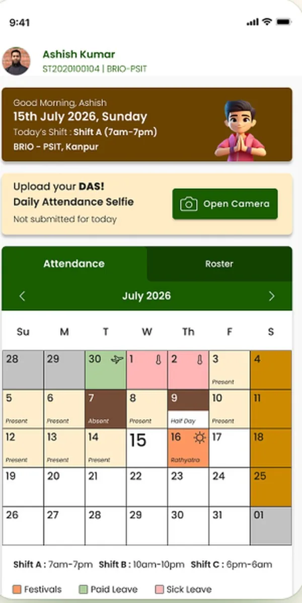
The screen above, in your hands — scroll inside to see the rest of the screen, then open the real, clickable BRIO ESS prototype in Figma.
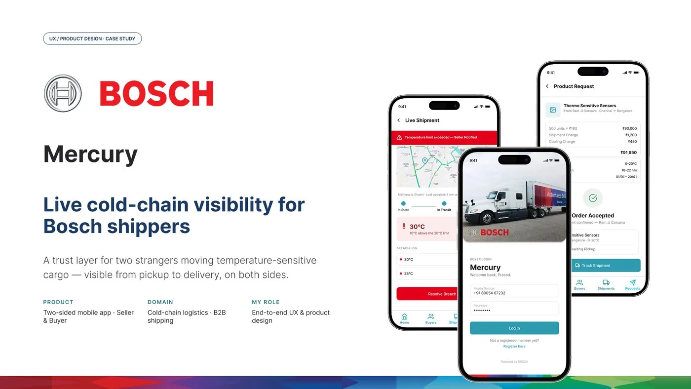
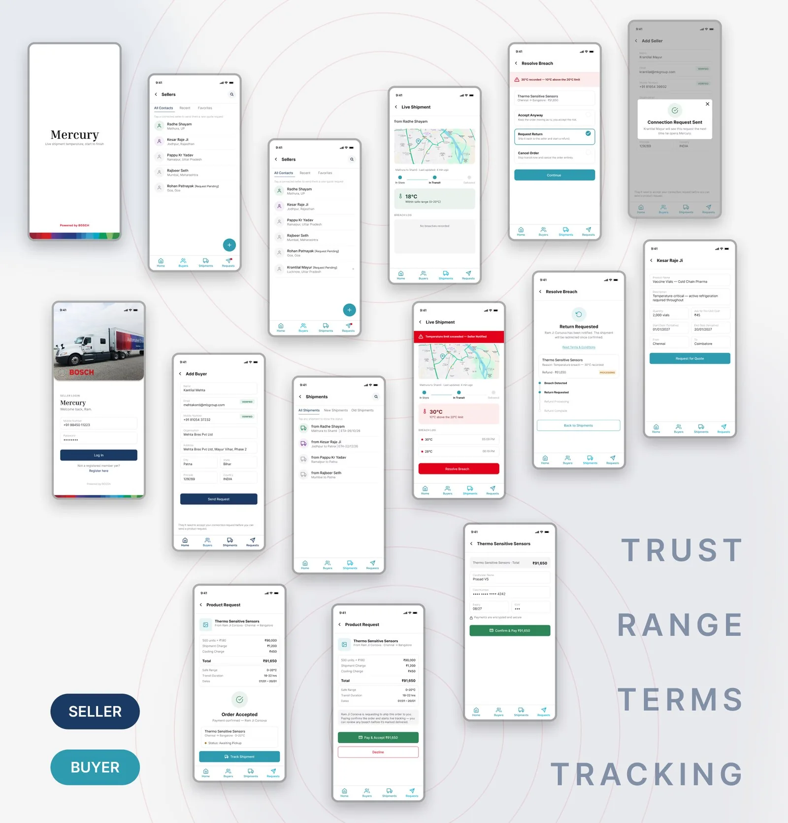
A trust layer for two strangers moving temperature-sensitive cargo — visible from pickup to delivery, on both sides.
Self-directed exploration, originally built for a design challenge.

A shipper hands temperature-sensitive cargo to a driver they’ve never met, bound for a buyer they’ve never met. For 18–40 hours, neither side can see it — only hope it arrives the way it left.
If the cold chain breaks, it becomes a phone argument with no shared evidence — whoever is more persistent usually “wins.”
Sensors and components that fail calibration outside a narrow band.
Cold-chain compliance isn’t optional — it’s regulated.
A few degrees for a few hours is the difference between sellable and spoiled.
Bosch already builds the hardware end of this — IoT sensors and thermostats fitted to the cargo. Mercury is the software layer on top: it takes a reading the hardware already produces and gives it to the one side that can’t currently see it — the buyer, in real time.
Four things became clear fast:
Repeat trade runs on years of informal trust. A new pairing starts from zero.
When goods arrive spoiled, the outcome depends on negotiating power, not on what actually happened.
No update is possible at all until the doors open at the destination.
Before either side discusses a shipment, they want to know who they’re dealing with.
Twelve moments, one shape — where trust breaks down:
Mercury only works if it earns trust on both ends of the truck at once.
Get paid without shipping to someone who might not pay, or ghost after a dispute.
A breach he can’t prove wasn’t his fault — and a buyer who won’t take his word for it.
Know the cargo is still good before it’s at his dock, not after.
Paying upfront for goods that show up spoiled, with no leverage to get his money back.
How might we give two strangers the same trustworthy view of one truck?
Not a tracking app for the seller and a status page for the buyer — one shared source of truth, with each side seeing only the controls their role needs.
Once paid for, temperature and location are live for the buyer — nothing to request.
Every reading is logged with a timestamp, ready to point to.
Seller and buyer see the same shipment from two seats, not two disconnected apps.
Colour tells the truth about severity. If nothing is red, nothing is wrong.
Mercury is the middle layer — it doesn’t sense temperature and it doesn’t move the truck.
A thermostat/IoT sensor on the cargo reports temperature and location throughout transit.
Turns a raw reading into a live status, a breach log, and an action.
Two businesses who’ve never met, each seeing only the controls their role needs.
| Phase | Seller | Buyer |
|---|---|---|
| Connect & verify | Registers, verifies phone & email, adds the buyer | Accepts the connection request |
| Agree terms | Sends an itemised request with the safe range | Reviews and accepts the shipment terms |
| Pay & ship | Confirms the order, hands off to the carrier | Pays upfront — this is what starts tracking |
| Live transit | Watches the same live feed, read-only | Watches a live temperature & location feed |
| Resolution | Sees the same breach log & outcome as the buyer | Chooses: accept anyway, return, or cancel |
Inter, tuned by weight, no second typeface. Four statuses, four colours, no overlap — red is reserved for exactly one meaning across both apps.
What follows is a qualitative summary of what the design demonstrates — a concept built on real research, not a shipped product with measured results.
Mercury’s whole job is closing the gap between what each side knows — not after the fact, while it’s still happening.
The breach screen above, in your hands — scroll inside to see the rest of the screen, then open the real, clickable Mercury prototype in Figma.


“Empathy at the core, skills in brain, passion in heart make a perfect recipe for being a good designer — and in fact, for being a good person.”— Prakhar
My journey began in Mechanical Engineering, where I learned to understand the relationships between structure, function, and performance. Over time, my curiosity moved beyond how things work to the more nuanced question of how people perceive, interpret, and experience them.
UX became the intersection of these interests—a discipline where analytical rigour meets human behaviour, and where technology, context, and emotion shape the way we interact with the world.
Today, I bring these perspectives together to design products and experiences that balance functional clarity with human complexity. I am drawn to the space between what a system is designed to do and what a person actually needs from it.
Understand people before designing interfaces.
Think in journeys, states, ecosystems and reusable patterns — not isolated screens.
Work closely with product, engineering, business, research and content.
Turn complex business requirements into experiences people can actually understand.
Good design rarely starts with design.
It starts with noticing.
Art has taught me to look closely. Human behaviour reminds me to understand before I solve. Teaching keeps me curious. Mountains give me perspective. Culture and philosophy make me question the meaning behind what I create.
I bring these perspectives back to the screen — turning observation into understanding, and understanding into products, experiences and systems that feel meaningful to people.